What is Abstraction?
Abstract art is art that does not attempt to represent an accurate depiction of a visual reality but instead use shapes, colours, forms and gestural marks to achieve its effect.
Abstract photography, sometimes called non-objective, experimental or conceptual photography, is a means of depicting a visual image that does not have an immediate association with the object world and that has been created through the use of photographic equipment, processes or materials.
Abstract photography, sometimes called non-objective, experimental or conceptual photography, is a means of depicting a visual image that does not have an immediate association with the object world and that has been created through the use of photographic equipment, processes or materials.

Examples of Abstract Art


|


|


|
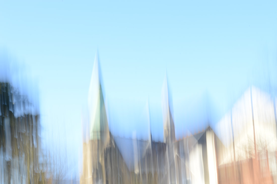
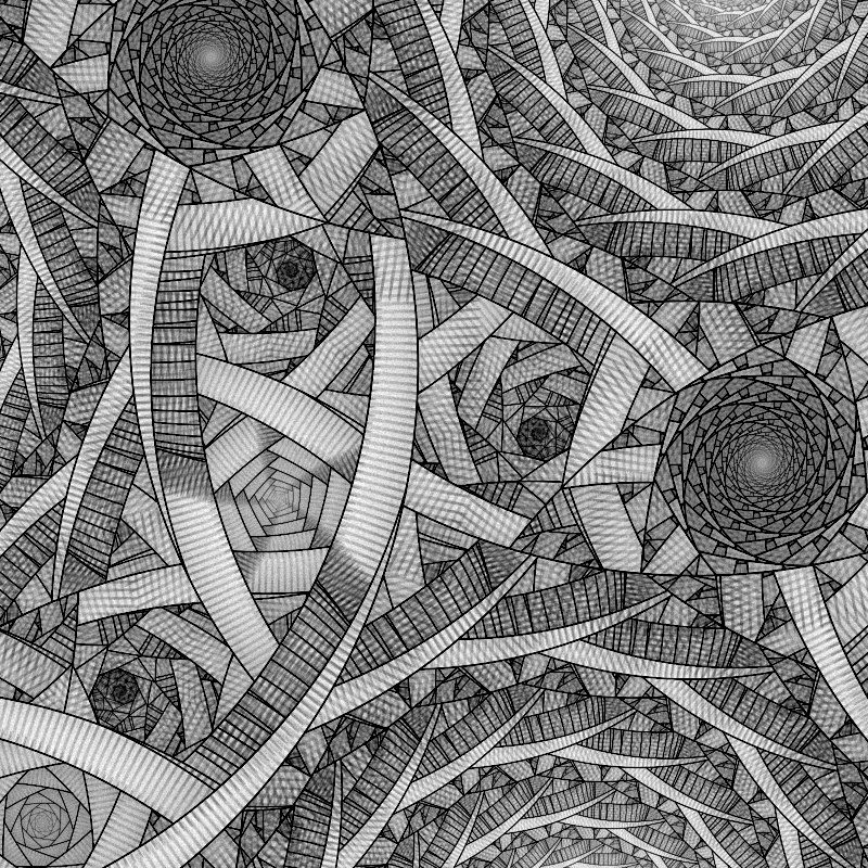
Beginning of My Abstraction Work
Artist Analysis: Andrew S Gray
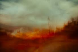
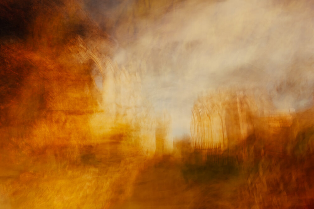
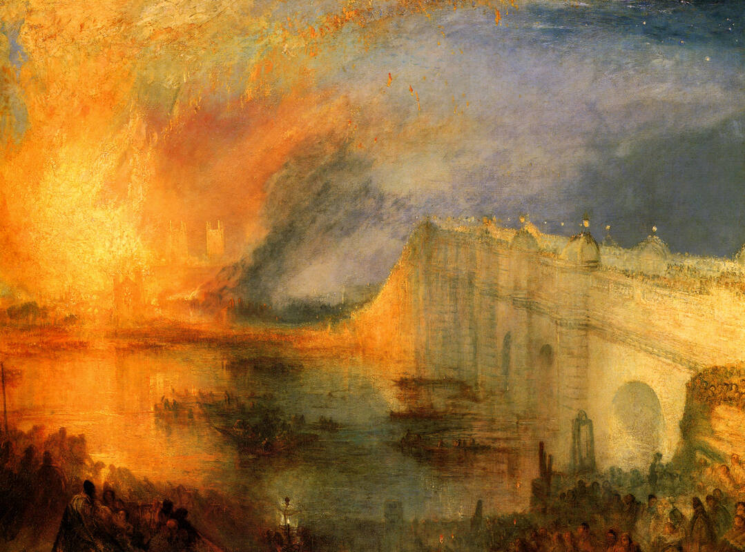
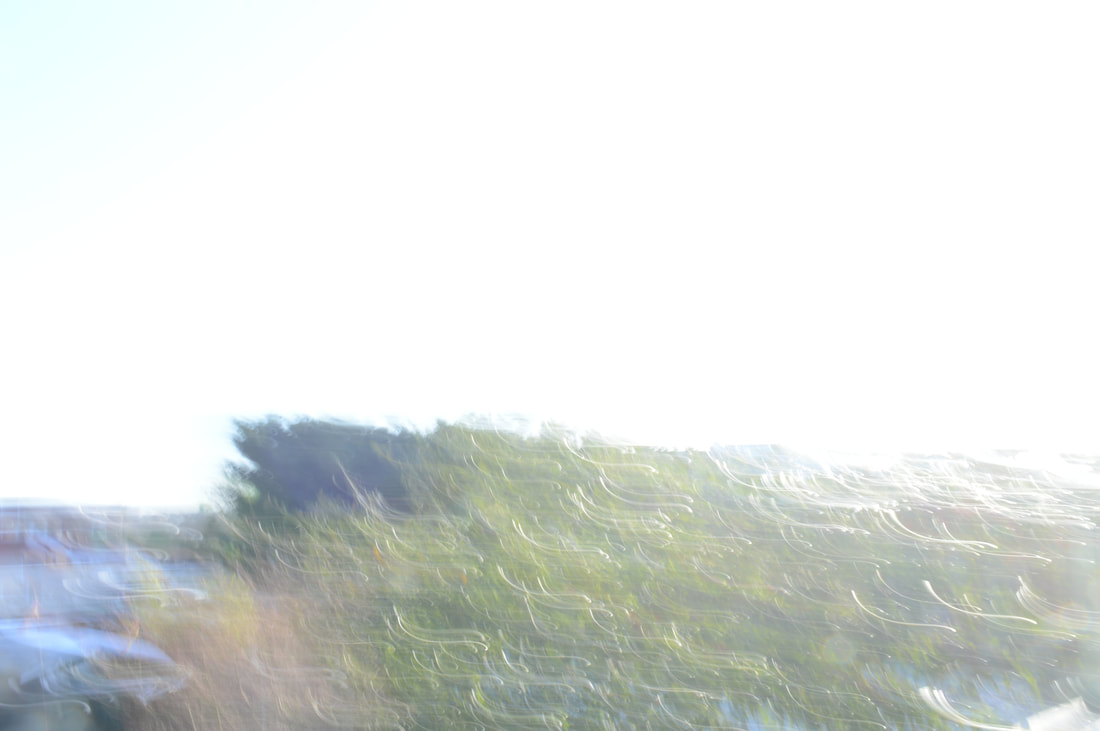
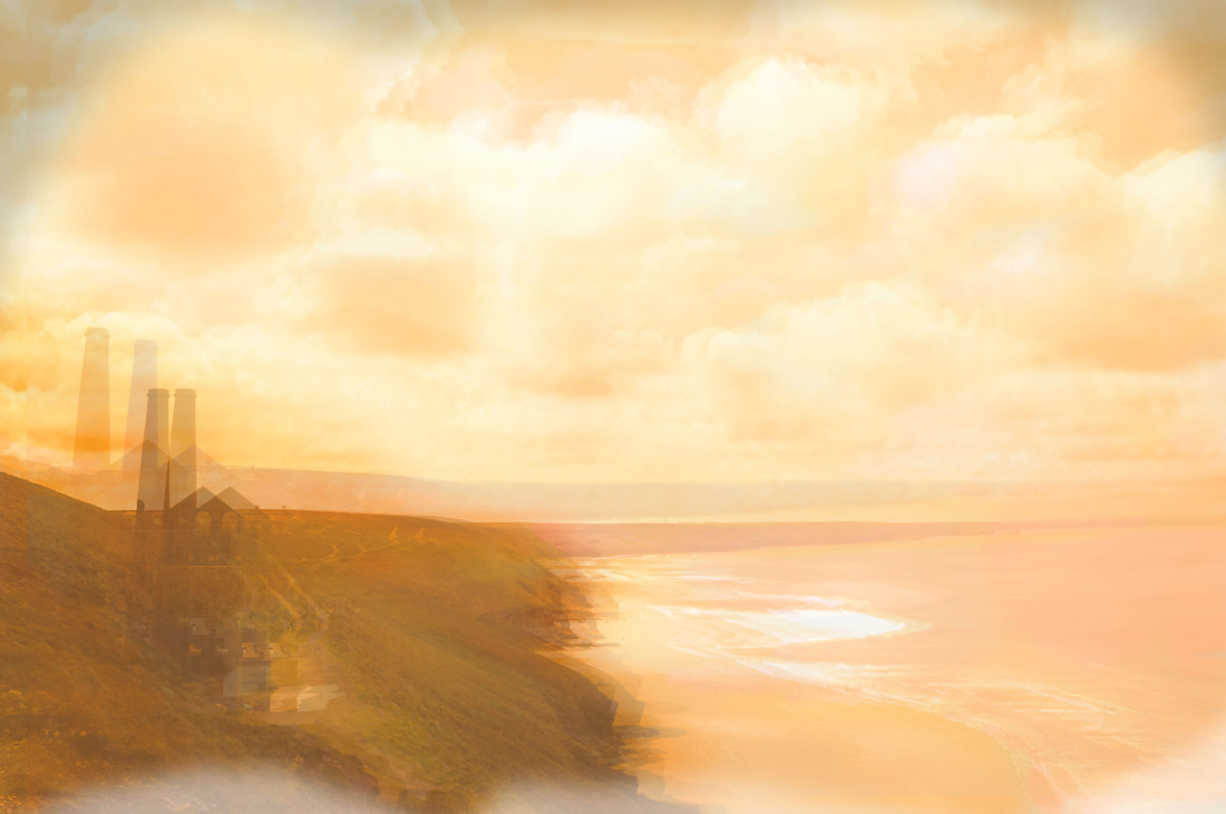
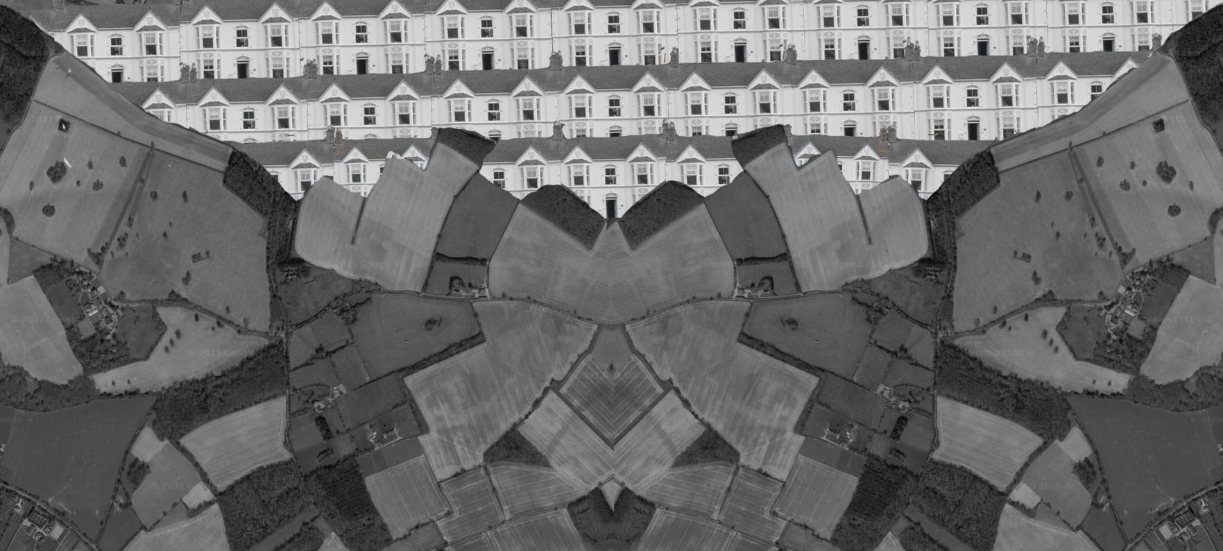
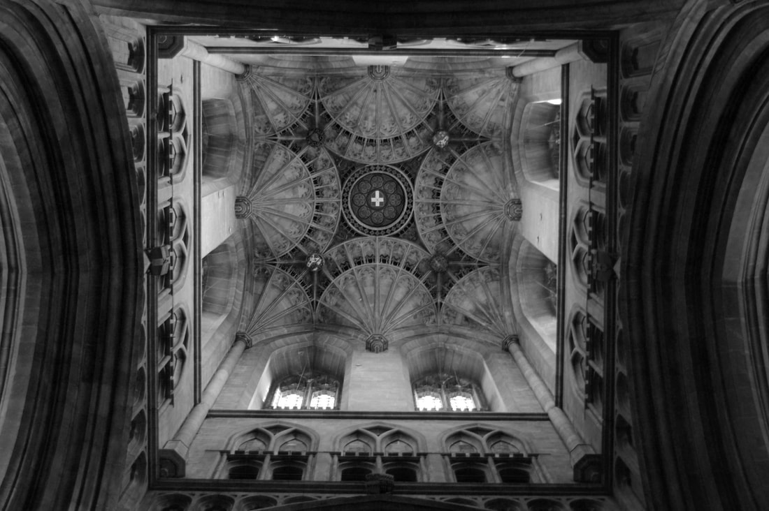
Andrew S Gray is a photographer who was inspired by the Northumberland countryside where he found his inspiration for emotional landscape photography. His unique type of photography was inspired by many previous painters and artists who he has taken into account. One of these artists was a 19th century master painter by the name of JMW turner who painted landscapes often portraying chaotic scenes like shipwrecks but also calm misty bases of hills. He has also been inspired by photographer Valda Bailey whos style uses a variety of blurs and layering in order to create a confusing and surreal effect triggering emotion by making us think of the beautiful images being displayed that have been distorted and hidden. Valda Bailey is excellent at obscuring detail like in image 1 which is a reflection of a stick yet in looks so foreign and indistinct. Andrew S Gray has taken inspiration from Valda Bailey which is clearly evident in his work, the use of duplicated images as well as distorted images vaguely recognizable.
Andrew S Gray has a unique way of using lighting in order to capture the effects of distortion and blur. His lighting is shot and edited to look chaotic and replicate the lighting style of JMW Turner, a common theme between both artists is the swirling storm of light. The lighting is emotional and helps to exaggerate the form of objects within the photograph via the use of high contrasts which highlight the form of buildings and trees. The lighting has a dreamlike effect which links to the theme of surrealism and triggers an emotional response to the picture since objects are outlined but not clear forcing and emotion rather than visual response. The light leads in to the theme of narrative just like how in Turners paintings the light is used to consume most of the painting making you have to focus on the other details going on.
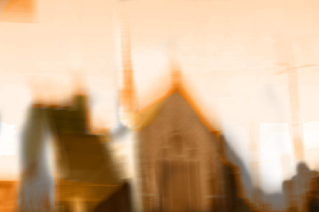
People have not been included in the artist's work, I believe this has been done to isolate the viewer's emotions when viewing the picture. When people are included in photos its normal done to portray a certain emotion. Andrew S Gray hasn't included people but has decided to include manmade structures, this helps to draw out emotion without displaying it via a face or body language, this choice has been made because faces are an easy way for an artist to portray an emotion to the viewer. The vague silhouettes of man made structures makes us imagine what the obscured images are which is the artists intention just how Turner has sub themes to his paintings like people drowning which will only be picked up if you can look past the distortion into the smaller details of the image.
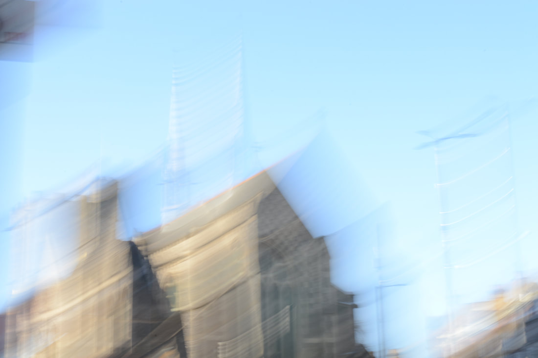
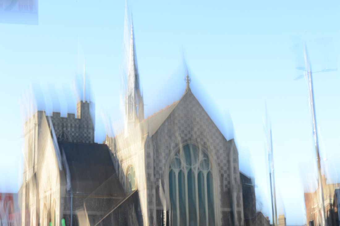
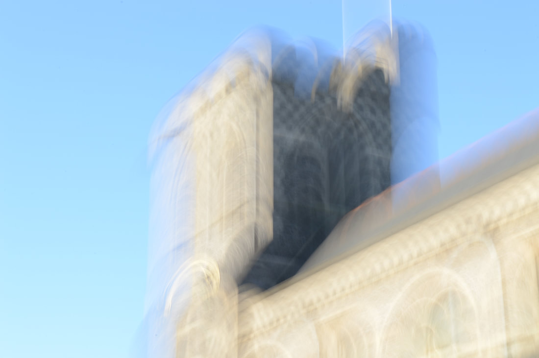
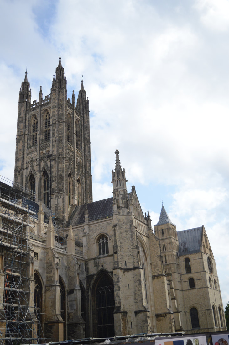
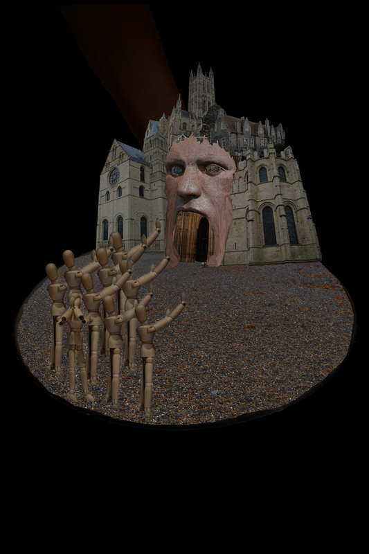
Distortion is a present theme in my selected artists work which is evident in his photography due to the use of blurs, duplication, shadows, saturation and colour. He uses these many techniques in order to create the effects of distortion. In Grays work he starts with a base layer image often of buildings such as churches then he applies techniques that create distortion with the final goal of obscuring the original images detail forcing viewer's of his photography to search for detail past the distortion.
People have not been included in the artist's work, I believe this has been done to isolate the viewer's emotions when viewing the picture. When people are included in photos its normal done to portray a certain emotion. Andrew S Gray hasn't included people but has decided to include manmade structures, this helps to draw out emotion without displaying it via a face or body language, this choice has been made because faces are an easy way for an artist to portray an emotion to the viewer. The vague silhouettes of man made structures makes us imagine what the obscured images are which is the artists intention just how Turner has sub themes to his paintings like people drowning which will only be picked up if you can look past the distortion into the smaller details of the image.
Distortion is a present theme in my selected artists work which is evident in his photography due to the use of blurs, duplication, shadows, saturation and colour. He uses these many techniques in order to create the effects of distortion. In Grays work he starts with a base layer image often of buildings such as churches then he applies techniques that create distortion with the final goal of obscuring the original images detail forcing viewer's of his photography to search for detail past the distortion.

|


|

|
Movement has been illustrated in the photographers style and editing via the use of swirling and duplicating the image. the duplicate image creates the effect that the picture is moving back and forth creating the blurry distorted image. The action of being confused or in a dreamlike state is emulated through the editing techniques portrayed by the artist, this links to the theme emotional landscapes since the emotion triggered is not linked to regular emotion you would feel looking at a in focus image linking to themes such as surrealism. This is the nature of Andrew S Grays abstract photography since it can fathom emotions that are only acquired in a dreamlike state or a surreal moment.
Colour is one of the key tools Andrew S Gray uses in order to create his photo edits, He uses colours like brown, orange, grey with hints of sepia and red. The use of these colours helps construct bright images with a focal point that look similar to an exploding bomb or rising sun. Colour has also been used to create layers in the photo instead of using aperture, this is a great unique choice made by the artist that makes his work stand out. The ground in his pictures is being swallowed by red whist the sky is a dim grey/sepia, this links to emotional photography because you can take away so much from just the colours.
Colour is one of the key tools Andrew S Gray uses in order to create his photo edits, He uses colours like brown, orange, grey with hints of sepia and red. The use of these colours helps construct bright images with a focal point that look similar to an exploding bomb or rising sun. Colour has also been used to create layers in the photo instead of using aperture, this is a great unique choice made by the artist that makes his work stand out. The ground in his pictures is being swallowed by red whist the sky is a dim grey/sepia, this links to emotional photography because you can take away so much from just the colours.
Examples of Valda Bailey

|

|

|
I have decided to take a look at the works of JMW Turner as I believe understanding his work is crucial to my analysis on Andrew S Gray. Studying Turners works has enabled my to broaden my understanding of one of Grays biggest influences, his style heavily draws inspiration from Turners surreal paintings. Turners work has helped me gain the knowledge on the processes behind the creating of Grays images as the two artists have a number of differences yet share a similar concept. Turner is a painter whist Gray uses many different digital programs, this is why it is paramount that I am able to understand both artists processes to help me create a piece of my own.
Artist Analysis: JMW Turner
“My business is to paint what I see, not what I know is there.”
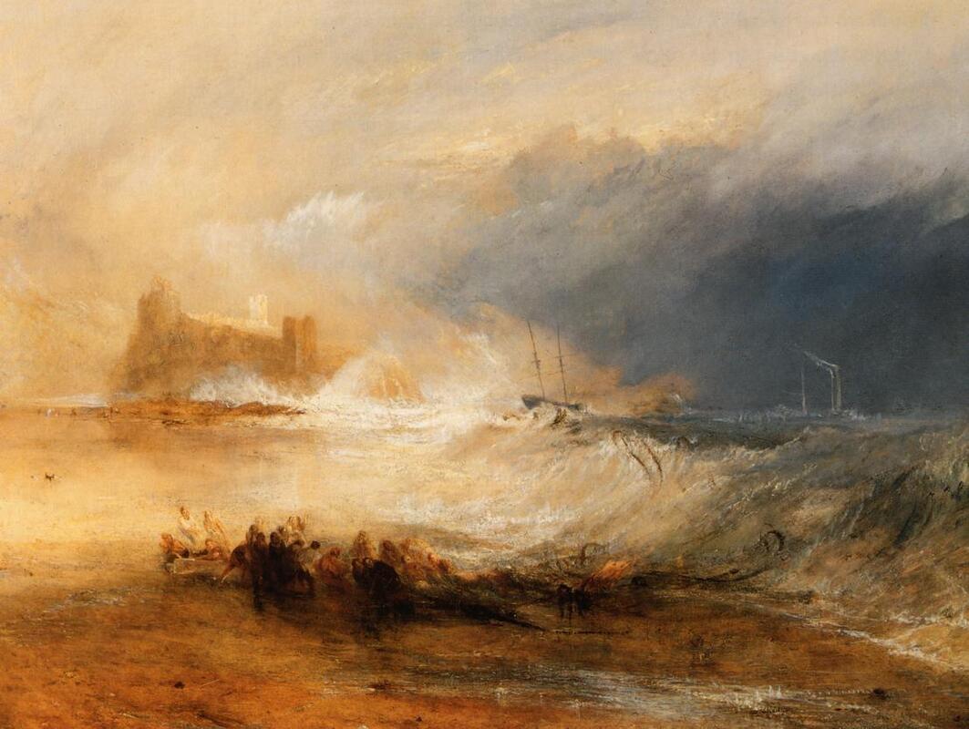
JMW Turner was an English painter born in 1775 who is known for his watercolour paintings in the romanticism movement. He is known for his expressive colourisations, imaginative landscapes and turbulent marine paintings. His painting are often chaotic, distorted and have swirls or explosion's of certain colours. An element of surrealism and beauty can be found within all of his works.
JMW Turner was an English painter born in 1775 who is known for his watercolour paintings in the romanticism movement. He is known for his expressive colourisations, imaginative landscapes and turbulent marine paintings. His painting are often chaotic, distorted and have swirls or explosion's of certain colours. An element of surrealism and beauty can be found within all of his works.

|

|

|
The genre of his work is landscape, he displays scenes of wide spaces of land and sea with a wide depth of field. Turner includes some recognizable objects such as animals, structures and boats however these objects are not so distinguishable in the majority of turners paintings, they appear distorted, indistinct, blurred, hidden, concealed and simplified. The use of these many styles and effects means the viewer must analyse the picture in order to pick out details such as the ship in picture 2 since it is obscured by the sea and sun. this also links to the blurring of detail such as the water and light covering the ship leaving little to identify it by. This relates to the theme of abstraction since Turner is taking away from the painting and making certain abstractions.
One key aspect to Turners work is his use of lighting. The way turner uses his lighting is to absorb most of the space on the canvas and then have all the detail surrounding the explosion of light. The lighting adds to the theme of chaos since it is disorderly creating a confusing effect that gives the viewer a surreal feeling.
Movement is one of the essential requirements in a turner painting, so many pieces of his work display violent, intense movement. When viewing Turners artwork you get a sense of change because most of his scenes are tragedy's at sea meaning it all could change in a second as it is swept away. Objects are captured in motion in many ways. One way in which motion is portrayed is by having ships crashing into waves clearly emphasizing the fact that they are traveling quick however they are up against the opposing motions of the sea.
|
|
|
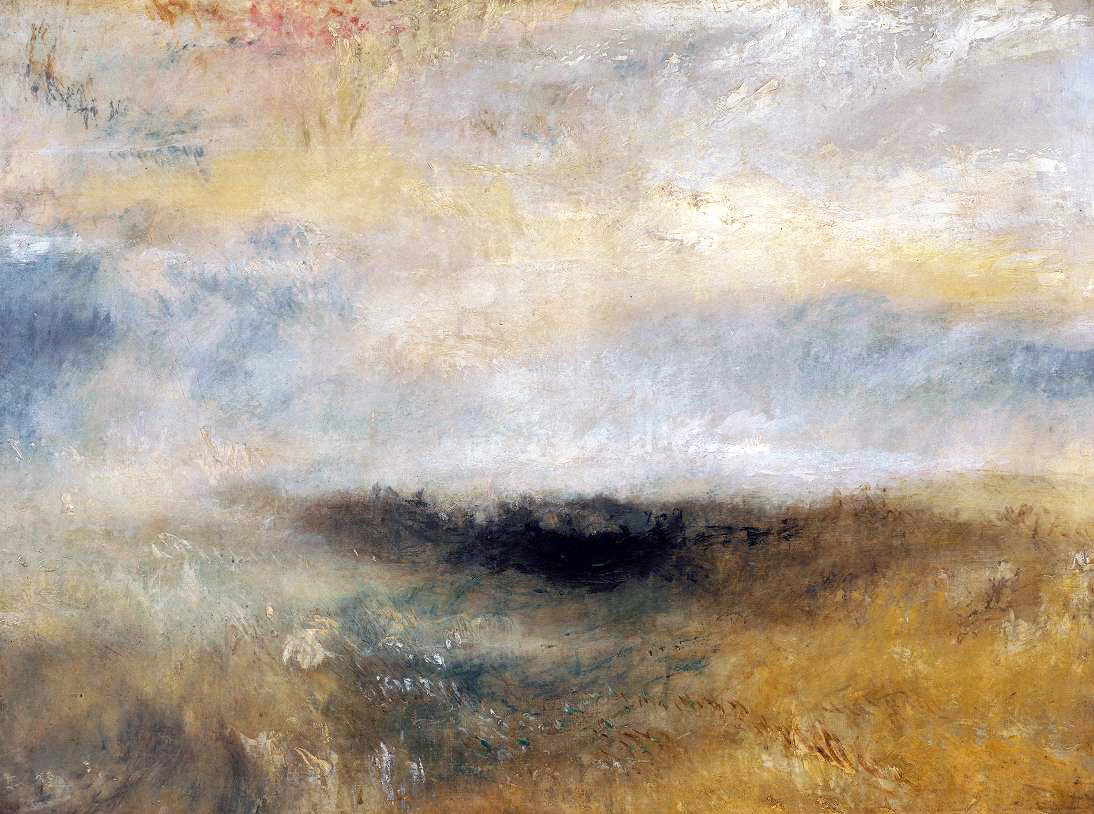
Turner is an abstract artist so naturally themes of abstraction are present within his works of art. These abstract elements appear in his pictures in many different forms, one key notable one is the use of the sea and how turner has chosen to have the sea swirling round the entire photo. This is abstract since it shows a unnatural motion that wouldn't occur in real life. This over exaggeration of the sea has been done to create abstractions of objects and obscure detail making the picture more abstract in nature and the scene more intense triggering more emotion.
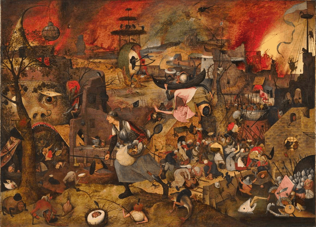
Narrative is a theme that Turner has explored greatly. All of his artwork illustrates a narrative in motion and in various stages of a scenes. One of his paintings displays a ship aimlessly crashing through the waves whilst its crew drowns. The narrative is pieced together by the viewer as each bit of obscured information is discovered in the image, once complete the viewer is strongly hit with a particular emotion such as dread or hopelessness. Turner is a master of creating emotion via narrative, this is displayed in the top left image of the deer. All the information we have is a bright plane with a grazing deer in the sun. In his quiet paintings the sense of dread and uneasiness is formed as the narrative is left unclear. The simplicity of the images narrative is what creates the emotion as opposed to his other chaotic paintings in which the tragic narrative is clear. The viewer has little information to determine the next scene in the painting, this unpredictability is why the seemingly harmless image of the deer really emanates dread and uneasiness. This can be likened to a piece of modern media. In the film Bambi this same effect is used as the scene depicting Bambi's mothers death, the scene is bleached of colour and simplistic creating the sense of dread and uneasiness.
Narrative is a theme that Turner has explored greatly. All of his artwork illustrates a narrative in motion and in various stages of a scenes. One of his paintings displays a ship aimlessly crashing through the waves whilst its crew drowns. The narrative is pieced together by the viewer as each bit of obscured information is discovered in the image, once complete the viewer is strongly hit with a particular emotion such as dread or hopelessness. Turner is a master of creating emotion via narrative, this is displayed in the top left image of the deer. All the information we have is a bright plane with a grazing deer in the sun. In his quiet paintings the sense of dread and uneasiness is formed as the narrative is left unclear. The simplicity of the images narrative is what creates the emotion as opposed to his other chaotic paintings in which the tragic narrative is clear. The viewer has little information to determine the next scene in the painting, this unpredictability is why the seemingly harmless image of the deer really emanates dread and uneasiness. This can be likened to a piece of modern media. In the film Bambi this same effect is used as the scene depicting Bambi's mothers death, the scene is bleached of colour and simplistic creating the sense of dread and uneasiness.
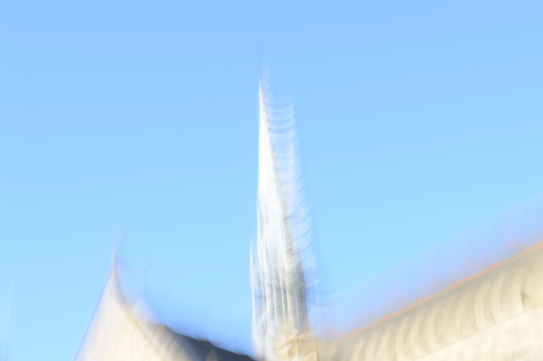
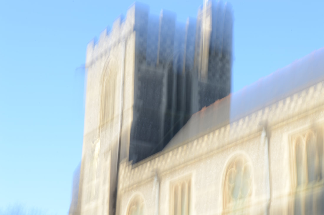
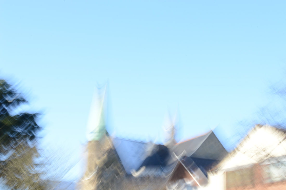
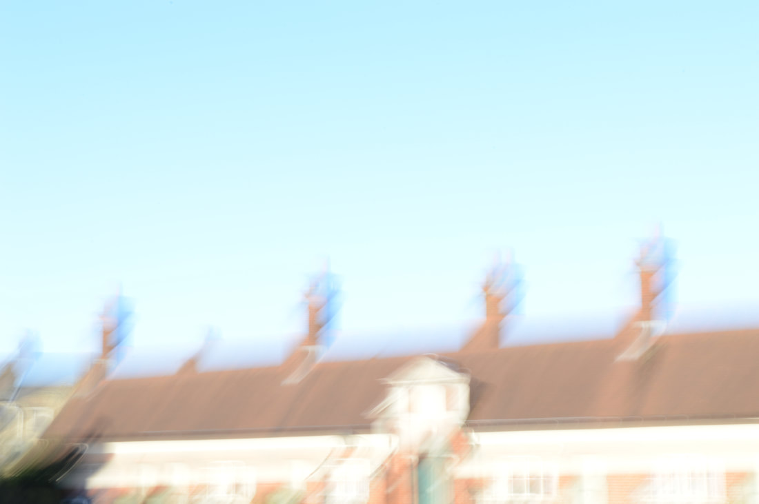
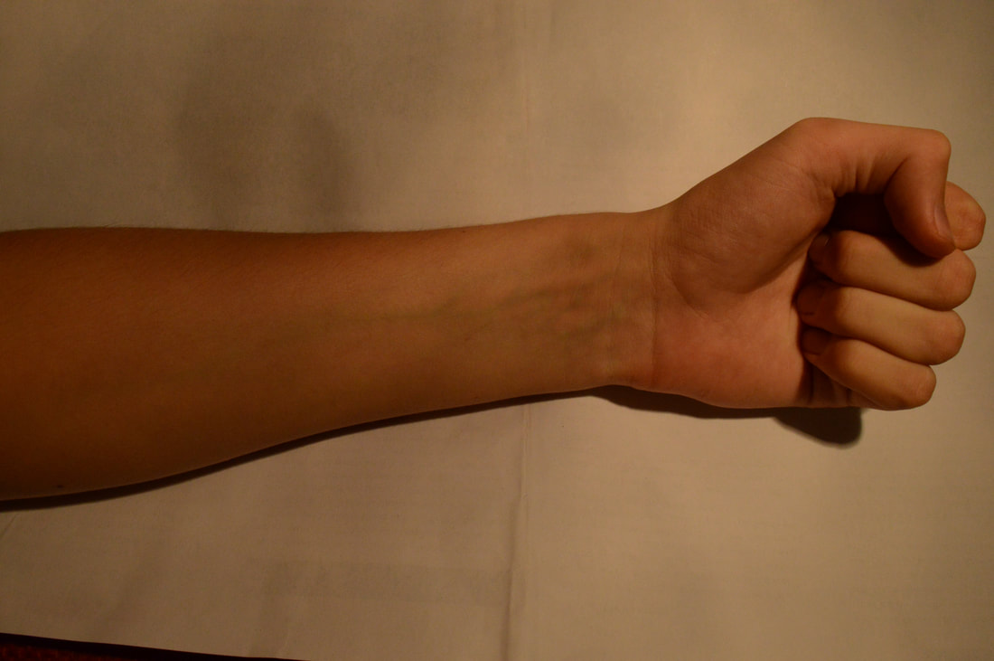
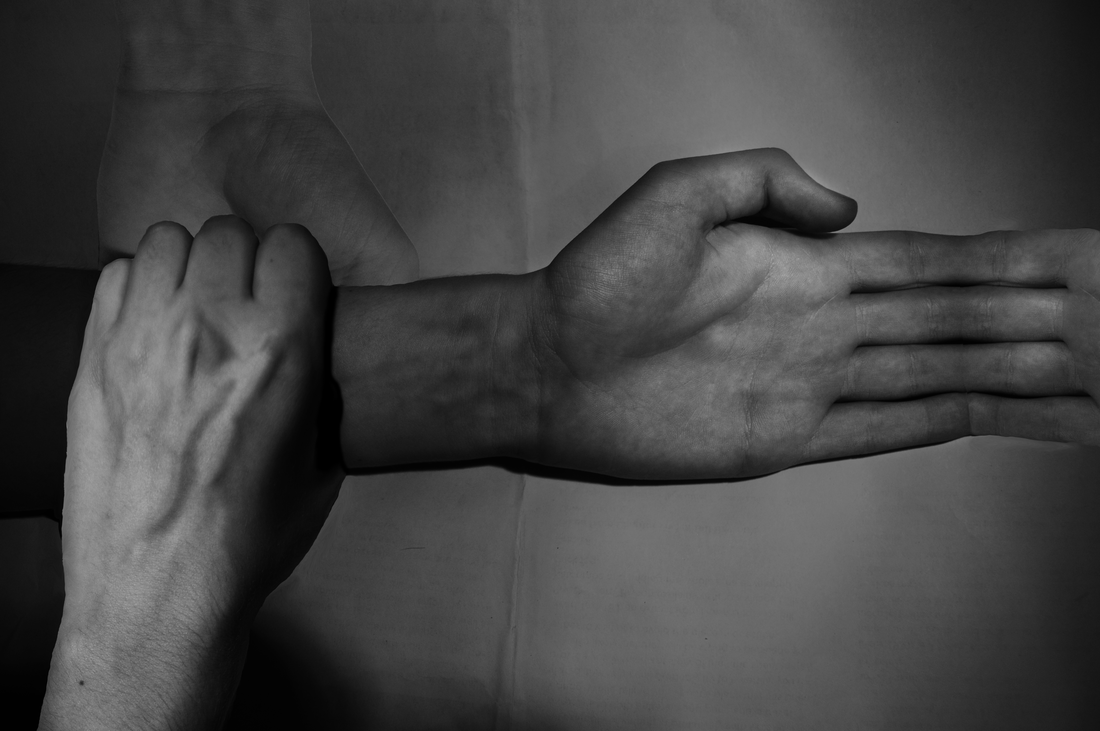
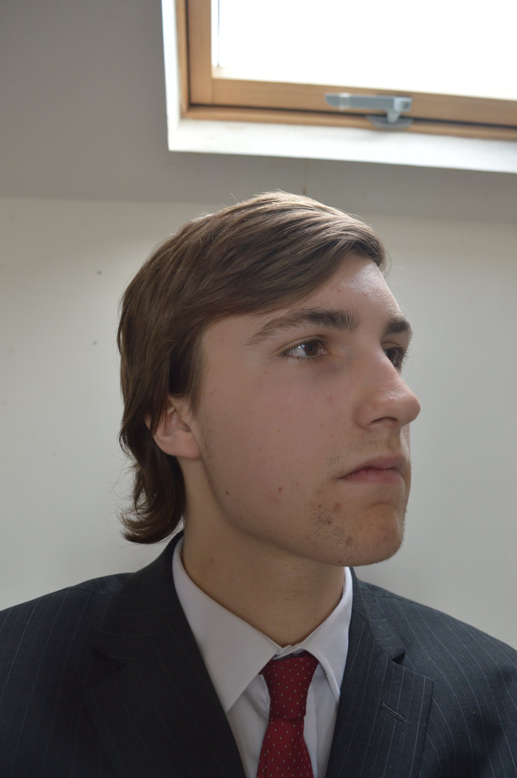
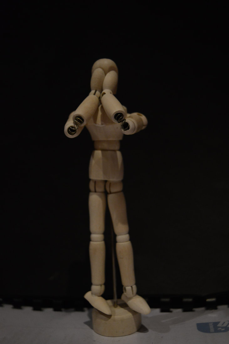
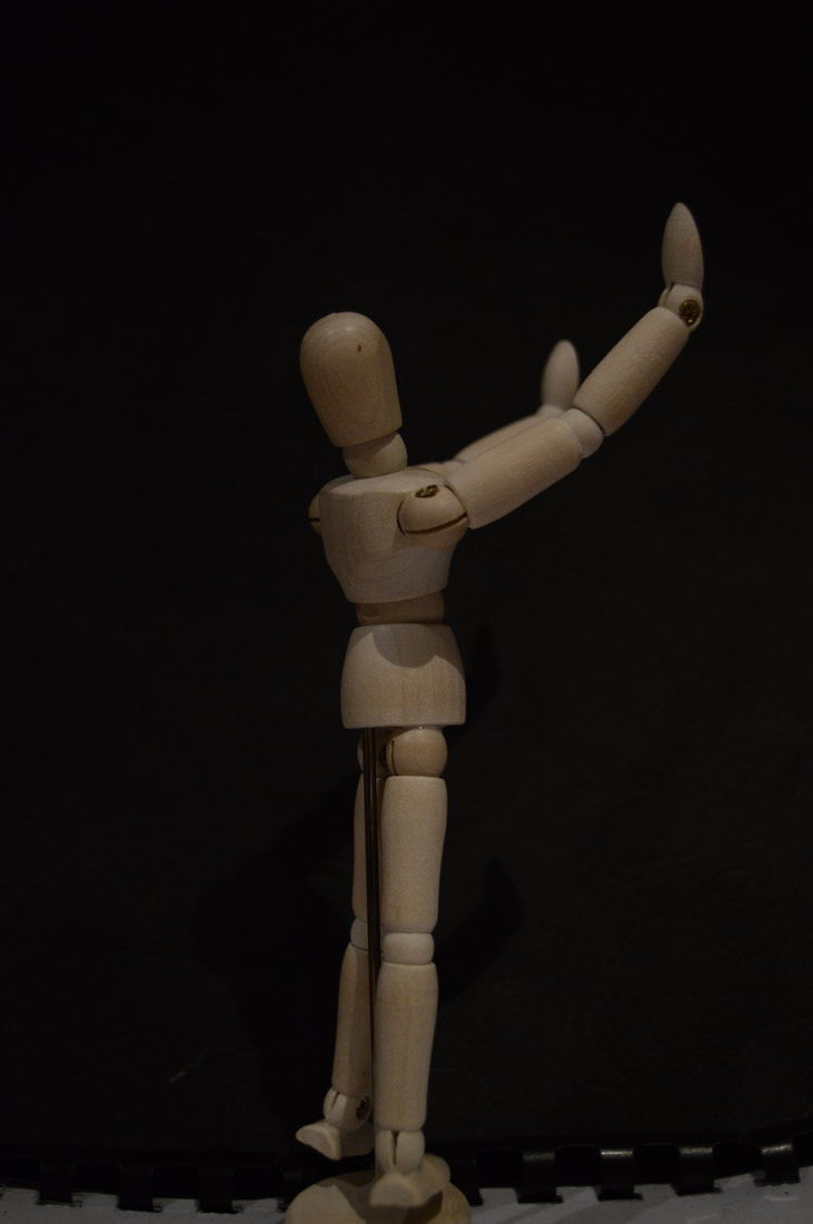
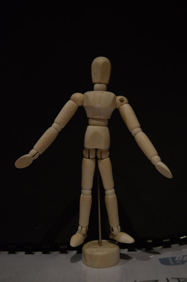
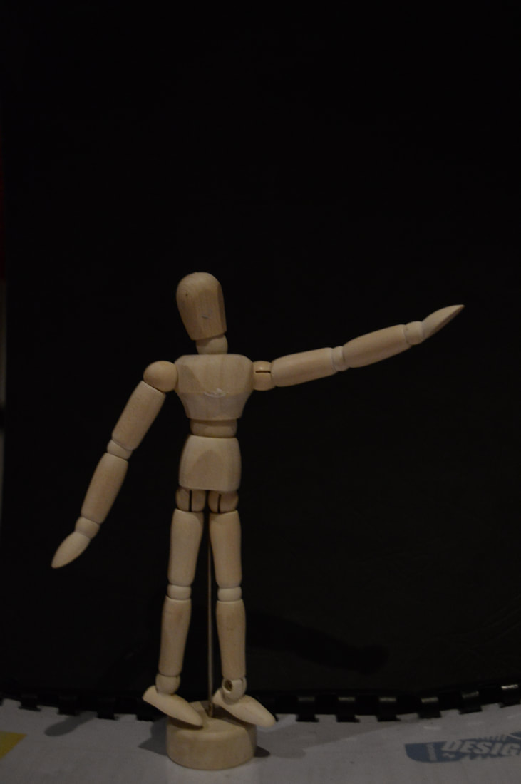
Shoot Analysis
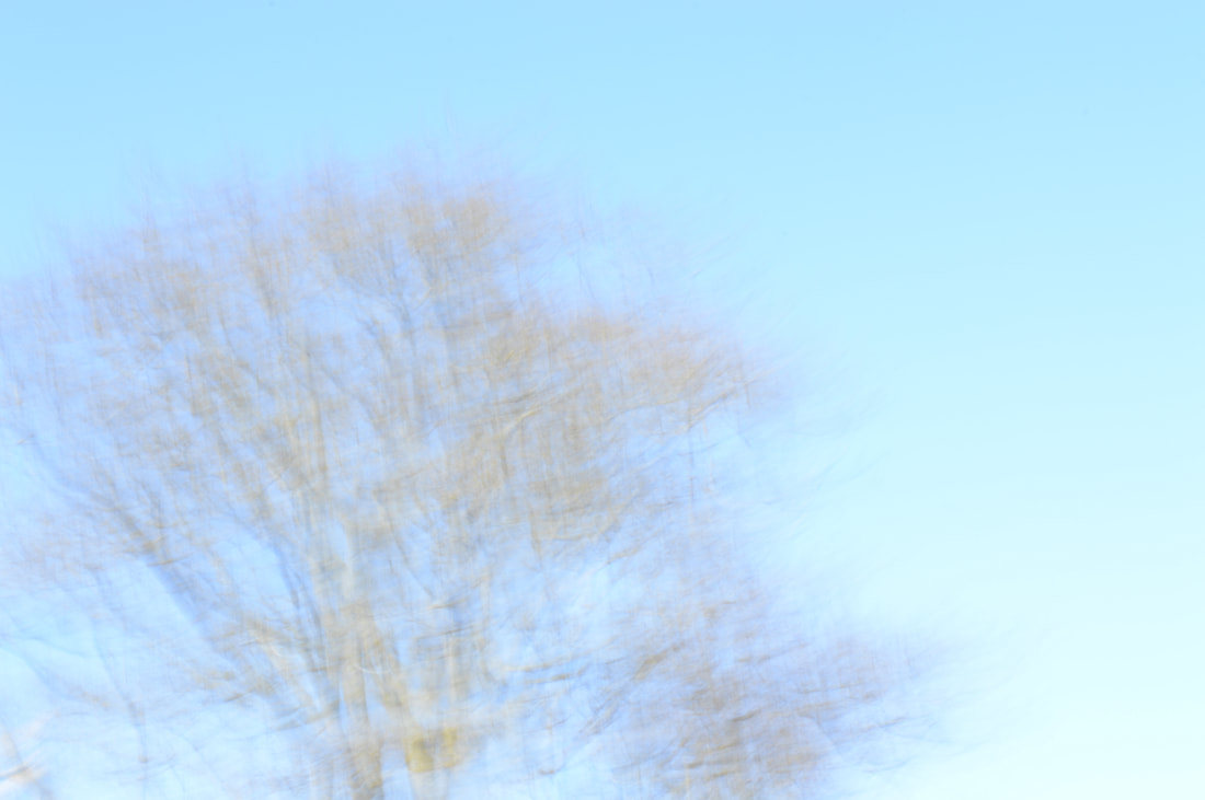
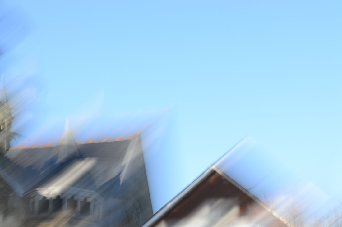
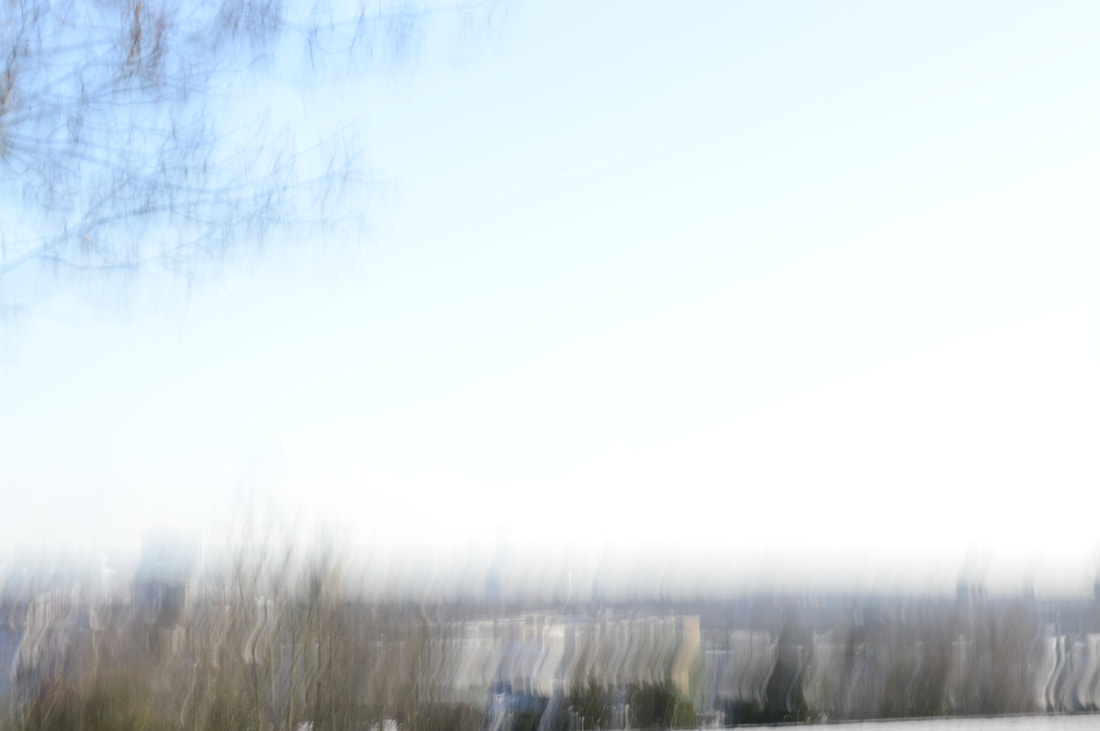
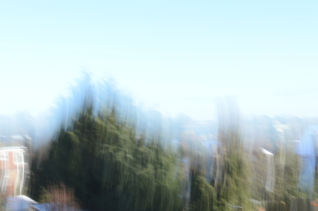
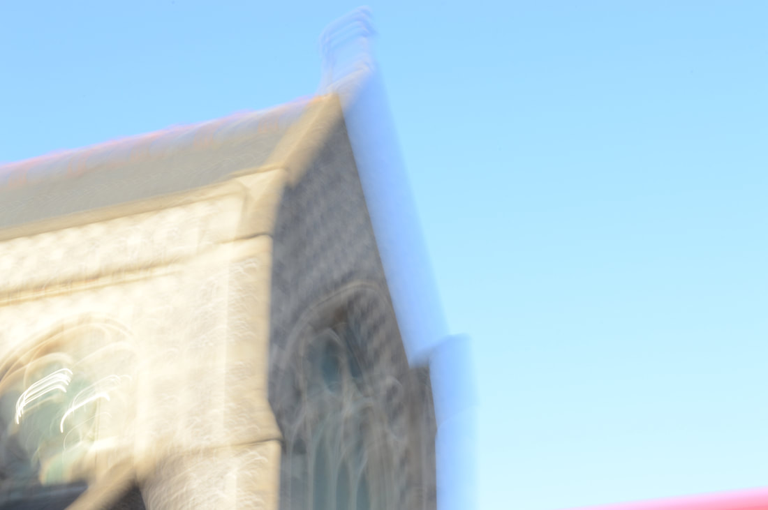
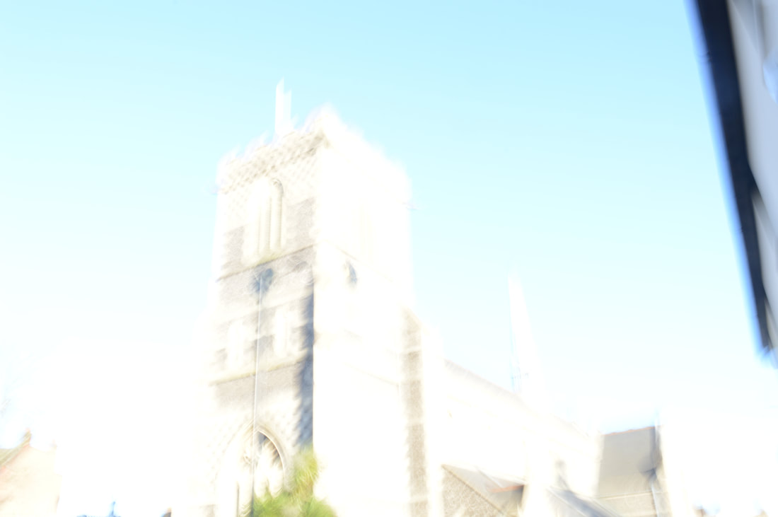
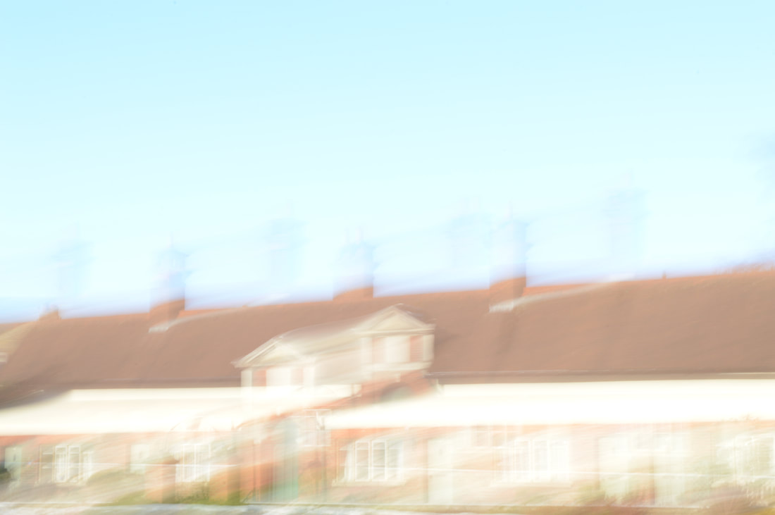
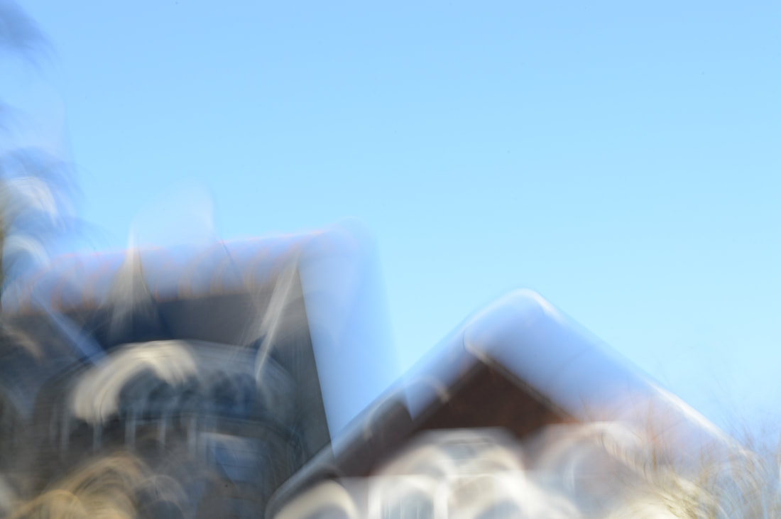
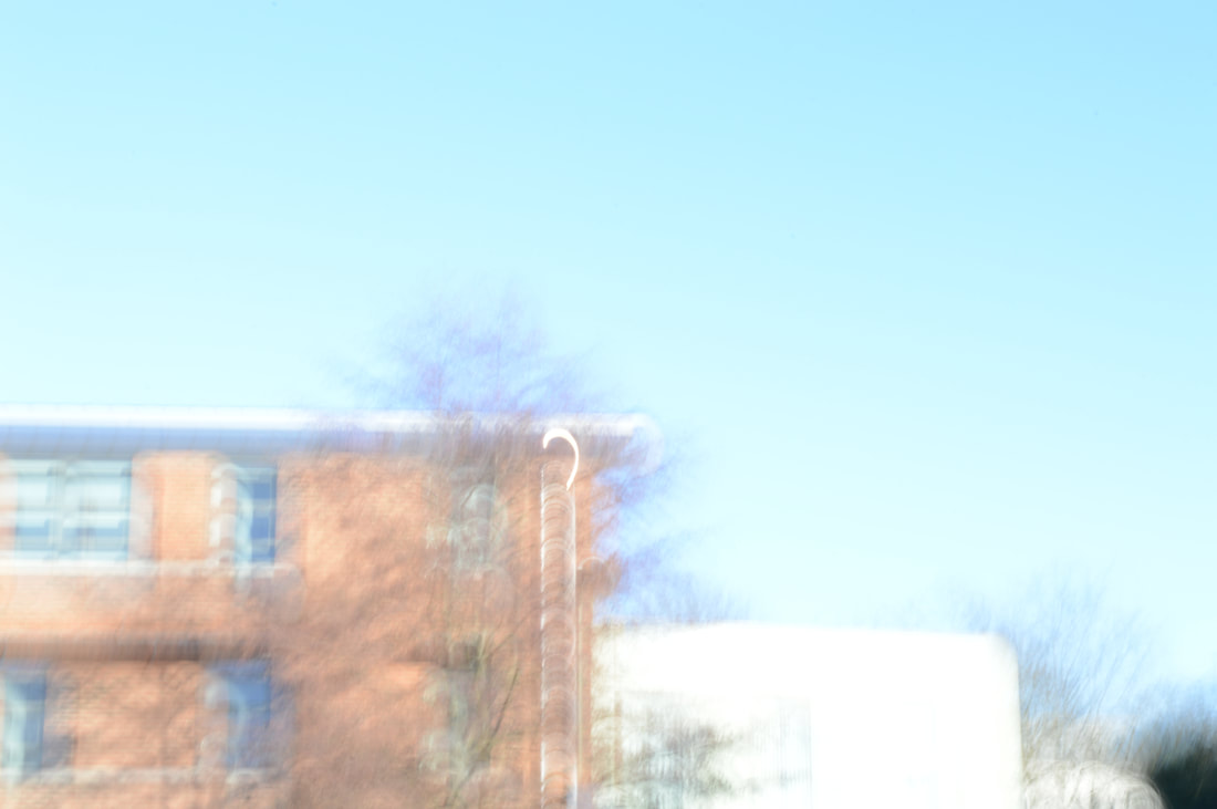
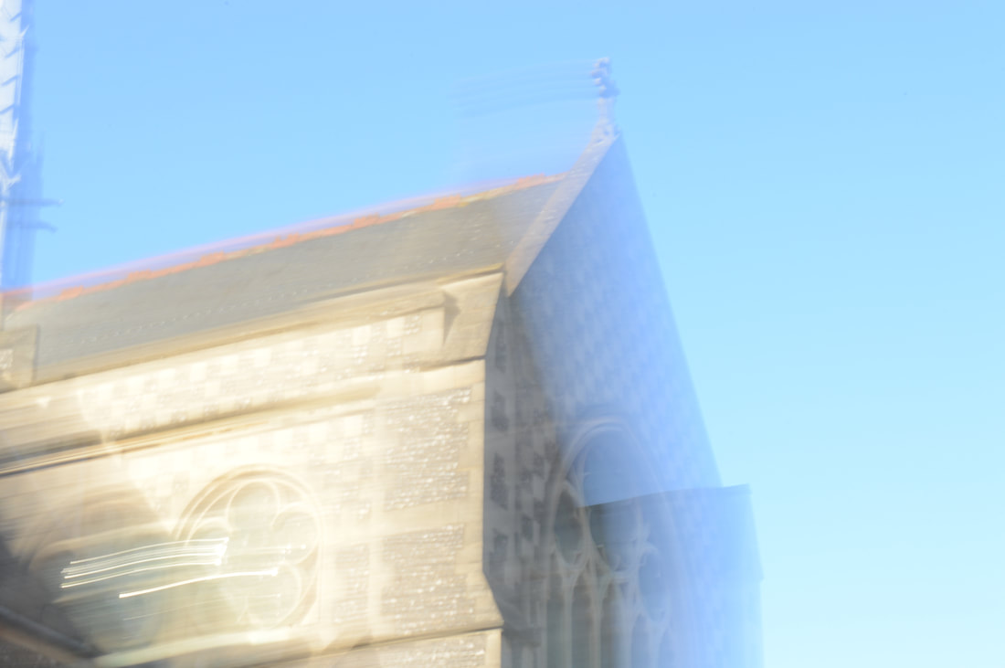
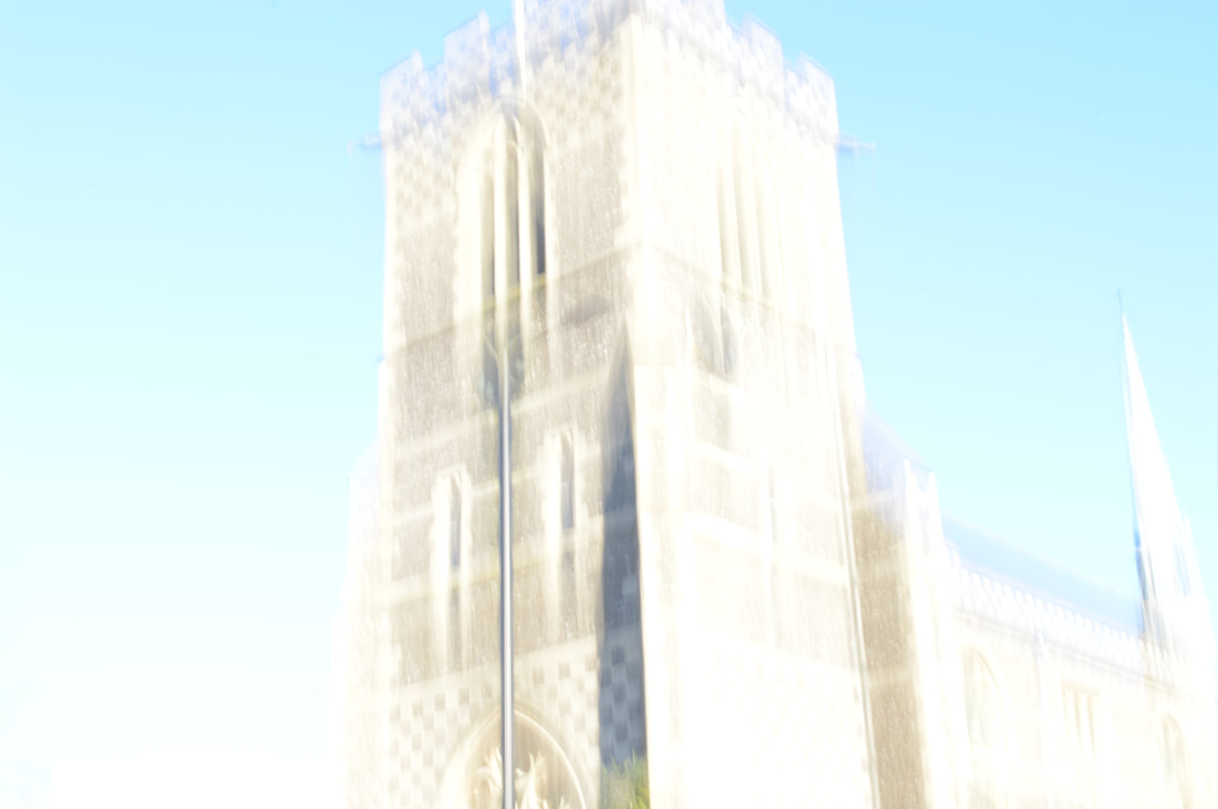
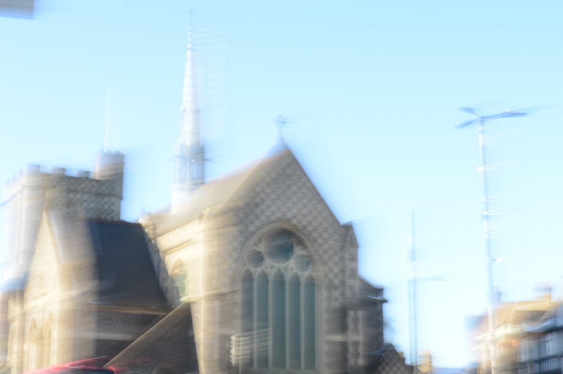
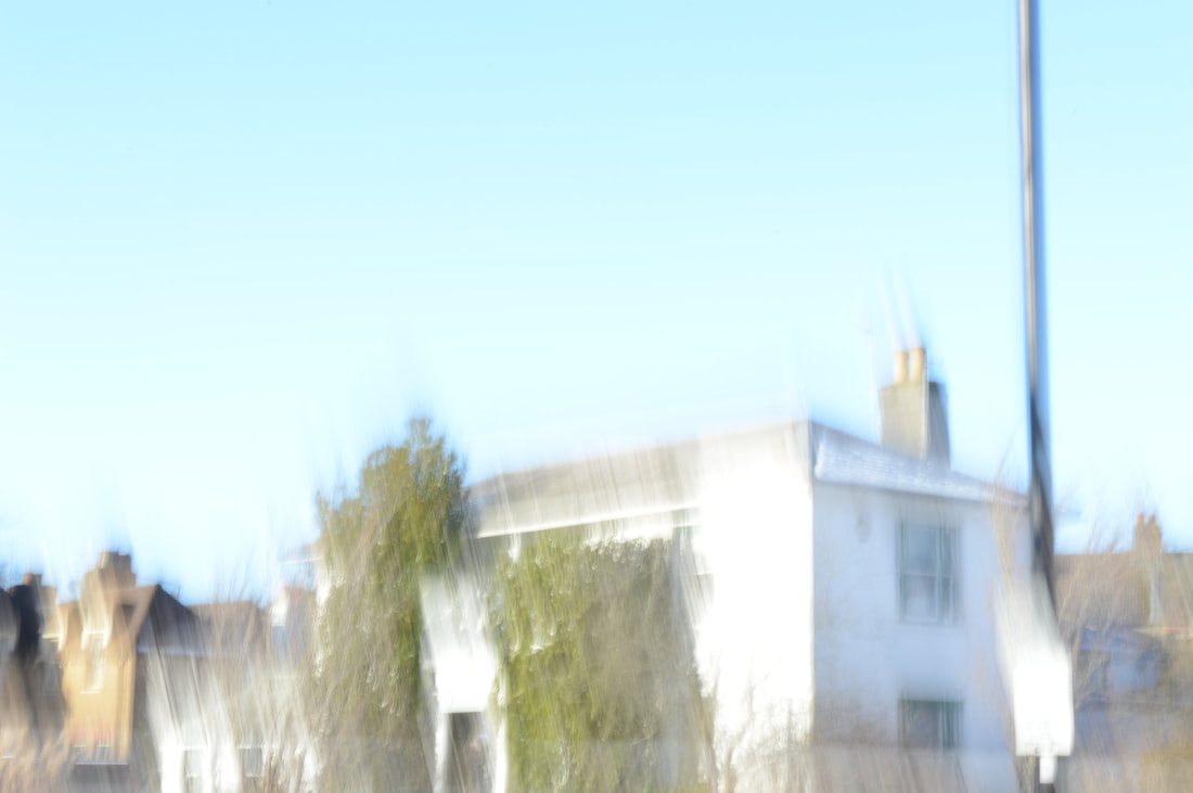
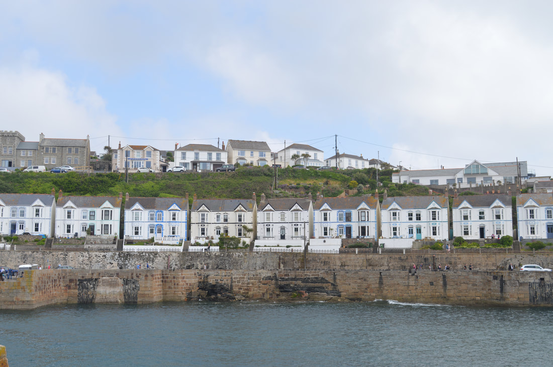
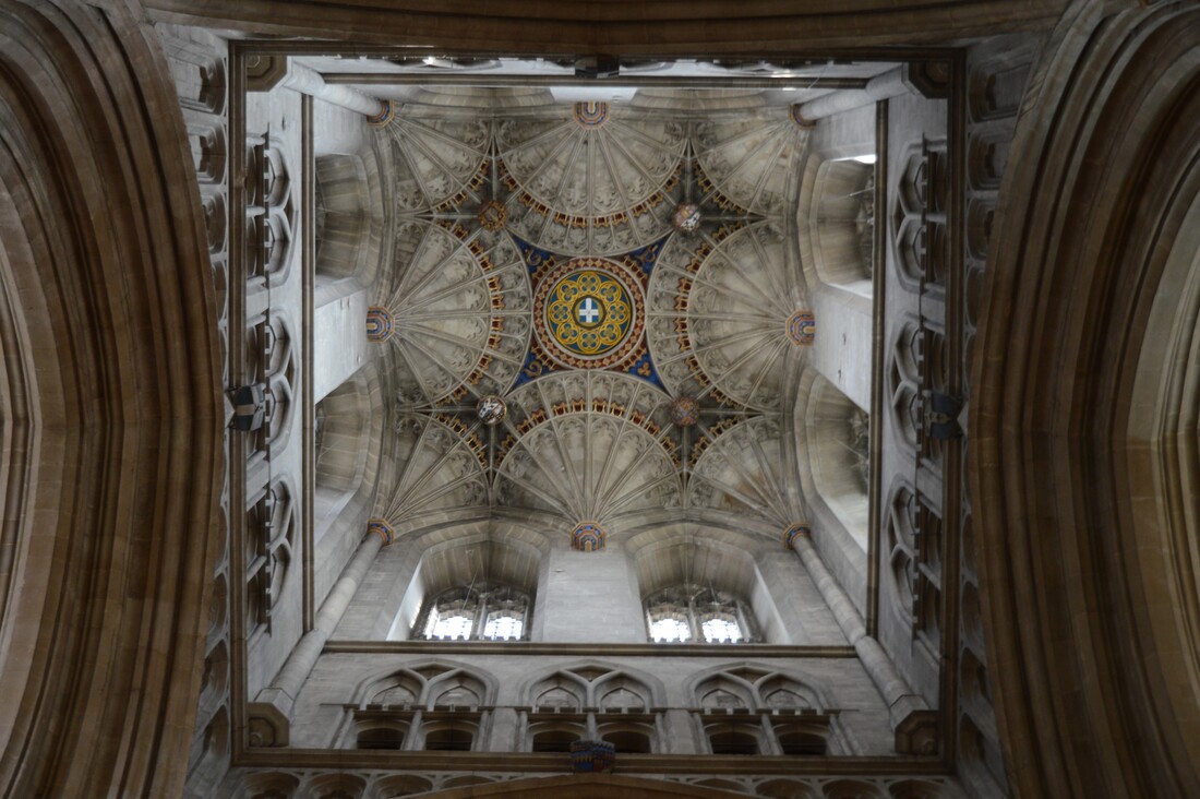
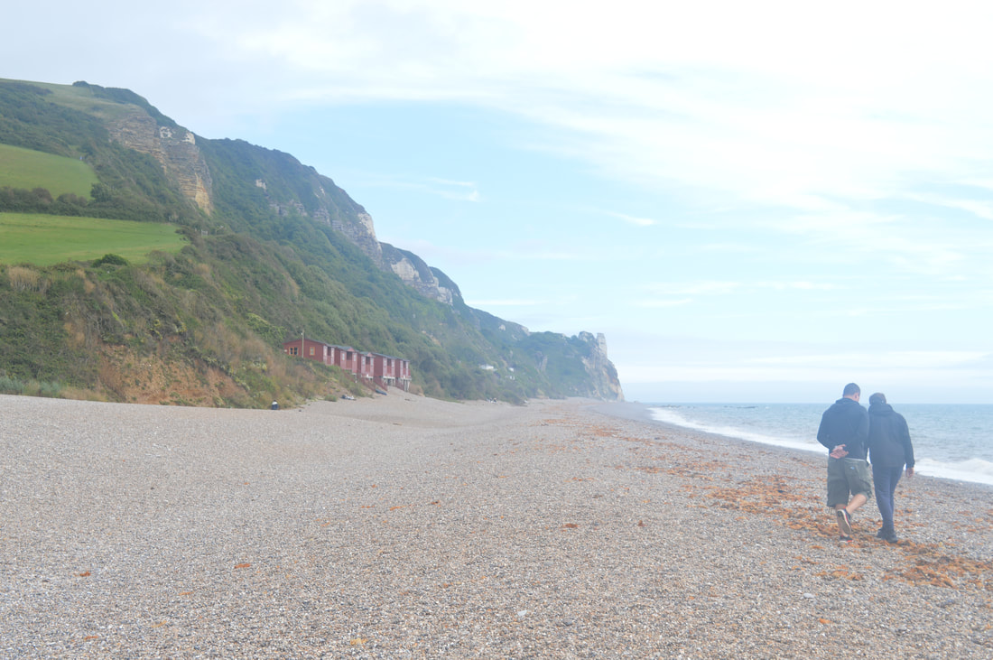
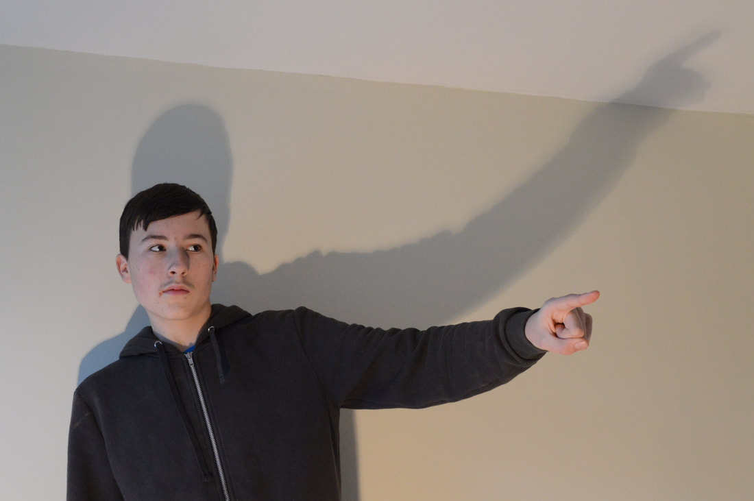
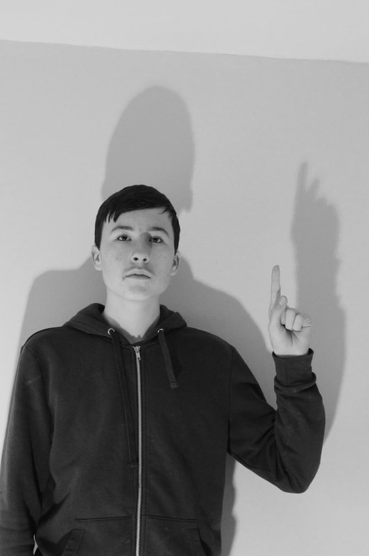
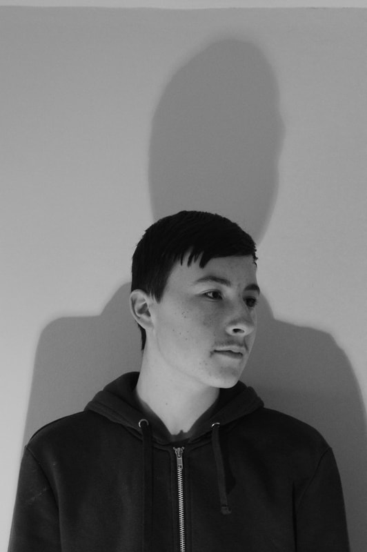
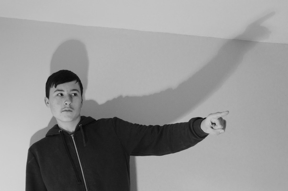
In this photoshoot I aimed to experiment with shutter speed and how it can distort the image in order to gain a desired effect. I set out to various part of High Barnet in order to capture images that relate to the artist's style and themes. Another of my intension with this shoot was to capture specific buildings that relate to Gray's chosen objects. Around High Barnet I found a host of Gothic churches that I used for the Christian elements of the artists work. Many blocky square buildings such as a clinic can be found, these provided an excellent canvas to experiment using shutter speed on as the effects of my movements in patterns was clearly visible. I finally used an image from my holiday in Cornwall as I wanted to replicate a landscape as these are heavily featured in the artists work. As well as this I took a shoot of foliage to see what something with less identifiable information like a bushy tree would look like. My shoot was done replicating the techniques of Andrew Gray, who is known for his blurred layered images heavily inspired by the legendary painter JMW Turner. I have used the shutter speed to multiply the objects within the image as well as experimented with duplicating an image and layering to get a similar effect. I adjusted the shutter speed to be slow and then began moving the camera in various patterns an directions. The effect of this was that the objects in the image would multiply and blur in the same way found in Gray's work. This shoot broadened my knowledge on how to correctly use shutter speed to my advantage to create distortion. I believe this shoot was highly successful as not only have I correctly employed the use of a key photographic technique but I have formed my own version of my chosen artists work.
Photoshoot
|
|
|

|
|
Edits in style of artist
|
|
Edit response
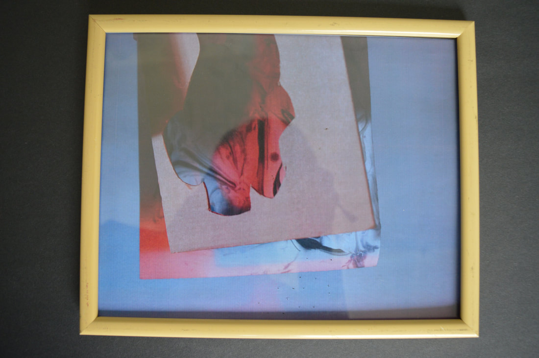
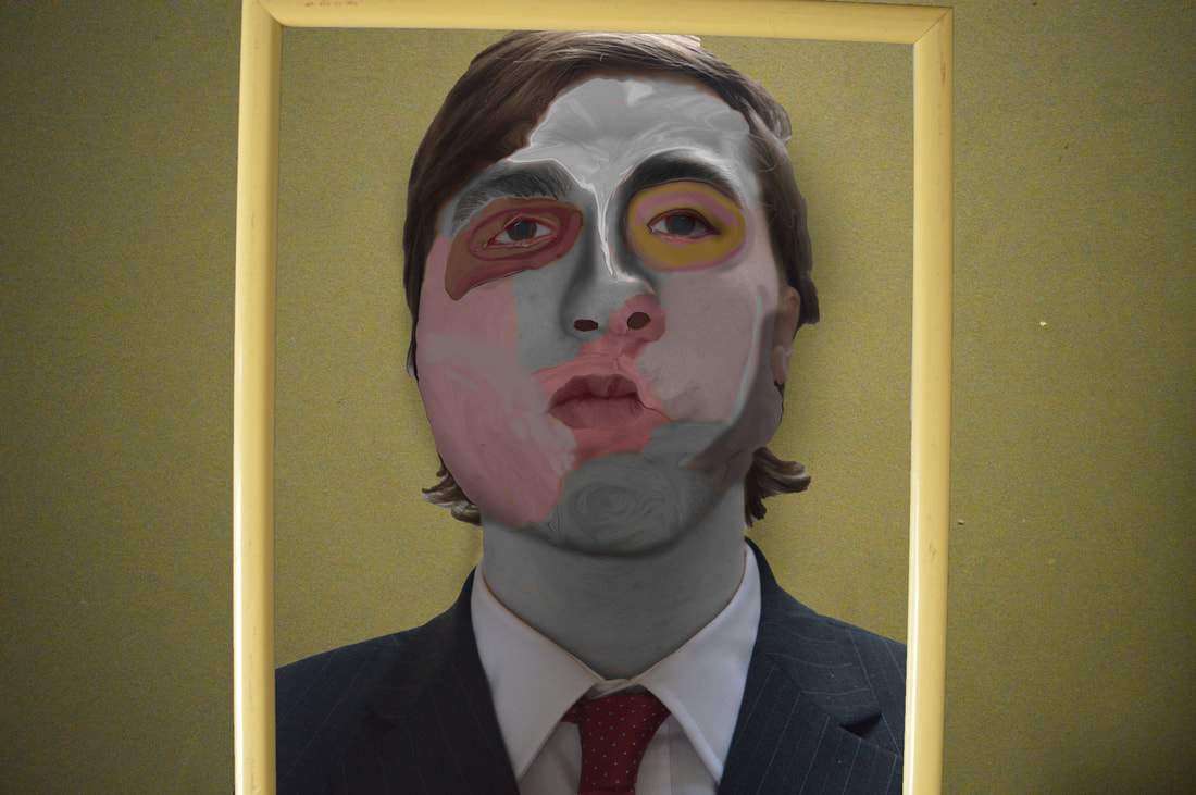
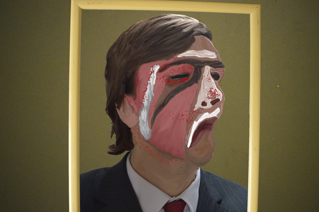
My response to my edits is that I have successfully been able to replicate the style of Andrew S Grays photography style by using a duplication of images as well as colours such as yellow and orange commonly found in Grays work. My edit really creates the effects of confusion just like Gray and Turners work via the use of blurred duplicated and merged images/colour. Abstraction is clearly present in my work since the image is indistinct. To improve I think I need to add a bigger range of colour to create more contrast between objects within my image such as the mine, in Grays work he uses many colours to darken corners, highlight buildings and obscure photo details. Gray layers on many different subtle effects that are barely noticeable but add up to create the entire Photograph, to improve and be able to further emulate Grays style i would have to find a way to create the minor details like scratches, cloudy effects and faded objects. All these effects give Grays work a vintage appearance like they once were painting on a canvas that have lost colour and detail over time.
I have selected MC Escher as my chosen artist to further aid in my exploration of the theme abstraction. I have used MC Escher to further explore the theme of abstraction because he uses techniques such as tessellations, optical illusions and chaotic scenes. He uses these themes to link to abstraction since his artwork is chaotic and confusing which is abstract in nature, his pictures are unsettling since you cant pinpoint what way the picture is orientated and there is no clear theme present its completely submerged in the theme of surrealism.
Artist Analysis: M.C Escher
"We adore chaos because we love to produce order"
Maurits Cornelis Escher (1898-1972) was a Dutch artist and one of the most world famous graphic artists. He made mathematically inspired woodcuts, lithographs, and mezzotints that often included optical and conceptual effect. His work follows the themes of surrealism, op art, expressionism, realism, cubism, northern renaissance and modern art.
Maurits Cornelis Escher (1898-1972) was a Dutch artist and one of the most world famous graphic artists. He made mathematically inspired woodcuts, lithographs, and mezzotints that often included optical and conceptual effect. His work follows the themes of surrealism, op art, expressionism, realism, cubism, northern renaissance and modern art.

|

|
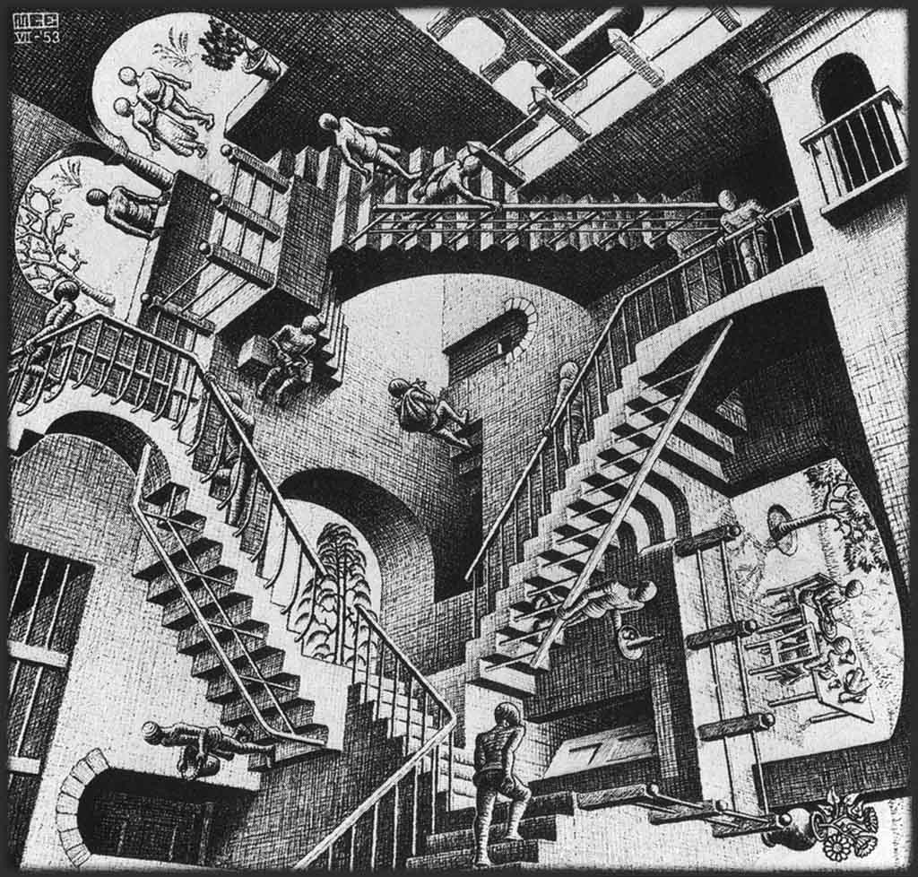
In an analysis of MC Eschers artwork containing the staircase with the people(image 4) I discovered how his variety of techniques and themes come together to form one of his famous artworks. The theme of surrealism and optical illusion has been significantly portrayed in this image due to its design having small pieces of scenes cobbled together into one seamless picture that at first glance looks fairly simple just 3 staircases in a triangular formation, this is when you discover the further detail of the surreal piece. The she staircases have people traveling up the top of them and down the lower side, this is how MC Escher creates chaos and abstraction within his artwork. Confusion is the word i would use to describe the stairwell artwork because as you look further into the details and peoples orientation within the image you discover more chaotic and surreal themes like the two people going down the same step but one is on the upper plank and the other is on the lower(found bottom left).
|

|
|
Colour has been used in his work via the medium of black and white, I believe this has been done to further add to the effect of surrealism and to add colour would be to add more elements to create an image from. The use of black and white helps to add a 2D effect despite within the image being 3D. The black and white colour makes the viewer look to shading and subtle elements like details in order to grasp the full effect of the optical illusions and tessellations within MC Escher's images. Line is a key theme in my selected artists work. Line has been used to help emphasize the 3D optical illusions via the use of hard edges that make identifiable shapes such as triangles and squares. Line helps to create order within the work by making recognisable shapes within the chaotic nature of the optical illusions whilst at the same time it creates chaos and abstraction since it is confusing due to the multiple directions the lines run in. Pattern is a key theme in MC Eschers artwork and can be found in all of his work due to his use of tessellations and shapes. Tessellations are a key part of the theme of patterns and are a big part of my chosen artists work since he uses them to create illusions like in the fields turning into birds image, abstraction can be found in his use of tessellations and shapes because they create order via the use of chaos just like how in-between the birds is a blurred merging the two images of the fields and birds together. Rhythm is a theme present in MC Eschers artwork which enables his pictures to flow just like a musical piece. What can be found in most of his work is ups and downs created from staircases normally in the shape of a triangle or square, this creates a rhythm since staircases have an imaginary beat that changes depending on whether they are ascending or descending.
Photoshoot
|
|
Edits in style of artist
|
|
Edit Response
Template-
What is the main focal point drawing your attention?
What types of shapes can be spotted in the image?
What selection of colours and textures are in the photograph?
Why would a certain mood be created?
Why has the colour saturation been enhanced / black and white with high contrast?
Why has the attention been drawn to one object / person?
Why has the specific location been chosen?
How has the exposure time been controlled?
How has the image been manipulated?
How have the formal elements been used?
How is the artificial or natural light used effectively?
How has this developed your idea and investigation – has anything changed / enhanced / clarified / contradicted / highlighted?
The main focal point is the tessellations found within the images. These are a key feature of Esher's artwork an
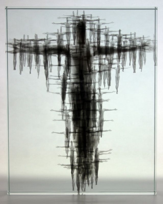
Artist Analysis: Michal Macku
"I am always seeking new means of expression"
Michal Macku is a czech artist born 17 april 1963, he started working in the field of photography from the age of 15. He later would graduate from the technological faculty of the polytechnic institute in Brno 1985 then went on to graduate from the institute of art photography in Prague 1989. He taught for a little while at Olomouc university and then went on to become a freelance artist. Michal macku is best known for his creation of his own photography technique know as Gellage which reflects on the overall theme of expressionism present within his work. He is continuously improving his technique and has even gone on to work with Czech television to produce an animated film set in the style of his Gellage technique.
Michal Macku is a czech artist born 17 april 1963, he started working in the field of photography from the age of 15. He later would graduate from the technological faculty of the polytechnic institute in Brno 1985 then went on to graduate from the institute of art photography in Prague 1989. He taught for a little while at Olomouc university and then went on to become a freelance artist. Michal macku is best known for his creation of his own photography technique know as Gellage which reflects on the overall theme of expressionism present within his work. He is continuously improving his technique and has even gone on to work with Czech television to produce an animated film set in the style of his Gellage technique.


|

|
|
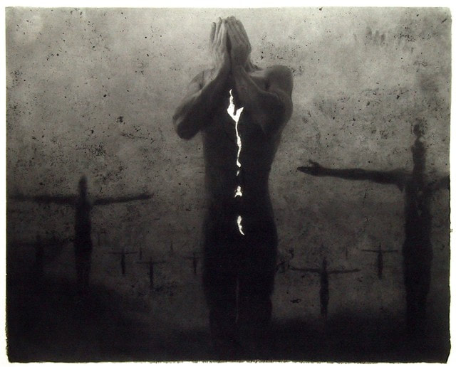
The theme of portraiture can be found within Michal Machu's work since it aids his personal technique know as gellage in which he has a portrait that looks like its tearing itself apart unveiling a bright white background. He has used the theme of portraiture because it excellently allows Machu to combine themes he wishes to express. Themes such as the human form, shadows, identity and religion are all expressed in the use of portraiture and his unique technique gellage.
The theme of religion is also present in his work which has been portrayed by the recreation of the crucifixion in my chosen artists work. The effects of the theme of religion on the viewer is that it helps his work to become a modern example of a classic event such as the crucifixion. Machus work mainly uses naked bodies which ties in to the theme of Christianity specifically since Jesus was stripped of his clothes before a crowd. Religion also is a key theme due to the nature of the expressionism portrayed adding powerful emotion to his works.
Emotion is a major theme my chosen artists work due to most of his work involving expressions of himself. The portraits with disfigured and distorted features create the enthesis on the powerful emotions linked to identity and the destruction of it via tearing, shadows and distorted features. The effect of emotion in his work is that we feel the close link between identity and expressionism, this gives the artworks a powerful aura imprinting the emotions portrayed onto the viewer.

|
|
|
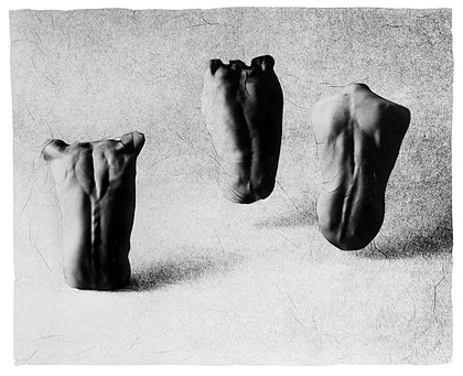
The recurring theme of shadows appears in his work due to the use of black and white, lighting and carbon prints which all play a part in manipulating the way shadows are perceived by spectators of his artworks. Shadow is used by Machu to obscure many different parts of the human form which tend to be most of the major parts of the human form like the face. Using shadows to obscure features is the artist way of making us focus on specific point of interest for example in the top centre image he has hidden the neck and eyes filling in the gaps with dark shadows creating a stark contrast against his light skin tone. This has been done so he chest and mouth act as the centre piece of the image, he is expressing emotion by screaming from his lungs to his mouth which is the reason for them remaining un-obscured. Another way in which he uses shadow and lighting is to highlight very specific details of the human form such as veins and muscles. The effect of this is that form is explored and highlighted to the viewers eye since well placed lighting casts the shadows into the spaces in-between the highlighted areas allowing expressionism to be further explored via the use of different details found on the human body.
In my shoot for Michal Macku I wanted to replicate the many styles of his work including his own personal style gellage. I took images to represent form which is the key theme of my chosen artists work. I selected objects that display the theme of form and creation such as insects incapsulated within glass. These objects portray creation and form in an elevated way that glorifies and elevates the objects in the same way Macku highlights these themes using faith.
Photoshoot

|


|
Edits in style of artist

|
|

|
Edits Response
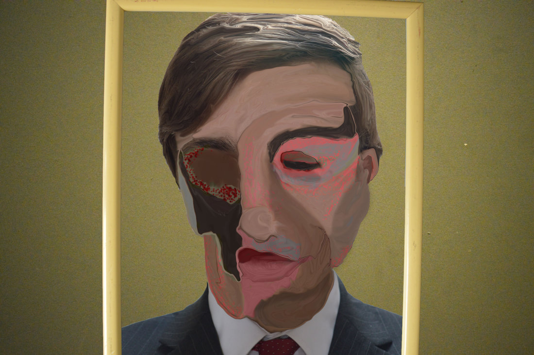
In my work in the style of Michal Macku I aimed to create an image for every unique technique he employs. This include his personal gellage technique, his work using the material glass and finally his carbon print work. In my image using a glass encapsulated beetle, I took advantage of the use of colour by adapting the image to feature cool blues. This has been done to complement the dark coloured beetle as well as the glass. The emotional effect of this is the viewer feels a calm and focused presence of mind as if they were watching a still lake. This effect is also extended onto the subject matter of the photo as the cool blues represent the beetle being frozen preserved in time. In my second image I have attempted to replicate the technique of gellage. I have used form to explore how iconography can be displayed through its manipulation. The artist uses symbolism in his work to reflect the theme of faith via the medium of expressionism. I have used black and white tone to emphasize the detailed form and highlight aspects like veins and crevasses. This technique is used by the artist to display the theme of creation linking to faith. Exploring tone has allowed the artist to show details like the individual muscle glorifying the human form. In my third edit I have used repetition to create iconography.
Artist analysis: Francis Bacon
Francis Bacon was a British painter born in 1909 who created unsettling imagery. Focusing on the human form, his themes included crucifixions, portraits of popes and portraits with abstract figures occasionally isolated in geometrical structures. He lived an interesting life with many struggles such as being very poor as well as gay in less accepting times, his life experience paved the way for the unique artwork he would later create. I have selected Francis Bacon since he works within the realm of portrait and abstraction as well as distortion. In his artworks he has portraits of people some of which are popes although they appear heavily distorted and in Francis’ unique style. In this style he takes the portrait which mostly contains muted colour and adds highlights of rich reds, blues, yellows and other bright colours. He then applies distortion in the form of chaotic lines dragging the colour down the canvas blurring and exaggerating features.

|

|

|
Distortion is a present theme in Francis Bacons work due his unique style within the realm of abstraction. Distortion is created via the use of a rather muted palette which has had vibrant colours selectively placed on elements such as the popes chair and garments in order for Francis Bacon to add further distortion by removing lesser needed details such as the legs making the image more abstract in nature. The faces are also distorted by an array of methods these include only having half of the face illustrated, having exaggerated facial expressions, having blank muted colours on the face and finally having chaotic lines run down the picture to distort the person face and image. The effect of this is that it triggers a strong emotional response. This is due to the colours used in Francis Bacons work that mainly being pink and red. These colours give off representations of hate, violence and gore. We interpret his work as having strong links to emotion through the visual representations of emotion. Emotion is found in the facial expressions of his artworks which displays various feelings of confusion, pain, suffering and identity. This style of presenting emotion is directly linked to the artists lifestyle being born gay which meant he was unaccepted by his family and society leading to his unique grotesque portraits distorting his appearance, a reflection on how he felt himself and how he imagined others viewed him. An interesting artistic choice present in my chosen artists work is the use of selective distortion, when objects are present such as clothing they are not distorted and retain form compared to the people portrayed in the images. The people are heavily distorted suggesting that the people in the artworks have negative aspects or view themselves as grotesque to others. Bacon has used a technique know as impasto painting which involves using thicker paints to create an artwork that has texture, layers and can be blended right on the canvas making it excellent for blending as found in Bacons grotesque works. Francis Bacon uses this technique since it helps to exaggerate the grotesque appearances of his artwork due to the faces being made of thick blended paint which makes the colour and detail very simplistic whilst also distorting the facial features which is what Bacon intended to do since that was the way in which he viewed himself.

|

|
People are a key theme in my artists work since he mainly treads within the realm of portraiture, he has also included famous people such as popes which help to amplify his unique style since they are important religious figures. Francis has included himself in his artworks making some interesting self portraits that involve distorting his face via the use of dragging the paint as well as sticking to a pink/red colour palette.
Narrative is a theme present and is uniquely represented in Bacons work because of his style and chosen objects to include in is images. Narrative can be found in his picture, this is displayed by the unique objects which are framed to display the narrative. For example the first image with the cow and the man in the suit portrays a narrative within the picture despite the abstract elements. These elements also have a further deeper meaning to them, the man in the black suit represents British politicians attire of the time whilst the meat of the cow was influenced by Bacons obssession with butchers shops.The effect of this is we consider the reasons as well as the history behind these objects, the pope image helps us to imagine this artwork like it was this a famous event involving the pope or is it linked to the theme of religion, are the objects personal to the artist or have taken a role in his life narrative.
Francis Bacon uses a technique called triptych which involves having 3 images in a book like structure, these often involve having a frame and background which helps to amplify the artwork by using contrasting and complementary colours. Triptych images are visualy stimulating since they often will portray 3 starkly different scenes or 3 similar scenes, the images help to complement each other wether they are complimentary or contrasting. Francis Bacon uses triptych in his artwork to complement each work of art since all 3 images are similar since he uses a red and pink colour palette to link the images. The effect on the viewer being it allows you to draw comparison between each artwork as well as similarities in all artworks despite them being 3 separate pieces of art.
Photoshoot
|
|
|
|
|
Edits in style of artist
|
|
|

Example of the steps underwent in photoshop to create the edits
-used liquify tool in order to create the distorted parts of the face, elongate features and blend features together.
-used paint brush to various colours in order to add highlights further details and so I can use the liquify tool to drag the colours similar to how Bacon has strokes of colour across his artworks.
-used brightness tool in order to correct lighting making sure it matched Bacons style of bright well lit portraits.
-used colour replacement tool to add shadows onto the face to create dark patches as seen in Bacons work
-I have chosen to selectively distort and highlight areas to create the best effect. I left the hair relatively untouched applying only a bit of highlighting and distortion since the face is the main feature of the artwork similarly to how bacon only focuses on the face and leaves clothing and hair.
-colours I have used include brown, redish pinks, bright reds, tan, greys and whites in order to make the pieces as disgusting as possible. The colours I chose to work with imitate the complexion of an unhealthy grotesque person with a corpse like nature. This has helped me create the element of disgust just like how the inspiration for Bacons work is how society views him as grotesque.
-I have made the background a textured green in order to do two main things, firstly reinforce the idea of discust by having green which represents sickness and decay as well as the texture which makes it more griping to the eye. secondly I chose it to contrast but also complement the main portraits since the fleshy tones and reds contrast the green background however still links in to the theme of grotesque.
-Framing, I have selected a beige frame that I feel complements the green background as well as the fleshy tones of the portrait. The frames have all been distorted and canted to better match the portraits for example the facial expression looking down is very vertical meaning I wanted the frame to reflect the piece by boxing the person in and cropping the main image representing Bacons feelings of shame. where as other images like the side on position have been given much more room in the frame allowing for the slightly more bolder expression despite the portrait being heavily grotesque. This image represents the little pride Bacon had growing up as an artist. The portrait looking straight foward is design to bring all attention to the face so I have cropped the hair helping the viewer to focus on the enlarged face staring at them in acceptance of their grotesque apperance.
-3 layers in diptych portrait of face, frame and background green wall
-3 edits make up diptych, 1 standalone edit
Edit Response
The focal point of my edits is the distortion to the portraits as this greatly effects the perception of the image. The reason this is the main focal point is that it distorts the human form making it indistinct and intriguing. In this case the image has been selectively edited in order to replicate what Francis Bacon portrayed in his artwork, this being how he as an individual was disgusting and wrong. Shapes can be found in my edits in the form of circular patterns that have been used to break up the image of the face. Colour has been carefully edited in order to amplify the effect of the swirling shapes distorting and breaking up the face. This also forms a texture that imitates the thick impasto paint that Bacon used to give his paintings texture. Colour has been intensified to capture a similar highlighting effect Bacon uses to emphasize the grotesque appearance of his portraits. A key element to these edits was the selective use of distortion, this is displayed by the normality of the hair and clothing which are not particularly defining features of a person and therefore untouched.
Artist Analysis: Wassily Kandinsky
"Colour is a means of exerting direct influence on the soul."
Wassily Kandinsky was a Russian painter and art theorist born in 1866 and died in 1944. He went to the Odessa Art school as well as Moscow university. He would later be considered a pioneer in abstract art due to the theory he created of the way music visually looks as an abstract art piece. Wassily Kandinsky had a unique condition known as synesthesia, this meant his senses worked in a way in which he could visualize things such music as colour. Many people with this condition state that they can link colours to numbers and other themes. Kandinsky used this to his advantage so he could create art through his unique perception of colour linking to sound.
Wassily Kandinsky was a Russian painter and art theorist born in 1866 and died in 1944. He went to the Odessa Art school as well as Moscow university. He would later be considered a pioneer in abstract art due to the theory he created of the way music visually looks as an abstract art piece. Wassily Kandinsky had a unique condition known as synesthesia, this meant his senses worked in a way in which he could visualize things such music as colour. Many people with this condition state that they can link colours to numbers and other themes. Kandinsky used this to his advantage so he could create art through his unique perception of colour linking to sound.
|

|

|
Wassily Kandinksky was most famous for his use of colours which is clearly evident in all of his artworks. Colour plays a major theme since it is his method of expressing music as an artform. Colour has been used in order to add vibrancy to particular areas of the piece such as circles within circles and geometric patterns. This effect draws our eyes to the wide selection of coloured shapes each displaying its own personality and information which in its original form would have been music. Through speculation the assumption is that the colours present potentially represent various sound for example tone, pitch, tempo, crescendo and many other musical features. A difference in use of colour can be found within Kandinskys work for example in some of his works he has complex shades and transition from dark tones to light tones as seen in the centre top artwork. However in some of his other art pieces he has used simplistic colour that can be compared to styles like pop art. This causes the viewer to think about the way in which the artist is presenting an idea to the viewer, this idea is linked to both the idea of expression as well as music as a form of expressing ones soul. Kandinsky has created this link between colour and our souls and the use of simple tones and blended colour tones is a way in which he conveys this idea.

|

|
|
Rhythm is another theme that has been integrated into Wassily Kandinsky's art since he takes inspiration from music and the soul. Rhythm is found in music, Kandinsky has then converted musical rhythm and by extent the rhythm of our souls and converted it into a visual piece of artwork. Rhythm is evident in my artist work due to the use of colour and shapes which create a complex visual example of information such as rhythm found within music. This is portrayed by triangles that potentially represent a peak in pitch or by circles that may represent short low tones similar to a bass beat. One aspect of my chosen artist work is it is up for interpretation since it is an abstract piece, every shape and colour is linked to a rhythm that is interpreted personally and changes depending on the individual and the character of their soul.
Material are incredibly important to Kandinsky since they provided his artworks with texture. He painted on canvas, board, wood, plywood, glass, compressed board and canvas-board. This provided him with a wide array of materials to best aid his unique style. Kandinsky also employed the use of oil, watercolor, gouache and tempera to create his vivid, textured and complex artworks.
Material are incredibly important to Kandinsky since they provided his artworks with texture. He painted on canvas, board, wood, plywood, glass, compressed board and canvas-board. This provided him with a wide array of materials to best aid his unique style. Kandinsky also employed the use of oil, watercolor, gouache and tempera to create his vivid, textured and complex artworks.
Photoshoot
|

|

|
|
|
|
Edits in style of artist
Edit Analysis
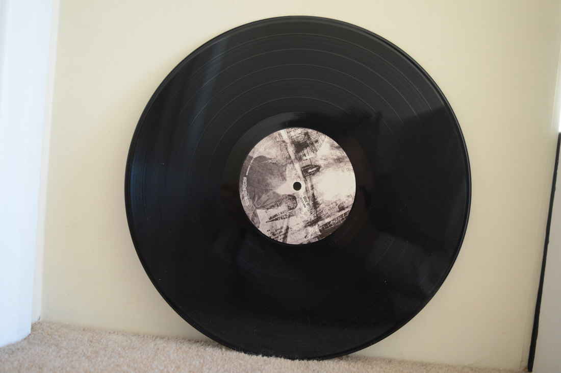
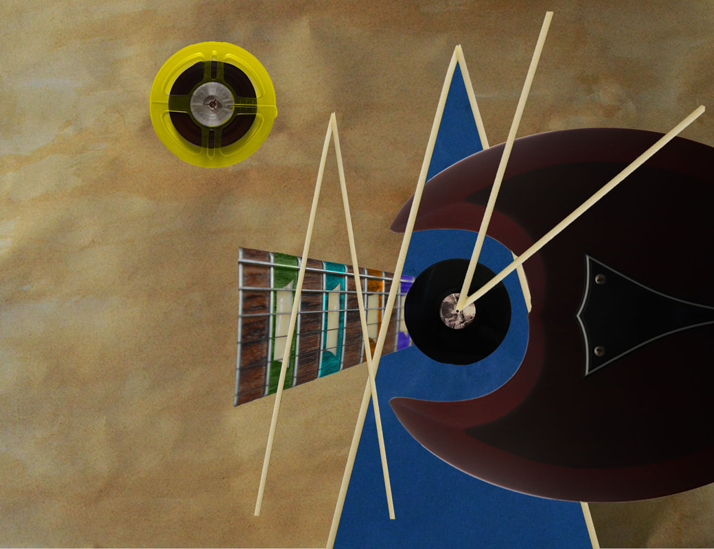
My edits have been inspired by Wassily Kandinsky and his unique technique using his mental illness synesthesia to create art from music. I have been successful in replicating his techniques and ideas as well as I can imagining how particular sounds translate into visceral imagery. I have used musical objects in my piece to draw the similarity between the art piece and the themes of music being linked to colour, shape and visual imagery. In the style of Kandinsky I listened to the band Nirvana to draw inspiration for my artwork. I created a focal point using a vinyl record as a focal point, the eye is immediately drawn to its circular form and composition as all the other shapes and objects revolve around this point. I have used colour to create the a bright and eye drawing piece. Shape has been used in order to represent different sound found within the music, these include triangles indicating the volume levels of guitars found in the tracks. The guitar neck represents the progression of the track, this has been done by having the neck originate from the record and extent towards the viewer.
Artsit Analysis: Hiëronymus Bosch
Hieronomous Bosch was a Dutch medieval/renaissance painter born in Hertogenbosch(an incredibly religious town) in 1450 to a family of artists, He was a representative of the Early Netherlandish painting school. He worked with oil on oak wood as well as the usual paints available at his time, his work contains many disturbing illustrations of religious concepts and narratives. His amazing macabre works are displayed arounds the world. His most famous work being a triptych named 'The garden of earthly delights'.
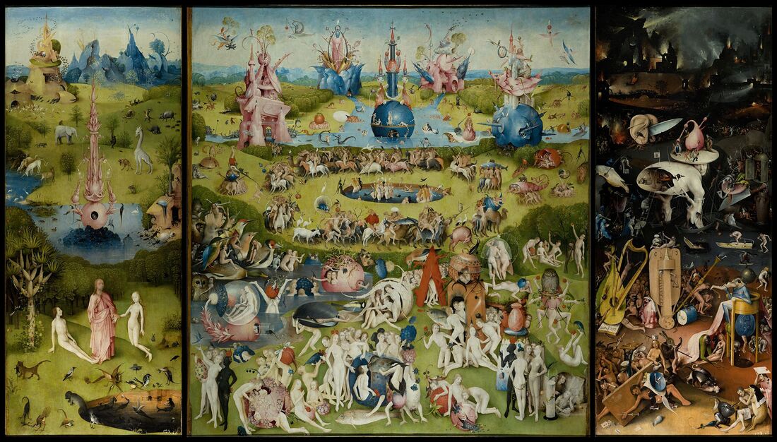
Bosch was a painter responsible for one of the greatest triptych ever created. The triptych is over 2m tall and just under 4m wide. When closed it is an art piece of its own portraying an image of a globe which symbolises the world during its creation(likely the 3rd day) as stated in the Bible, this also references the theme of the triptych once all 3 panels are opened. God is also present on the closed panel his hand raised indicating he is speaking. He recites the verse written which says "for he spoke and it was done, for he commanded and it stood fast". This links to a phrase spoken after that saying "the lord looketh from heaven and sees all mankind" referring to how as you open the tripdych you see Gods perspective. Each panel represents Christian ideas of the Garden of Eden and the earth and hell. These 3 panels complement each other since Earth is central in-between Eden and hell, one could argue that the panels have been arranged so they are in order following the Christian idea of heaven and Eden as elevated above earth where as hell is considered to lower beneath the two others. Bosch has used the triptych to his advantage by using the technique grisaille to make the outer panels look dull and uninteresting only for a sudden explosion of colour to capture the eye as the triptych is opened. This can be interpreted as Earth being devoid of life since the world hadn't been fully created, it reflects on the darkness of space before the Earth was made into a beautiful paradise as portrayed in the centre panel.
Colour an important key theme of his style because it was used to distinguish the three panels and the conveyed themes within. The Garden of Eden is lush, rich and green complemented by the bright clear water. This mirrors the colours of Earth as the use of greenland and water expands. Humans contrast the colour of Earth as they are naked with pale white skin. Another contrast is the fantastic animals that stick out and grab our attention, this has been done by the artist to replicate the effects of Cyriac of Ancona's bestiary which would have shocked people apon viewing the illustration of creatures from a distant land. The vibrancy in the first two panels connotes life as both the Garden of Eden and Earth are perfect habitats for humans and animals. This is in stark contrast to hell where the colours reflect that of the desert which connotes death and lack of life. The use of dark blues to paint the frozen river continues the theme of stone cold death. Darkness engulfs the centre ground and background hiding the area that surrounds the evil creatures found in hell. Dark colours have been used so that when your eye reaches the background you see the clear contrast of the blazing hellfire from the dark manmade structures surrounding it suggesting humanity is evil and the predominant reason for them being in hell. Artists like Bosch did this to personify the idea of hell as a place of eternal suffering and damnation as no such thing is written in the Bible. Colour is used to highlight many of the weird and fantastical sculptures and items found in the painting for example all the man made objects in hell are visible via the use of colour, this technique continues in Earth as the many structures and items are pink, orange or dark blue. The colourful objects separate themselves from the surroundings and are numerous in hell signifying mans expansion away from the natural perfect state of Eden and towards a man made hell as portrayed by Bosch.

|

|

|
Composition makes up the piece in a variety of ways, the idea of composition within the chaotic nature of the artwork is confusing to first onlookers. A clear idea of a centre point is established by an egg to which all compositional lines match up too, the pool also acts as a centre point for the people and animals since they revolve around it. The horizon line is another key example of excellent composition as all three horizons of the triptych form a single uniform horizon line. Finally three distinct grounds can be observed in the form of a foreground, centreground and background that aligns in each panel.
Photoshoot

|
|
|
|
|
|
|

|
|
|
Edits in style of artist
|
|
Edit Analysis
The main focal point of the image is found within the circular composition of the images. The circular composition draws the viewers eye into the centre and central scene allowing for the key themes such as narrative, religion and colour to be observed. The circle is also the main shape found within the image as it forms the base in which the Garden of Eden and Hell sit upon. There is an equality to the perfectly circular form giving both heaven and hell equal importance. I have used colour in a way that plays to our preconceptions of what good and evil look like. Blue and green are used to symbolise the perfect nature of life in Eden before the original sin, while in hell dark dull colour symbolise the downfall of sinners and lack of life as hell is a place of damnation. People are the main objects in the edits, they are found in both however more people are found in hell signifying how humanity goes through many dark periods and how everyone is born with original sin. I have chosen a posable doll to present the human form as this creates a blank slate that can be inserted into any seen. These blank dolls represent humanity in its purest form free of individuality, human inventions or other similar concepts. This means the humans found in my piece could potentially occupy a place in either Eden or Hell as there is nothing to suggest they have sinned, for instance blood stained hands or a bag of stolen goods. The naked dolls also represent humanity as the choosers of good or evil, this is seen in Boschs work as hell consists of man made objects hinting that humans are the ones at fault not God.
Artist analysis: Michelangelo
"I saw the angel in the marble and carved until I set him free"
Michelangelo di Lodovico Buonarroti Simoni was an Italian painter, sculptor and architect born in the republic of Florence 1475. He would go on to be one of the greatest artists of the 16th century as well as the most flourily documented artist. He was part of the high Renaissance movement which was a short movement in which the greatest pieces of Italian art were created. He produced many religious pieces of the highest standing which led to him being granted the name Divino( the divine one). The church was responsible for his employment, they paid for his fine skills meaning his pieces were not an act of faith instead a commission.
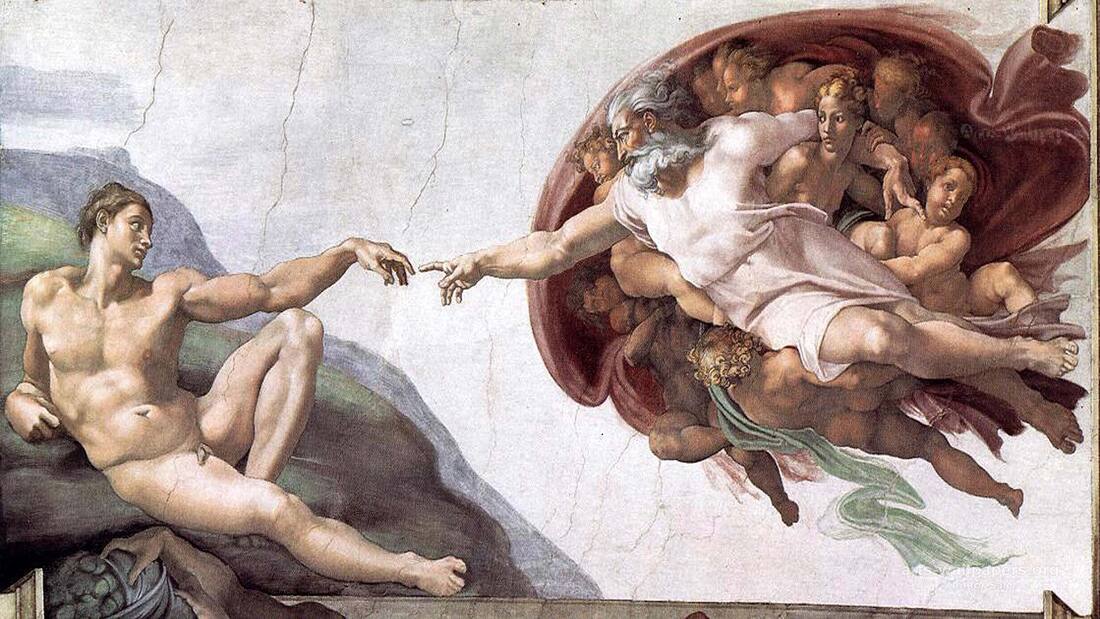
Narrative is an overall key theme of Michelangelo's work due to his choice in depicting biblical inspired scenes and people. This is evident in one of his most famous works 'the creation of Adam' in which we see the moment God breathes life into Adam. The image contains a rich narrative packed with details that make up the whole story. Adams hand hesitates to make contact with God foreshadowing the original sin. The physique of God and Adam are perfect, this alludes to the idea of 'imago dei' or made in the image of God. The cloth located behind God forms the shape of a human brain, this has been done to represent how intellect will be passed on to man so that man may reach his highest potential and bring all things his mind develops into creation. The quote "A man paints with his brains and not with his hands" best describes the artists abilities to portray narrative in an impressive way using detail to reference particular aspects of the bible.
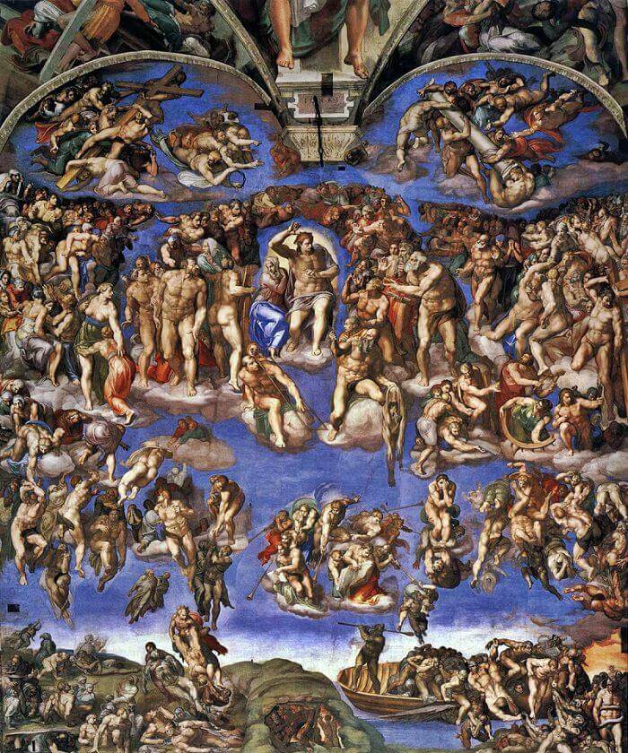
Abstraction is a theme present in the many works of Michelangelo. This includes his abstract thought process when approaching various stories and ideas from the bible. As written above(narrative) his ability to draw ideas that most would not consider such as the concept of God not only breathing life into Adam but also gifting him intellect. Further abstractions are made to Christianity in the form of Greek mythology. This has been conveyed in the painting 'the last judgement'. In this painting Michelangelo illustrates Charon the boatman who takes you from Earth to Hell. This is an abstract depiction of Christianity because People face the Judgement of God in purgatory before being put in Heaven or hell, there is no mythological element as seen in the Greek's idea of a boatman.
|

|
Colour has been applied in a specific way to provoke emotion and an idea of Heaven. The artist mainly uses light blues, beige and greens in his work to achieve this effect. The idea of Heaven as a bright place causes the viewers to feel a positive dream-like feeling as if they where floating in the sky. Dark and more violent colours like orange have been used in Hell to symbolise the medieval belief that Hell is a place of eternal damnation, suffering and shame. However, these colours only occupy a mere 5% of the entire piece meaning negative emotions are not drawn out unless the bottom right corner comes under scrutiny. Another use of colour is to portray the idea of shame or lack there of. This is best shown in 'the creation of Adam' in which Adam lies naked on the ground whilst God is draped in a white robe. The canvas is overwhelmingly occupied by the various beige tones that depict Adams form. This has been done in order to tell the viewer that he feels no shame at this current point in the biblical story. Similarly in 'the last judgement' many of the people and saints either appear partly clothed potentially alluding to the idea that they all inherently had original sin. A different metaphor for the lack of shame Adam originally felt is that every person is born naked just as Adam was at his creation and in the Garden of Eden.
The skill to depict form is something Michelangelo excels in. He is able to illustrate form in his paintings and sculptures. Size and by extension proportions have been applied to his works to explore the form of the human body. The human form is glorified via the size and proportions given to the people he depicts. Form has been used to elevate and glorify people in his paintings. Adam and the saints are given excessive muscular body's. This has been done in order to place them above the average man and to turn them into the idea of perfection. The greatest example of this is his most famous sculpture 'David'. This particular sculpture captivates all whose eyes gaze upon it, Its magnificent derives from Michelangelo's eye for form. The body sculpted portrays the perfect human form since all features such as limbs are proportioned to please the eye. David's body has been given just enough muscle in order to make his form eye-catching and look above average, this is so the viewer can admire his relatively standard but perfect form. The sculpture has intentionally not been given excessive amount of muscle as this would convey the idea that David was above everyone instead of the average person he is in the bible who rises to importance through his actions. Overall form has been used to please the eye and inspire.
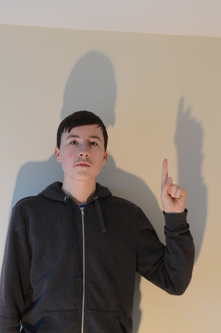
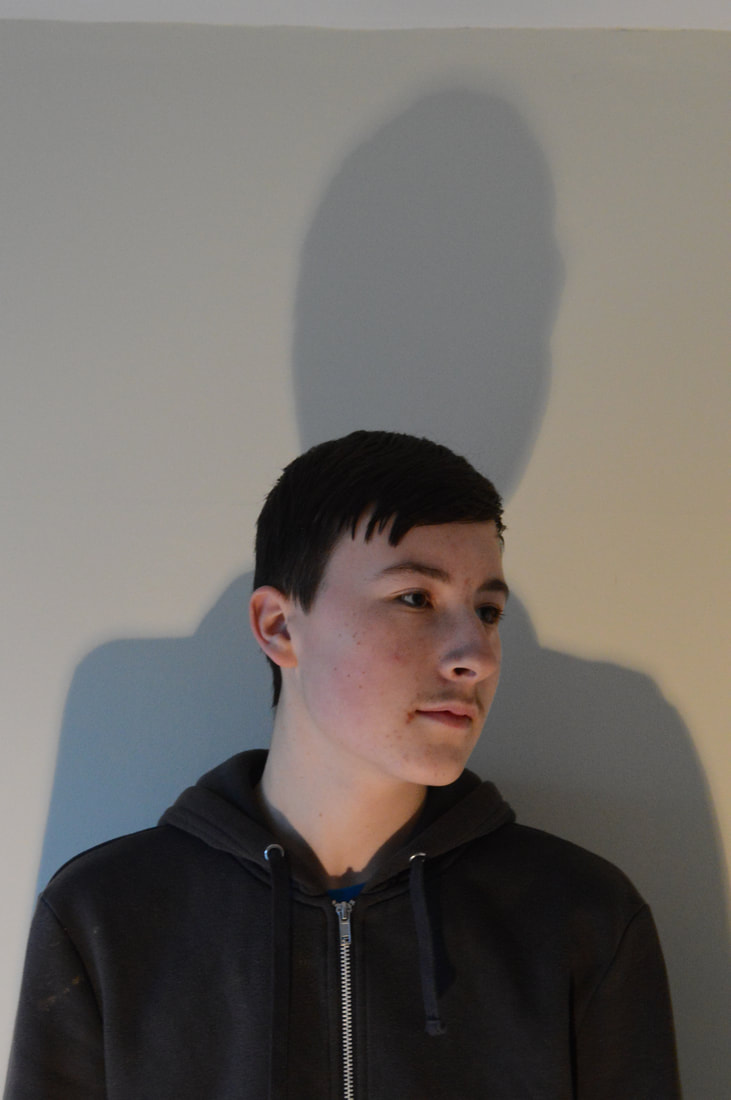
In this photoshoot I wanted to work on my portraiture and depiction of the human form as seen being used by great artists like Michelangelo. I created a photoshoot using a model and a white background. I chose this which background as it provides me with a perfect canvas to replicate theme from Michelangelo's work, for instance his amazing portrayal of form and more specifically the human form. took inspiration from amazing works of art like the last judgement in which many themes such as form, portraiture and emotion rain supreme. In the photoshoot I aimed to imitate these themes in my photoshoot depicting form via the use of shadow, lighting, portraiture, emotion and pose. Pose is a key theme I would like to display in my work by taking inspiration from a number of historic poses found within great works of art by the likes of Michelangelo's David or his paintings. I also wanted to show the theme of sculpture in my work. I achieved this by including a shadow with the outline of the pose, however the shadow provides an amplified version of the image sparking emotions like the sense of superiority.
Photoshoot
|
|
|
Edits in style of artist
|
|
|
Edit Response
A focal point is created in the image on the face as the image narrative revolves around the emotion of the facial expression. The eyes are also used to point in a certain direction adding to the narrative as seen in the image involving the pointing motion. In this edit I have decided to use black and white to imitate that of a white marble statue. The absence of colour allows the viewer to appreciate form and detail. This is important as like a statue, the observer must use their mind to determine the beauty of what the sculptor is portraying. Colour often play too much of a role in pre determining our opinion on themes such as emotion, as colour such as red immediately will trigger feeling of anger, passion or violence. The lack of colour in my edits is freeing and allows for the more key themes like the shadow to be appreciated. The shadow itself acts as if it were a statue or shadow of a statue with a spotlight on it. The shadow adds a powerful effect to the image as it provides repetition and form an amplified version of the pose shown in the image. The emotional effect of this is a sense of authority and greater power is displayed. The pose has been chosen to hark back to that of great influential poses found within historic statues and paintings. The location I have selected aids the depiction of form as the blank white background draws an outline of the person as well as casts a shadow in their image.
Final Piece: Ideology and Its Portrayal
Begin with the story of Cain and Abel, In this story Cain slays his brother. Its one of the first storys found within the genesis chapter of the bible which means reader of the bible are immediately exposed to the fact that murder is an inherent part of the human condition. I would like to link this to periods of conflict such as the third Reich and Nazi Germany in which a distinct lack of Christianity and ignorant to the capacity for suffering displayed despite the 1940 being considered a modern time.
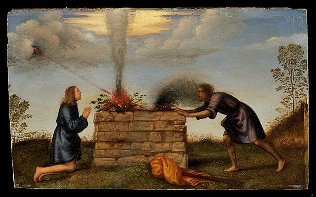
Mariotto Albertinelli
Mariotto Albertinelli was an artist of the high renaissance movement, born in 1474 in Florence. He became partnered with a few other artists to form a workshop. He is known for his painting featuring religious depictions such as Cain and Abel or Mary.

The way the artist has used colour is subtle but impactful on a symbolic scale. The garments Cain and Abel are wearing are similar in tone as they are dark. However subtle hints to the biblical story can be observed in the form of Abel's garments being a blue as opposed to Cain's black robe. This metaphorical use of colour foreshadows the events in the story as black is a colour often used to create a semantic field of death, evil or mystery. Another use of colour can be observed via the medium of bright orange fire. Observing the image we see a link between God and fire. A beam of orange light can be seen breaking through the clouds on Abel's side, this beam is God favoring Abel leading to his success. On the other hand we have Cain whos fire contains little orange and consists of mainly dark black smoke. This use of fire draws parallels to the story of Prometheus and how he stole fire from the Gods. This story indicates that fire is something God given and unique in the way it is used by man. Albertinelli has used fire in his painting to symbolise success as in the biblical story the brothers achievements are in farming.
Religion is the artists main theme and all of their works feature religious figures or narratives. The Bible is a clear influence on the artist as a great deal of their artworks depict biblical narratives. The depiction of the biblical scenes in his paintings are closely replicated with very little abstract elements, for instance the greatest abstract element in the Garden of Eden is that 3 scenes of the narrative have been portrayed on a single canvas as opposed to the more traditional and favoured method of religious art being the triptych.
The lighting used is natural and replicates that of a bright summers day. All scenes in Albertinelli's paintings are well lit including the figures found within. The effect of the lighting is it creates a neutral or positive emotion in the viewer. this is key as the image is glorifying religious scenes/figures. The artist doesn't wish to dramatise the scene via lighting in a manner that would take away from the narrative.
|
|
People are heavily featured in the artist paintings as in his work he focuses on the way he can portray the people in the bible as opposed to other artists who put story or symbolism first like Hieronymus Bosch. From his work we can infer that the key elements in the bible are derived from humans. We see a representation of when Eve is created from Adams rib, this is in the form of Eve literally emerging from his rib as a woman. Albertinelli has portrayed this scene in this way to add enthesis to the fact that people play the most important role in the Christian creation story. Cultural influence can be observed in the artist work in the depictions of various elements. The location of his paintings can be likened to that of European landscape painters, for example Fra Bartolomeo. Were Hieronymus Bosch imagined his own landscapes and features within his great paintings, Albertinelli has inserted 16th century contemporary European landscapes. The effect of this is his work conveys the idea that Europe is the perfect location as even in his painting of the Garden of Eden we see this use of European landscapes. It also makes the image relate to the population it would be viewed by, this being Europeans.
Narrative is a key theme found within Mariotto Albertinellis work due to the subject matter of his work mainly being biblical scenes. In his painting of the Garden of Eden we can see this display of narrative in the form of the genesis story of Adam and Eves creation. Adam is being helped off the ground by God which is a reference to how Adam was created from the dust of the earth. We see God raising his hand indicating that he is speaking, this has been done to show how many Christians believe that the symbolic nature of this part of the story is that God gifts unto man knowledge and conscience. In his work he portrays the narrative of genesis all on a single canvas. Adams creation, Eves creation and the temptation of them both are all depicted as part of a single consecutive narrative, as western people read right to left and in the artists work he has displayed his narrative in this order. Some narrative changes have been made by the artist to represent pieces of the story. Cain and Abels success was in farming, however to give a better visual representation the artist has changed this to fire. The effect of this creative change is that the story becomes more understandable to all Christians and non-Christians alike. Abels fire is burning bright aided by the light of God whilst Cains is being smothered in smoke. Other biblical narrative features have been illustrated in the form of smaller references. The image titled Madonna and child (Mary and Jesus) contains a small stone carving below the feet of the central figure. The has been placed centrally in order to reference the downfall of man or in biblical terms when Adam and Eve ate from the tree of knowledge. This is a form of foreshadowing the events of the bible as Jesus s the one who will free humanity of the original sin.
Composition has been employed by the artist in a way that always elevated the most important figure in the painting. For example in the Garden of Eden image we see that God appear in 2 stages of the genesis story in both of which he is placed centrally. This use of composition is typical of religious artists as it acts as a way to glorify the highest power and represents that God is always at the centre of everything. For instance Michelangelo's the last judgement has Jesus as the central figure because he is the greatest biblical figure but also since he is the judge over all. The composition of Cain and Abel sees a centre line dividing the piece in 2 down a horizontal line. This has been done to represent the brothers struggle as equal as in the story no brother has a clear advantage over the over.
Fra Bartolomeo example
|
|
Shoot Analysis
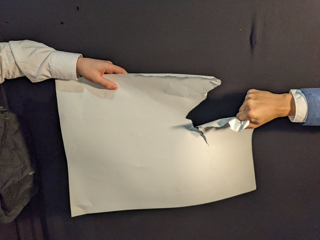
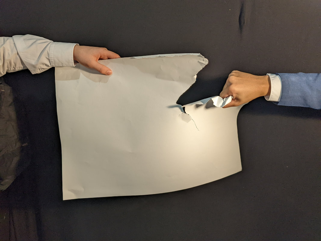
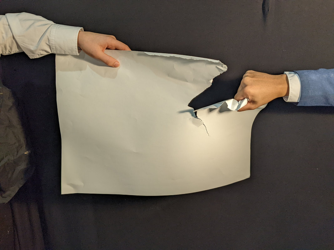
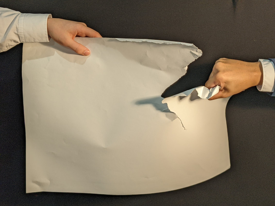
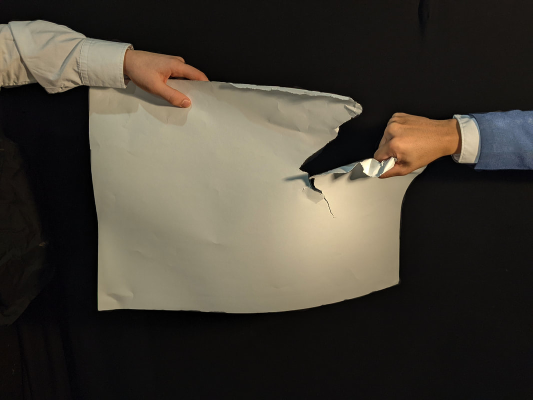
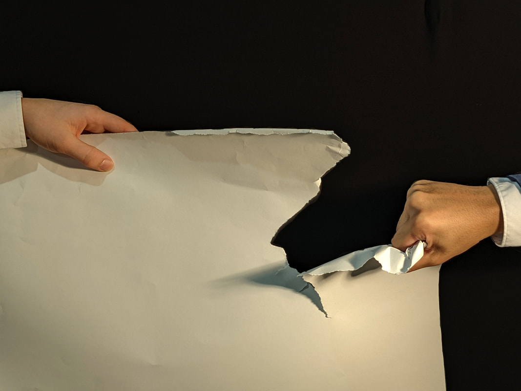
In this shoot, I wanted to develop my use of simplistic metaphorical imagery, I aimed to explore the use of materials and composition in order to portray elements of a story and to represent emotions and ideas. To keep the shoot relatively subjective and devoid of additional unrequired information, I used a black background. The effect of this is every object chosen in the scene will immediately create a focal point. I was also inspired by German artist Gerhard Richter and the way he uses colour and form to create subjective imagery. His pieces have few identifiable objects which allows the viewer attention to immediately be drawn to elements of his paintings. I like the way Richter in some of his paintings uses a single colour to occupy most of the canvas then adds a subjective form using another colour. This technique creates a powerful emotional effect as if the colour occupying most of the canvas is red, it then transforms the other colours and forms into ones of hate or fear as they are being consumed by red. In my shoot I used two people to rip a piece of paper in an uneven manner. One person is wearing a darker colour and their pose is one of violence whilst the other is wearing white and the pose indicates they are not hostile. The violent hand is attempting to tear aways as much as they can get by force, this has led to them gaining the least as co operation would be more productive than conflict. These images represent the Cain and Abel story and how because Cain was less successful he turned to violence. In my images I have positioned Cains hand to gain the effect as if he was in the action of punching down to slay his brother.
Photoshoot
|
|
Edits

|
|
|
Edit Analysis
A focal point is created in the image via the use of composition. The eye is immediately drawn to the central object and action which is the piece of paper being torn unevenly. Despite the paper being torn unevenly, the composition suggests that the two hands are equal. In the story God favours Abel and Cain is jealous of this despite being brothers resulting in his wraith. The story is teaching that violence is an inherent part of the human condition and we are all born equal so regardless of situation you should not act out against others. Shape is used in my images to convey the theme of landscape paintings. Just like how Albertinellis Cain and Abel painting is a landscape. The contorting irregular rectangle adds tension to the images as they represent the struggle between the two brothers. I have decided to go for a simplistic colour palate to create a focal point on the blue sleeve as its the only colour present apart from skin, black and white. This has been done to create a focal point on the blue sleeve of Cain as the darker colour represents his malice.
To progress my final piece I wanted to explore the nature of conflict as seen in the Cain and Abel biblical story. I took what I learnt from Albertinelli about religious depiction of conflicts and began transitioning to looking at real world conflict. Ernst Barlach is the next artist I am looking at. He portrays conflict through sculpture and his main inspiration is war and its effects. His work is driven by expressionism rather than Albertinelli's contemporary religious painter style. Barlach will also help me expand my use of materials and artistic expression as I will be using sculpture in my own images.
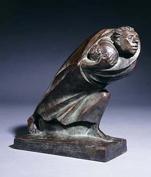
Ernst Barlach
Ernst Barlach born 1870 was a German expressionist sculptor and illustrator. His story is one of conflicting views as pre WW1 he supported conflict and viewed the German army as an unstoppable force. In his later years post war he changed his views to that of a pacifist and his art reflected his new negative opinion on war. This would attribute him the title of a degenerate artist given by the Nazis.
|
|
|
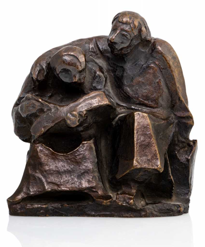
Form is the key theme of Ernst Barlach work because he works within the expressionism movement in which depiction of form takes priority. Barlach portrays the human form as angular and geometric. This has been done to portray themes such as emotion and narrative as the angular form has been used to display the motion of the sculptures actions. A swept almost streamline form has been used in the top third image, this has been done to represent the attacker and unstoppable form of the German army. This depiction of raw aggression stems from the artists early post WW1 views, these being the view that most Germans held. This war culture in Germany can be traced back hundreds of years, in more recent time the 19th century Prussian army was considered to be the finest land force on Earth. The artists views changed post WW1due to him witnessing the horrors conflict brings. Sculptures from the post WW1 era convey a very different emotion to that of the charging barbarian. His new sculptures forms are tragic in their portrayal, making use of iconography and shape to draw emotion from the viewer. The top centre sculpture uses a square block to encapsulate the person forming the shape of a stocks(torture method). The effect of using shapes to change the form of the sculpture into something recognisable like a prisoner in stocks is thought provoking. This is because the shapes the artist has selected are not intended to be a specific object. We as the viewer interpret the shape as we are aware of what suffering is and how to cause it. Form and shape has been carefully sculpted by the artist in order to provoke this cognitive function. For example in the top left image the person is holding a shape with a spherical form, it is our job to determine in times of war what would possession would he be cradling. Some might say a child whist other claim its his most valuable possessions.
Expressionism is one of the themes the artist has greatly used in his work. Expressionism is the artists main genre of work, this is covered in the theme of humanity in sculpture. The aims of expressionism is to distort reality to for a subjective view on what the artist is portraying, Barlach distorts the reality of war in his work via the form of his sculptures and their expressions. The artists sculptures feature angular or geometric shapes in order to portray the motion of the sculpture. Instead of having free flowing clothes the artist has chosen to present them in a modernist style. The effect of this is the action of the figure is greatly emphasized as the movement can be more easily observed, the parts of the body such as the arms are represented by hard edges.
|

|

|
People are a key theme in my chosen artist work and are greatly featured as human conflict is his theme of interest. People are represented with realistic proportions despite them having elements of modernist or expressionism distorting parts of their form. Fascial expressions are the greatest human element used by the artist. The host of expressions found within his sculptures conjure feelings of fear and furiosity.
Movement has been displayed by the artist in the form of shape and pose. Both shape and pose have been used to convey motion or movement. The first example of this is the hard edges of the sculptures like the cutting blade of a knife or slicing swept wings of an aircraft. The second example is the poses of the people as they portray a strong sense of momentum through various leaning poses which some would consider unnaturally powerful. The effect of the combination of modernist sculpting techniques and intense posing is that the figures emotional impact on the viewer is either shattering, fleeing or powerless. Shattering in the man charging, fleeing in the refugee and powerless in the prisoner.
|
Inspiration for my work
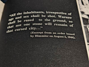
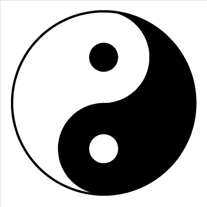
In search of potential influences on my work I read a book titled 'We Have Not Forgotten'. The book mainly comprises of rare images from ww2 era Poland and the atrocities of the Nazis. Within the book I found a number of quotes from various Nazi leaders, one of these quotes was from Himmler the leader of the SS. The quote highlights the hatred and distain for Warsaw and its people in the use of the attributive adjective cursed. I have been inspired by this quote to create a dynamic involving an attacker and defender or opposing city's/nations at war. I have also been inspired by the concept of ying and yang as to have an attacker a defender must also exist, and within each side a piece of the opposite resides forming the never ending cycle. |
|
|
Shoot Analysis
In my second shoot, I wanted to develop my use of sculpture, now focusing on the portrayal of conflict and opposing ideologies. I worked with clay models using a variety of tools, this provided me with a pliable material unlike metal in which I can craft a sculpture. This idea is similar to the works of Ernst Barlach, who works within the expressionism movement in order to convey a message as well as portray themes of emotion. I was inspired by the way Barlach captured a for and against view on war, as just like two sides of a coin you can have one without the other. By forming sculptures emulating two opposing ideas, two pieces of the puzzle are present before the viewer. It is interesting to consider that when photographing these sculptures the viewer must be able to see a development in narrative, and representation of the two opposing ideas. Despite the angular bronze expressionist form of the sculptures, I was able to portray a convincing scene of an attacker and defender as well as have them fit together like a jigsaw piece. Just like Barlachs personal connection to his work, I have also used my personal history to inspire my work. Although I was able to capture images of the sculptures and their forms, it proved very difficult to photograph the clay in an environment that fully exposes each carefully adjusted shape. In my future shoots I would need to explore how I can use other materials to draw out the important elements, in this shoot being the sculptures form. Experimenting with materials such as tin foil may yield a better display of my sculpting work.
Photoshoot
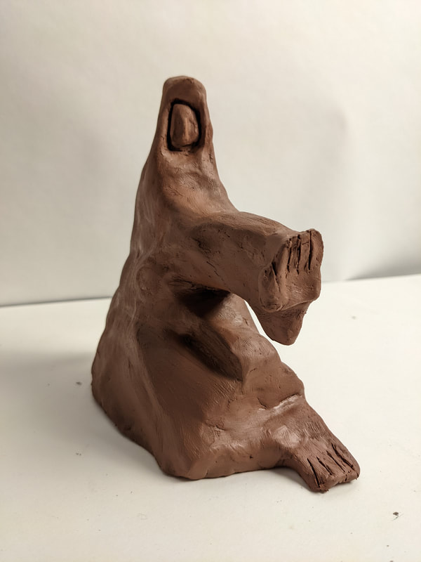
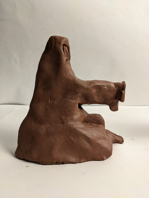
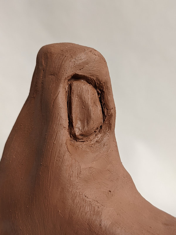
|
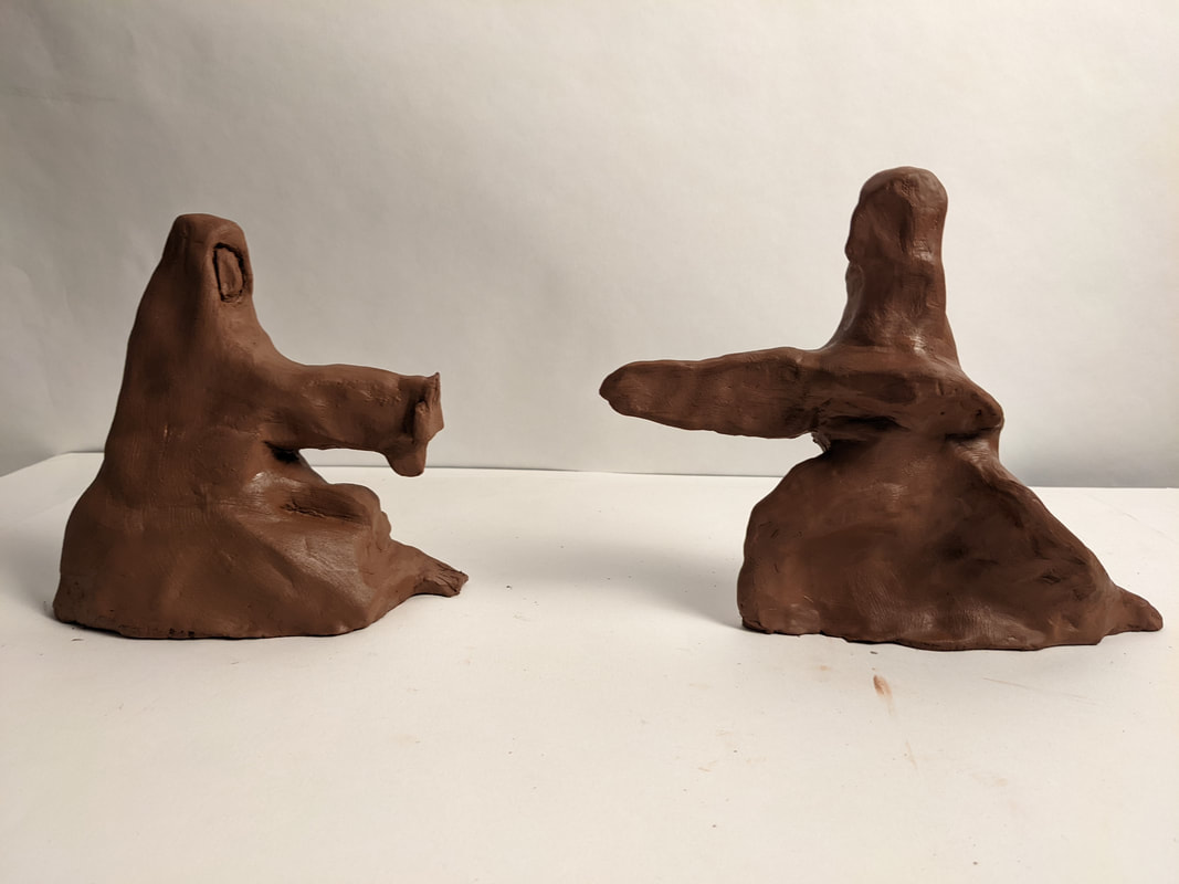
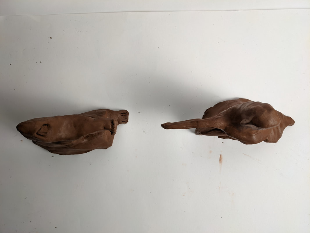
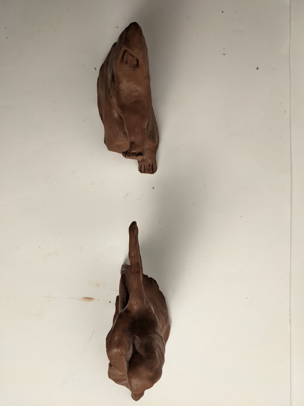
|
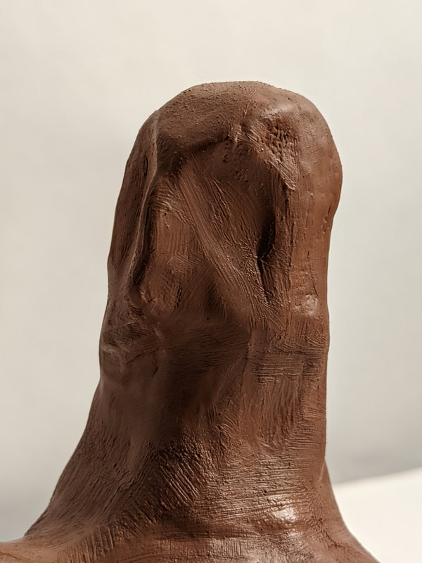
|
Edits
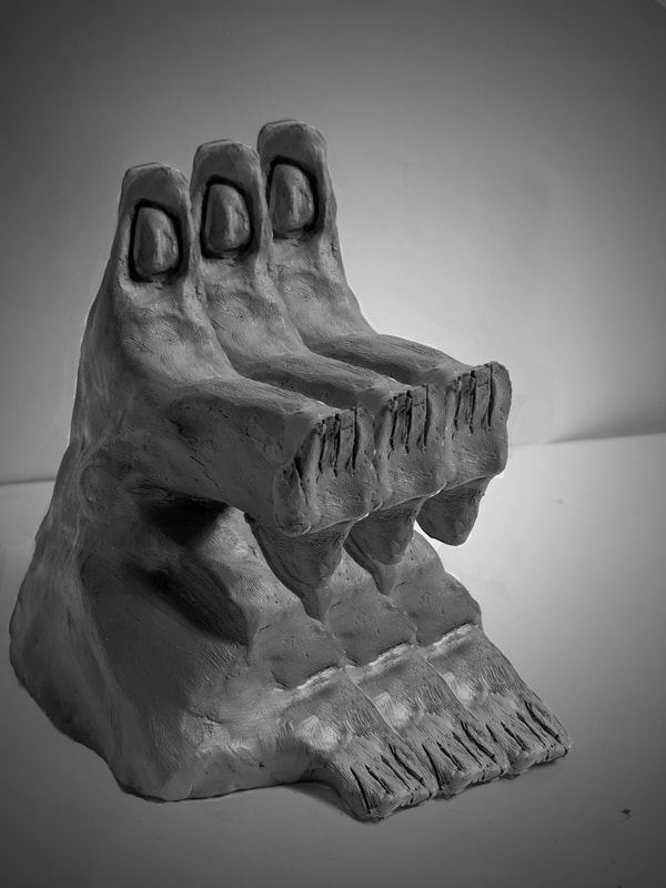
|
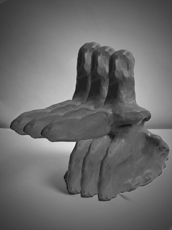
|
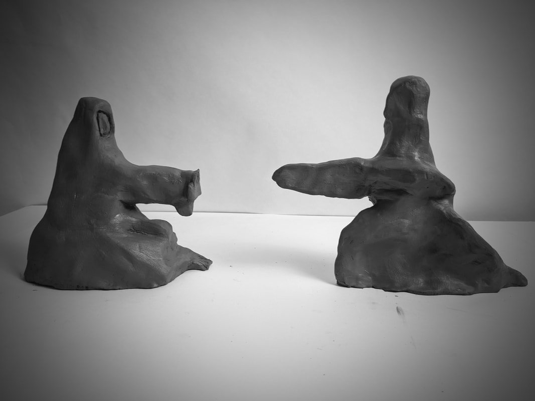
Edit Analysis
In these edits following my response to Ernst Barlach, I experimented with how layering and tone can effect the portrayal of a particular theme or element. My edits create a focal point on the clay sculptures via the use of a vignette, this creates the effect of an eye focusing in on key information. The vignette also serves the purpose of intensifying the conflict found within the images. Tone has been used in order to highlight the sculptures form as each represents a different ideology. The detail in the form has been carefully crafted in order to conjure emotion, this is evident in the attackers visually muscular form and overarching stance. Similarly tone brings to attention the form of the defender being one of weight and protection as the bulky shape acts as armour or a buffer to the attackers advances. Layering has been experimented with in my edits to see whether multiple figures would effect the intensity, emotion or overall impact of the piece. I have done two edits involving this concept, both the attacker and defender have been layered. The immediate impact is that the viewer perceives the image to be displaying an army all attacking in unison. This amplifies the ideology of attack and defense, However it cheapens the sense individual story and struggle. Increasing the amount of figures also doesn't add to the never ending concept of attack and defense, this is due to them countering each other like the ying and yang. My landscape edit focuses on the ying and yang concept as only one of each side is present. The effect of this is the individuality of the opposing ideologies is restored leading to a more intense scrutiny of the individuals story, struggle and place in the conflict dynamic. This piece demonstrates how to have an attacker you must have a defender. I have sculpted them to reflect the idea that like pieces of a puzzle the two interlock and complete each other or counter one another.
From Barlach I gained a key understanding of conflict influenced by the real world and how a persons perception of a subject such as war changes their depiction in art. Barlach underwent a change in opinion from a war supporter to an opposer of conflict. I also gained an understanding of sculpture and how personally forming an object to represent themes such as emotion, conflict and expressionism can have an important impact the viewer's understanding of such subjects. Moving on to Marshal Arisman I wanted to view an artist who brings together the themes of religion and conflict in a raw powerful style. Arisman is who I chose as he covers many cultural/religious influences and the theme of conflict not only in humans but with nature and technology. Arisman employs the use of coloured backgrounds to occupy a large portion of the canvas, this technique is simple yet impactful since colour plays a key role in the perception of an artwork and its context. For instance the Adolf Hitler portrait is a mockery of the ww2 portrait that portray Hitler as heroic and powerful. The red background used immediately creates negative emotion. I hope to learn from Arisman how the 3 elements of colour, context and form are used to create effect in the image and how does each element impact the others.
Marshal Arisman
Marshall Arisman born in New York 1937, is an abstract artist and graphic designer who has made pieces for a number of prestigious companies including General Motors and The New York Times. His main inspirations are the themes of violence and predation particularly involving the environment, media and religion. Over his many years as an artist he has produced numerous successful art installations each with its own unique style and theme.
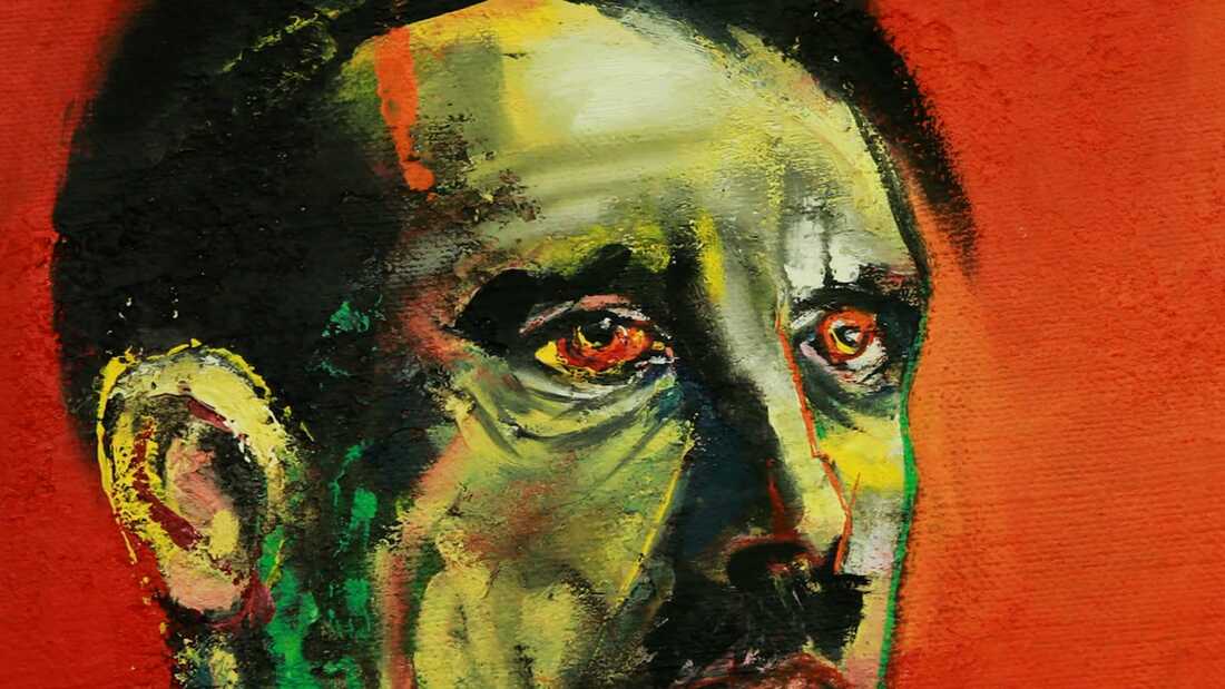
Colour is a major theme found within Marshall Arismans work. His command over colour is superb as he employs a number of techniques in order to provoke an emotional response from the viewer. The artist mainly uses negatively associated colours such as reds and blacks. This choice of colour has been done to reflect his violent inspirations and horrific imagery found in his artwork. He has used red in some of his images to connote the visual violence of the subject, for example red has been used in his last tribe installation involving the theme of nuclear war. The hints of red have been added to represent the violent nature of each person. In his Adolf Hitler (Mass murderer) and Patrick Bateman (Psychopathic-Killer) images he employs the use of vibrant crimson greatly to connote the level of the individuals violence.
Pattern and line has been used by Arisman in his work to draw attention to various aspects the artist wishes to express. In his last tribe installation he uses both Pattern and line in order to symbolise the tribal nature of nuclear was and conflict. Waves adorn the skin of the warrior indicating how modern nuclear warfare is of the same mentality as early Stone Age conflicts. Historically the greatest example of this is the USA against The Soviet Union at the time of the Cold War. Line has been used to hint at key themes in the artwork. In the Patrick Bateman image(Top centre) the edges defining the suite have been extended beyond the form of the person. This has been done in order to highlight the theme of style, competition and narcissism in the book American Psycho. The line overextending also servers the purpose of making the form of the person incomplete, this represents the insanity and unpredictability of the character.
Religion has evidently had a significant impact on Arisman's artwork as he includes religious imagery in his different installations. These installations have been constructed in the theme of a particular religions, some are Native American, Abrahamic/Christian and Chinese. His last tribe works could also be placed within the theme of religion as culture and ideology often cross over with religion. An example of this would be how instead of religions like Christianity being worshiped in the name of God, instead humans become the object of worship. In Japan the emperor was worshiped as a God amongst men until post WW2. Religious symbolism has been used by Arisman to form a connection between those who follow or know of the religion to what he is portraying in his artwork. In his angels and demons installation a humanoid bird can be observed wrestling with a snake. Snakes are depicted as the enemy to humanity especially in Christianity where the snake represent the original sin. A quote from William Blakes America resonates with some of Arisman's work. “Fiery the Angels rose, & as they rose deep thunder roll’d Around their shores, indignant burning with the fires of Orc.” This quote and the artists link via the use of religious symbolism. Fire has often been considered as the genesis of man as its use as a tool propelled humanity forward. God is portrayed as fire as the burning bush. In greek mythology fire is an object stolen from the Gods by prometheus, he is considered to be the creator of man.
Shadow is a technique used by the artist to create tension and emotion. Shadows conceal various features of the humanoids we see in Arisman's work, these being the form of the humans face and body. The effect of this partial concealment of form is that a sense of distrust and uneasiness is created, this provoked natural reaction.
Form has been explored by the artist via the medium of humanoids. Various humans and humanoid creatures have been illustrated, each has its own symbolism based on which installation the image originates from. For example, the humanoid with the head of a bird wrestling with the snake is religious/biblical in its form and comes from the 'demons' installation. Despite the form of animals and people being clearly identifiable the artist has chosen to present detail as indistinct. The bird head has no feathers and the beak lack the detail to identify what kind of bird it is. The same can be observed with the snakes form as its head duplicates and no clear features can be observed identifying it as definitely a species of snake. The indistinct forms are further made unclear by the application of colour, as both creatures use two tone colours or shades making objects such as tongues, eyes and smaller details like feathers unidentifiable. This reinforces the link to religion, warfare and other themes as the murky indistinct nature of the images adds an element of surrealism as if it were a dream or religious experience. Form is obscured to present themes such as humanity or lack there of during warfare. Tribal paints and colours break up the form of people like camouflage continuingly distorting the human. The image from the American Psycho book cover of Patrick Bateman displays the theme of individuality. His form is distorted in a red melting appearance completely obscuring any characteristics that would define him as an individual or human for that matter.
Pop art is a subject that Marshal Arisman has featured prominently in his artwork as he was a graphic designer for newspapers, publishers and film. The artist has created pieces based on a host of different popular culture media. These works include American Psycho, Silence of The Lambs and Star Wars. These pop art pieces are what helped propel Arisman to fame as an artist, companies saw his unique style and commissioned him to design covers.
Narrative is a theme greatly employed by the artist to add context and impact to his images. A number of sub themes appear under the main theme of narrative, these include war, culture, religion and humanity. The two greatest sub themes are religion and humanity. Religious narrative can be observed in the form of symbolism. The image containing the image with the snake and humanoid conjures imagery of the stories in the bible containing serpents, these being genesis and the Garden of Eden or exodus and the bronze serpent. Symbolic objects create instantly recognisable imagery. The serpent wrestling with the humanoid is recognisable as a religious symbol as it is often featured in biblical narratives. The theme of humanity is present and explored as a compilation of different elements of humanity. The last tribe image featuring the man in face pain speaks to the tribal nature of warfare and humans. This symbolism represents how warfare resets humanity back to a more primitive time and in a way present the history of the human race. Other of the artists images represent humanity as a scare on nature, this is conveyed via the form of a rainbow in various shapes scaring the animals form in some way. In some images humanoid shapes can be seen within the rainbow further reinforcing the idea that humanity has an effect on nature that is opposed to nature as the human shape is distinct.
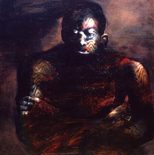
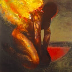
|

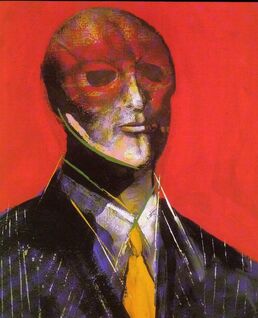
|
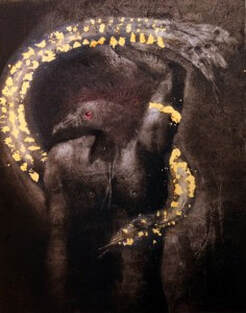
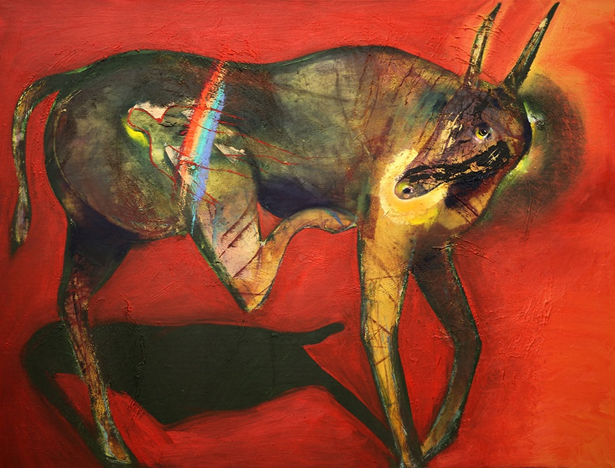
|
Shoot Analysis
In my Arisman shoot, I wanted to work on my ideas of how colour, objects and narrative can be combined to form an impactful artwork. For this shoot I focused on objects and their importance in relation to the themes of religion and ideology. I gathered a vibrant red background which would give my shoot a powerful emotional effect, this is due to the nature of colour and our perception of it and how it changes the object within the piece. This is similar to Arisman's painting style as he uses colour in relation to objects to give them additional emotional effect, this is best seen in the Hitler image as everybody known his evils, however when the red is added it provides a beyond evil devilish appearance.
Marshall Arisman – Marshall Arisman, Marshal Arisman throughout his many installations and artworks creates themes via techniques that combine elements, one of these elements is the use of religiously influenced imagery. I have done this in my shoot in the form of various objects that relate to a religion or ideology. The later edits will distort the appearance of the objects to change their emotional effect and pre conceptions. This shoot was highly successful as I was able to capture the powerful effect of red and colour as a theme. The objects I used further aided the impact of my shoot as they each hint to a narrative, religion or ideology.
Marshall Arisman – Marshall Arisman, Marshal Arisman throughout his many installations and artworks creates themes via techniques that combine elements, one of these elements is the use of religiously influenced imagery. I have done this in my shoot in the form of various objects that relate to a religion or ideology. The later edits will distort the appearance of the objects to change their emotional effect and pre conceptions. This shoot was highly successful as I was able to capture the powerful effect of red and colour as a theme. The objects I used further aided the impact of my shoot as they each hint to a narrative, religion or ideology.
Photoshoot
|
|
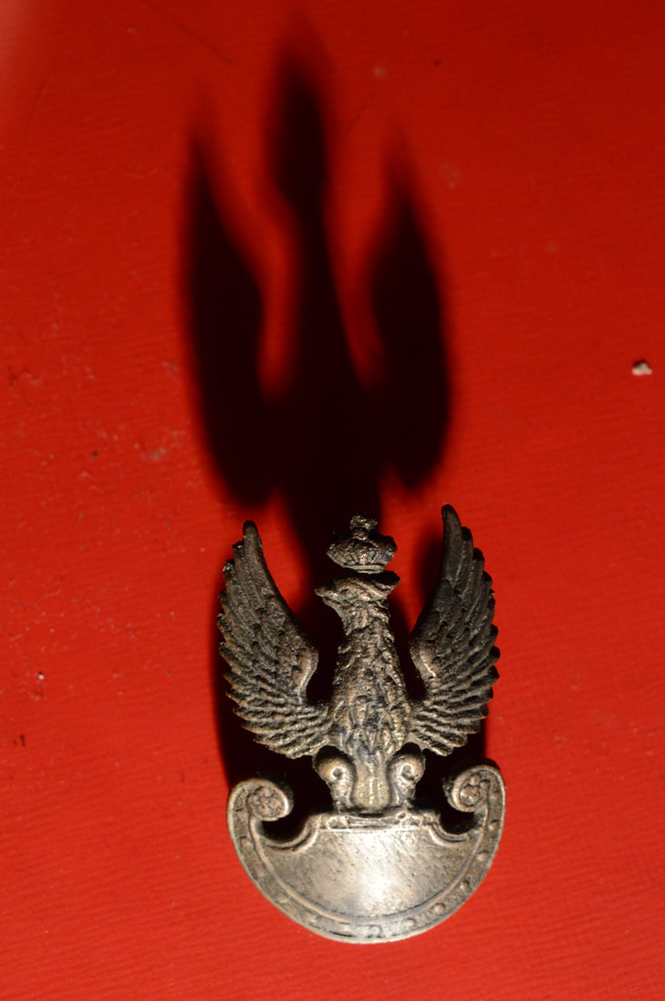
|
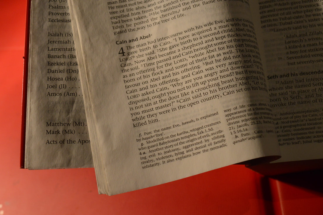
Edits
|
|
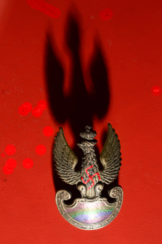
|
Edit Analysis
The focal point in my edits is the object of the ideology placed centrally in each image. These draw the attention of the viewer as they are the focal objects placed on a red background. I have decided to use the theme of shape in my edits, this has been done to exaggerate a particular aspect of the focal object. The shadow forms the shape of the object and increases its size and impact. The shadows acts as an extension of the ideological object. Red is the primary colour used as it is arguably the most powerful of all colours. Instantly violence, romance or emotion comes to mind when the image is viewed. The powerful background stands on its own in terms of its raw power, however additional elements of colour have been used. The key secondary use of colour is in the rainbow that is a prominent feature found in Arisman's work. I have used the rainbow in my work as it highlights the ideology marking it with a distinct pattern, this is also symbolic for mans unique aspect of conscience. These images create the same powerful moods found in ideologies propaganda or artwork, examples of this would be in Soviet artworks in which a great sense of patriotism is achieved. I have enhanced the colour saturation to increase the powerful effect of the red background giving it a richer and more intense shade. Blacks have also been darkened to form shapes and shadows that mirror the focal object in the image.
After covering Ariman and his intersectionality between the use of colour, context and form to impact the viewers perception of themes such as identity or religion, I have learnt by swapping an element of the image its portrayal can change. Theoretically his Hitler image could be given a bright golden background and the artwork would change the viewers perception of Hitler. I would like to make use of elements such as colour and use them to my advantage in my final piece to change various perceptions of the images context. To progress I concluded that I need to look at how an artworks portrayal can skew the context of the image in a real world historical context. I decided to look into the Soviet era as from a modern perspective people understand that the Soviet Union and its leader caused the greatest amount of suffering in the 20th century. Despite this suffering the insular culture in the Soviet Union and communist counties under it was one of glorification for the state and its leaders. Posters of Stalin or Lenin feature glorifying poses and colour. The artworks completely skew the historical context of the image and as an outsider viewing the pieces you would believe the figures in the images equal to that of religious figures . Viktor Semyonovich is the Soviet era artist I have chosen as his work was some of the most impactful in terms of portrayal via use of themes such as colour, people and composition. My aim is to learn how real world context can be skewed via the portrayal of an image and how various elements such as the suffering caused by war can in fact be subverted into glory.
Viktor Semyonovich Ivanov
Viktor Semyonovich Ivanov was a Russian artist born in 1909 best known for his soviet propaganda artwork. He attended the USSR Academy of Arts where he became a master of political posters. The title of meritorious artist was bestowed upon him which was considered a great honour in the Soviet Union. His style and influence goes unrivalled by many other propagandist of the time.

|
|
Colour is an theme that has greatly been used to effect by the artist. The importance of colour and representation has been acknowledged by the artist to further the politics he wished to spread across the Soviet Union. One colour that is more prevelent than others is the use of red, this has been done in order to represent the colour of the communist party and Soviet Union. Red connotes the sacrifice of blood from the workers and soldiers, this also being the blood spilt at the conception of the communist party during the October revolution. Red is a bright colour that draw in the eye, the artist has made use of this by using the red a narrative direction. The red flags often flow into the main focal point of the piece, such a in the Lenin artwork the soviet flag leads the eye to Lenin's bold pose. Red has also been used to symbolise the friendship between nations, during this time and to this day China has had a red flag in the same style as the Soviet flag. They are depicted in many Soviet artworks as flying together along side a person representing each country.
A great sense of narrative is created in the artists work via the use of recognisable and symbolic objects. In the bottom left image a soldier holding up crops can be observed. This narrative is easily understandable due to the object chosen, for instance the crops clearly have been illustrated to represent the workers and more importantly the farmers. They also represent the colour gold which has been done to reference the Soviet flags. This also portrays the glory of the Soviet Union. Narrative is created by the artist in the form of people performing actions of workers. The workers acting out their tasks have been illustrated in order to persuade the viewer that the workers are the highest priority in Soviet society.
People are a key theme in Soviet era artwork. People are included in soviet artwork to encourage nationalism in the viewers of the propaganda, stereotypical portrayals of race can be found. The Russians have blond hair, bold eyebrows, masculine features and appear symmetrical . The effect of this is the People of Soviet Russia feel empowered as they are being represented as the driving force behind the nation. The pose of these people are heroic, an arm is typically raised lifting something of symbolic value such as a flag or crop. The poses are shot from below giving the person in the image a sense of power and importance, this is best demonstrated by the Lenin artwork as he is an influential figure.
Shoot Analysis
In my fourth shoot, I developed the concept of removing motifs from an image and reconstructing them into a stylized edit., these images being Soviet era propaganda. For this shoot I used a black background in order to just capture the object I wanted to show. The individual objects are the key in this shoot as in the Soviet propaganda the objects all come together to for a glorious piece. I am removing the power each of these objects have and creating an edit that mocks them. The soviets knew that propaganda and the objects they selected could be crucial to the strengthening of their ideology, by isolating my chosen objects I am making a stance stating that when on their own do the objects still hold the same effects. This shoot successfully uses shutter speed in order to completely block out any background detail. I have previously used shutter speed to duplicate and distort, but in this case I am aiming to control light intake. The camera was held perfectly still when taking the shots. This shoot has been effective and progressed my development as I have captured what I want from the images. The isolation of the objects alone is powerful and frees them allowing for the opinion of the individual to impose what ideas they wish on it.
Postmodernism
|
One key theme that my work has inevitably come across is post-modernism. This movement emerged out of the 20th century with the idea of erasing all previous historic conceptions and designing free of influences of what something should look like. This links to the Soviet Union as many of its ideas where post modern such as lack of countries, nationality or economic class. I will be using elements of postmodernism to create my edits mocking the style of soviet propaganda artists. Jackson Pollock is an example of a postmodern artist as seen on the right. A key artist that acted as a secondary influence was the famous Banksy, whos artwork has captured the gazes of millions. Banksy mainly uses black and white, however colour is used limitedly. Banksy also features fun and creative artworks that follow the principles of post-modernism. This is similar to the style of Soviet art as the same technique of colour is used.
|

|
Photoshoot
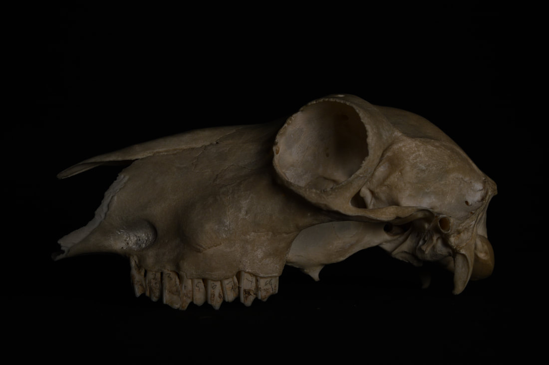


|
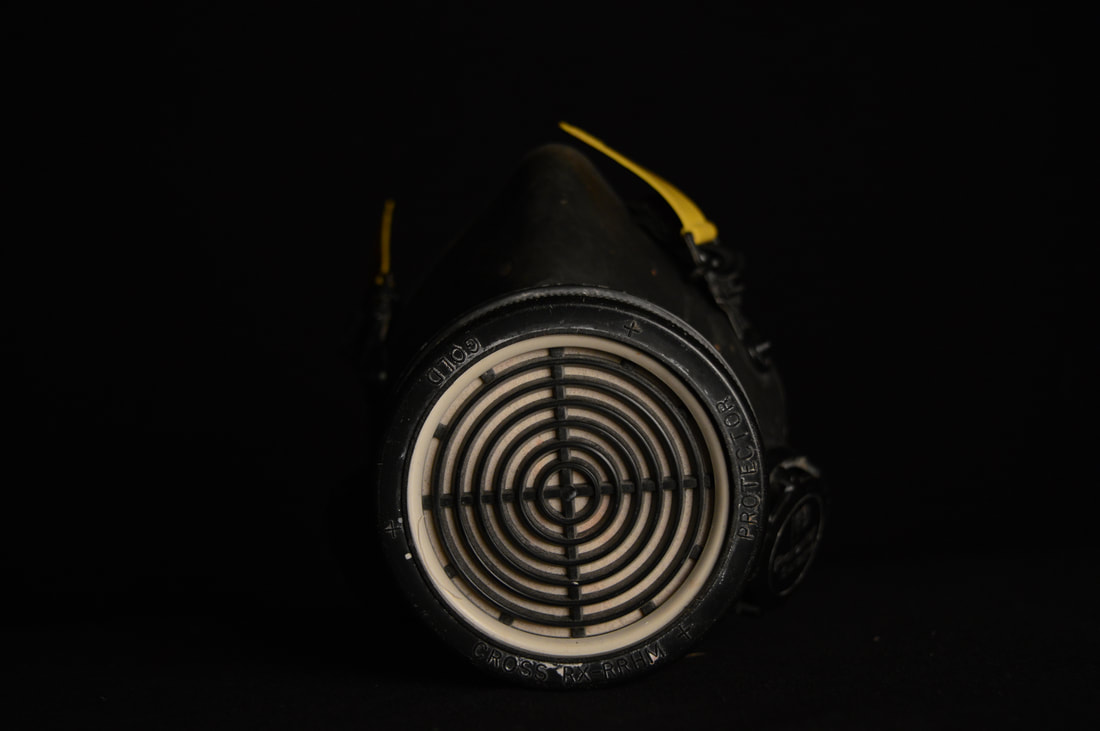
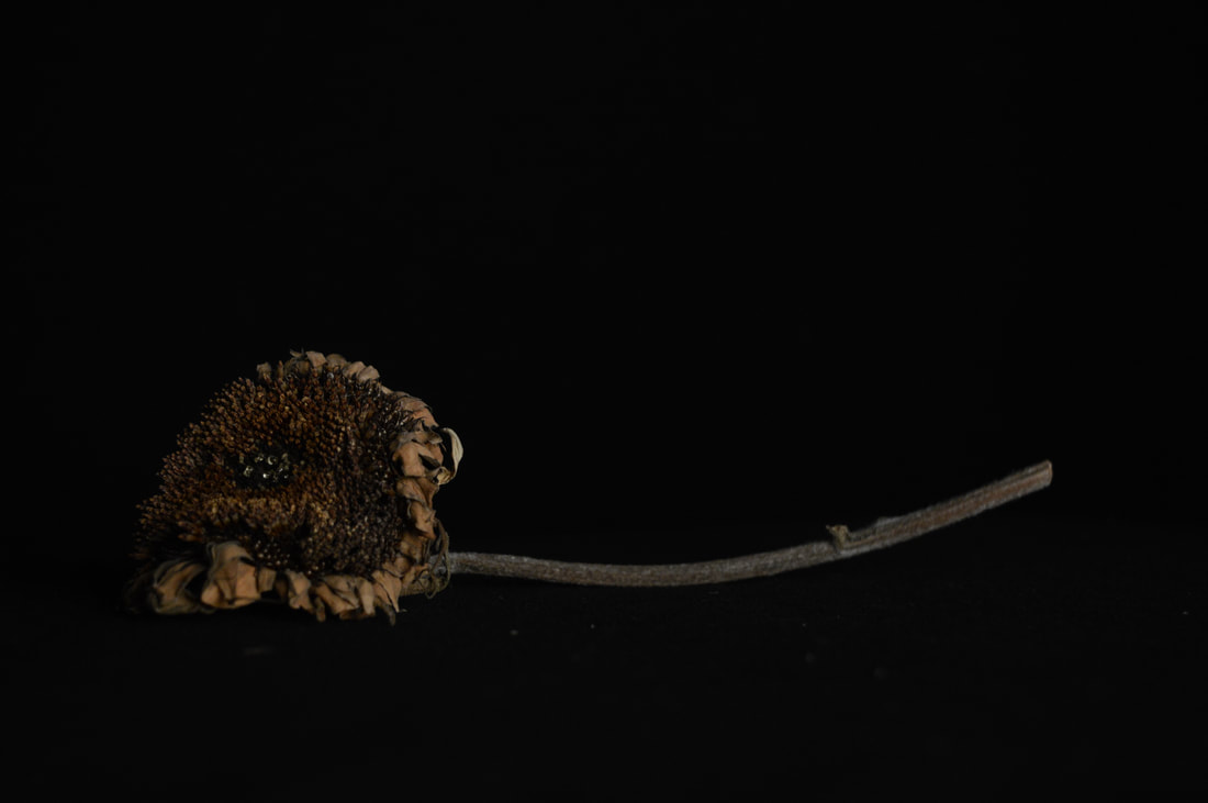
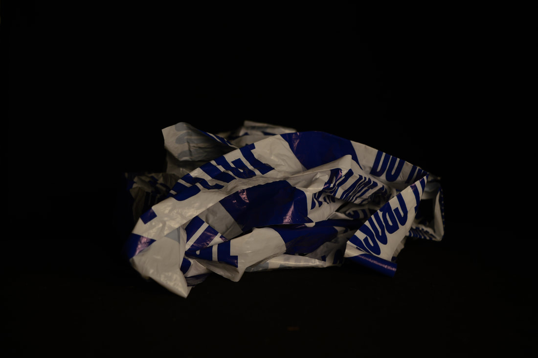
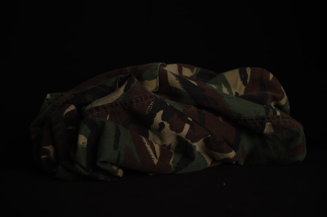
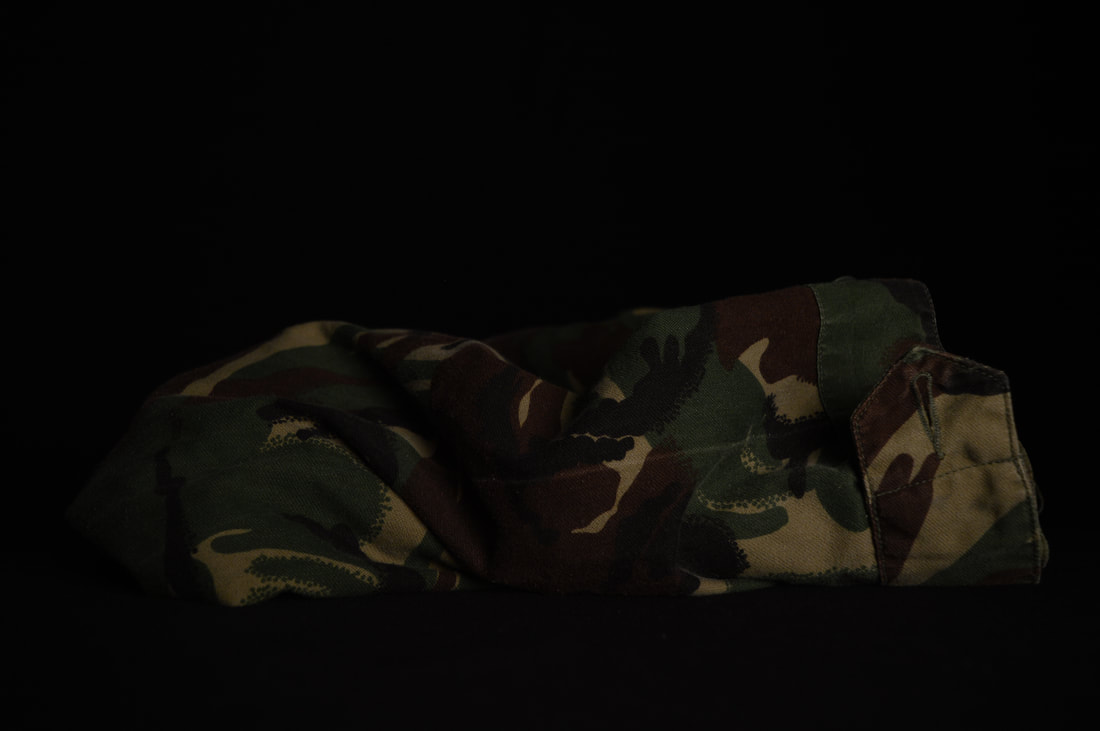

|
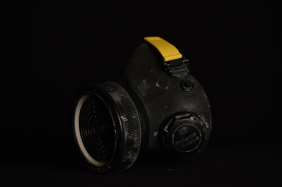
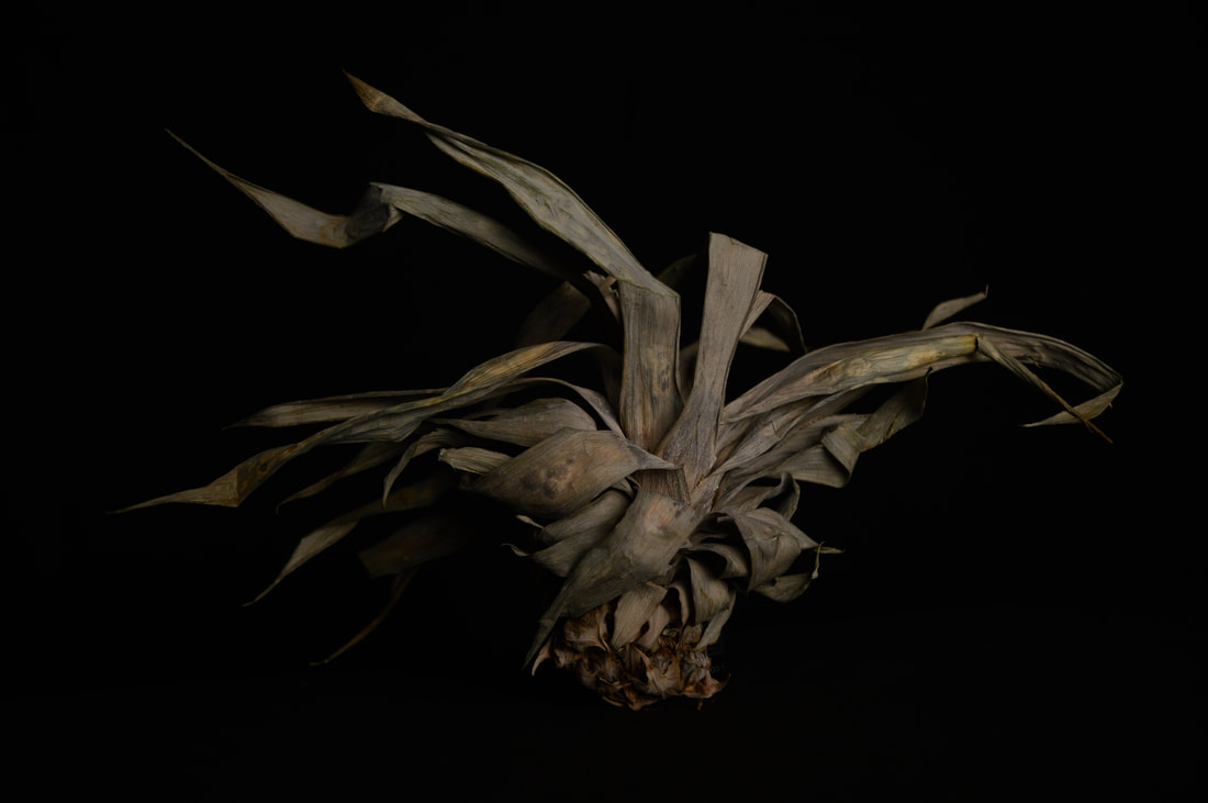

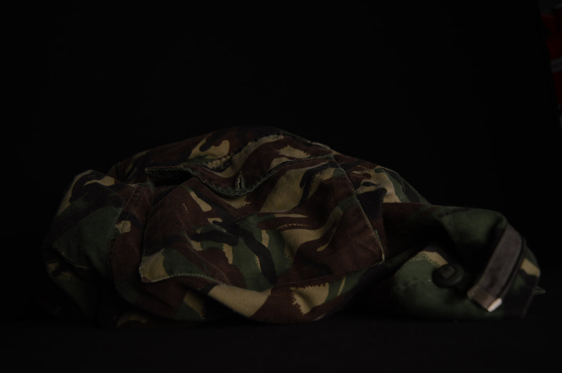
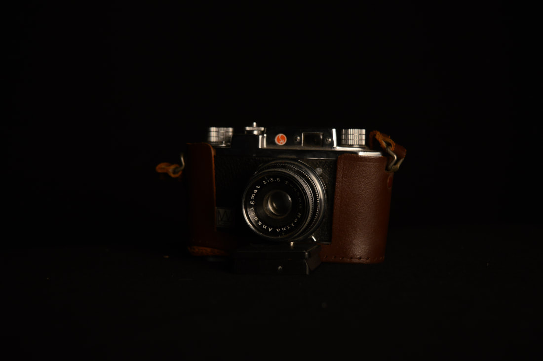
|
Edits
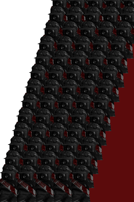
|
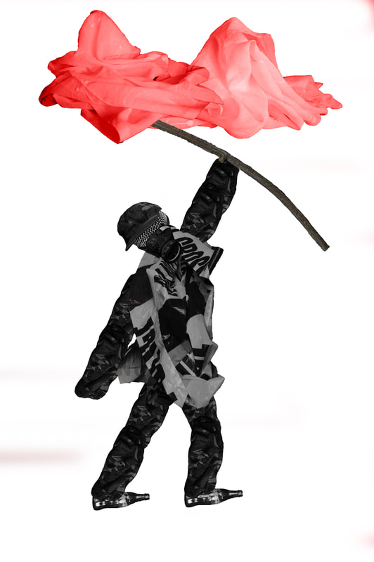
|
Edits Analysis
What I gained from looking at Soviet art was that a number of key themes could be observed. The first key theme being how the Soviet workers and leaders were portrayed as glorified and great despite the suffering during that time period. The second key theme is that of the individual and the collective. The leaders are like religious figures and stand on their own as their inherent power is greater than anything whist the people including the military are dealt a bad hand in conflicts in war or the gulags. Lastly for my final piece I needed to expand my understanding of composition and the individual. For this I chose Vincent Van Gogh as his technique, composition and personal suffering provide a harrowing gaze into personal suffering and how that impacts portrayal of themes. Van Gogh's The Starry Night was produced at one of the worst points in his life, this connection to personal suffering is what drove Van Gogh to display beauty in his artworks. He opposed the suffering found within life and subverted it via painting. This subversion of narrative is particularly interesting as a Van Gogh painting is not overtly displaying suffering as can be seen in a Francis Bacon painting. Shutter speed was used in this shoot in order to control light intake. This ensured I could highlight just the object and exclude the background detail. The effect of this is was that the object appear isolated allowing for it to be easily be inserted into my collage like edits.
Vincent Van Gogh
Vincent Van Gogh was a Dutch impressionist painter born in 1853 and died in 1890 after suicide by gunshot wound. Van Gogh suffered from mental instability and psychotic episodes, his physical health was also in rapid decline accelerated by his use of alcohol. He was considered a failure of an artist during his time and it wasn't until years after his death would he finally gain the recognition he deserved. Van Gogh is considered to be one of the most influential artist to ever exist and his unique pieces crucial to art story.
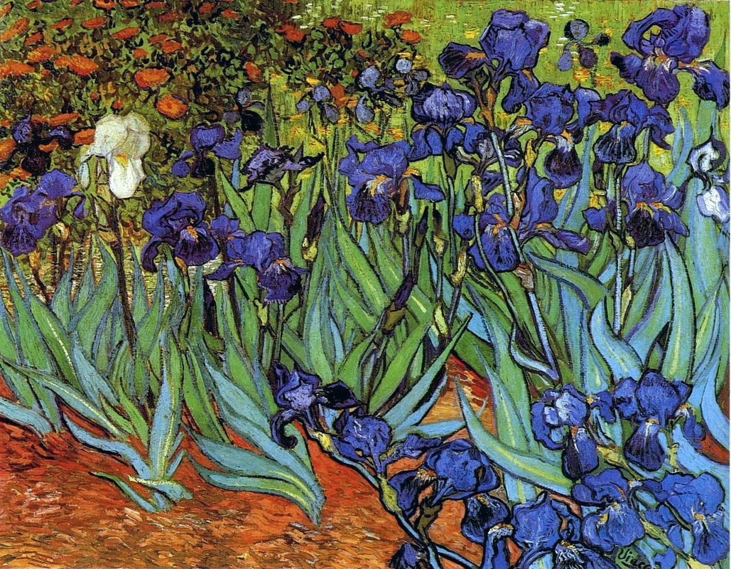
|
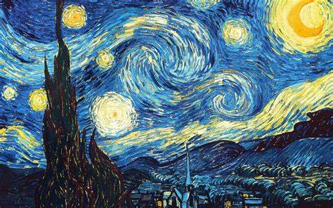
|
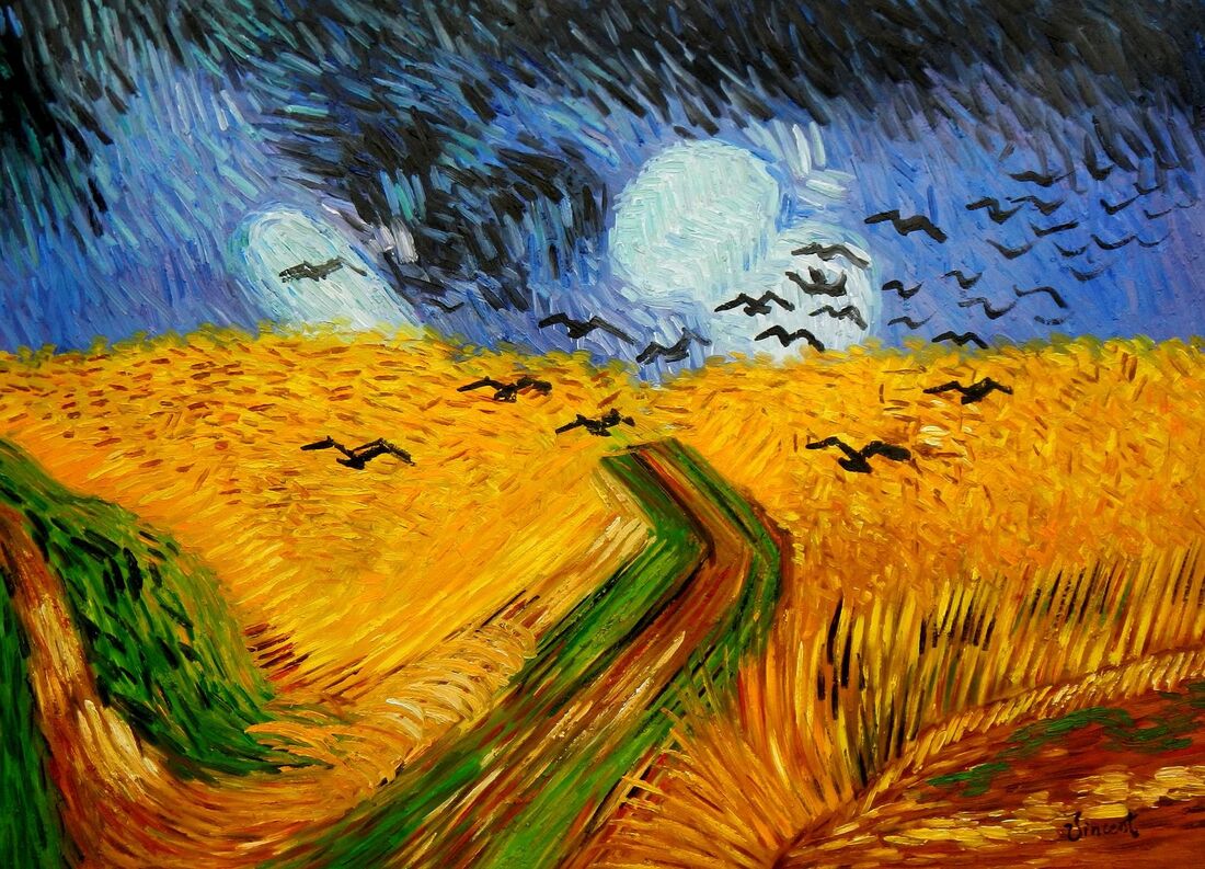
|
Colour is the greatest aspect of the artists work as its immediate potent effect captivates the viewer. The careful command of colour used by Van Gogh creates a bold yet elegant effect. The technique of short blob like strokes gives you application of colour a whole new appearance. This technique is best seen in 'The Starry Night' or 'Wheatfield with Crows' as they best demonstrate the importance of both colour and technique intertwining in Van Gogh's work. The colours have been chosen to be complimentary in most of the artists paintings. The effect of this is the paintings have a equal appearance that is soothing to the eye. Nothing in Van Gogh's art could be considered out of place or Juxtaposing the context of the painting. Starry Night is an superb example of this soothing effect that fits the painting context of a beautiful nights sky. With this context understood, the use of yellow and blue is inherently effective as the colours are complementing not only each other but the scene within the painting.
Objects (free flowing
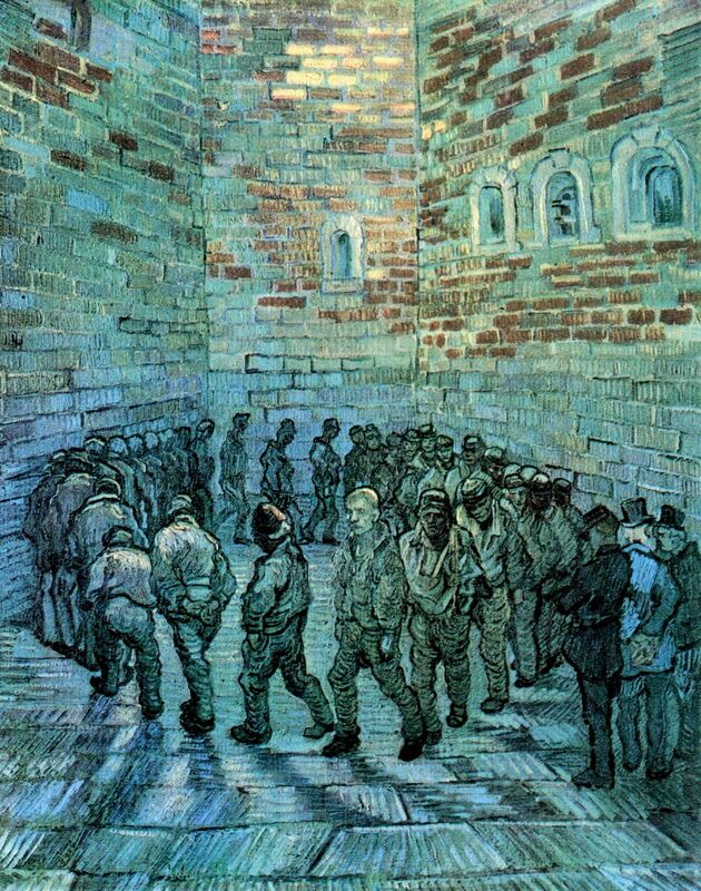
|
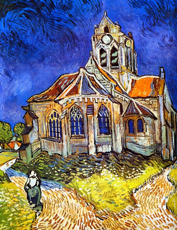
|
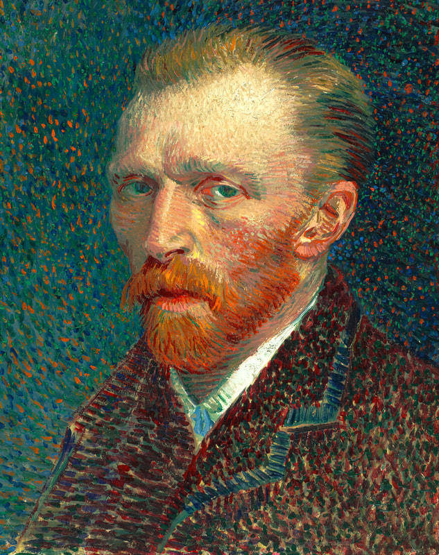
|
Composition has been masterly applied by Van Gogh in his many paintings. Composition is used in subtle and obvious ways in order to highlight information within the pieces narrative and imagery. He mainly uses the rule of thirds in order to di-sects his images into palatable information. The main object of the image is always places centrally, the effect of this is that the eye is drawn to the main object in which many other themes revolve around. An example of this is in 'The Church at Auvers' where the church is central and the main object, however other information can be observed revolving around the church. Placed at the bottom of the piece is a split path going around the church. This path gives the church power and creates a sense of narrative as a persons journey on the path is suddenly diverted by the influence of the church. In the bottom left corner a woman is seen, she provides humanity and makes the image feel alive. The woman acts as a transition to the next middle horizon line in which the bulk of information is held. Top the left of the church the rest of the village has been placed further hinting to the idea of an alive community rather than an isolated building. This connects the main image of the church to the people of the village. The church occupies a great space within the image, this has been done by the artist to signify the importance of the object and its importance to the people of the village. Finally the top of the image is filled with a clear deep blue sky that creates a sense of perfection. It is clear and simplistic in colour to not take away from the influence of the church and to not add further unnecessary detail that doesn't link to the narrative. This is the opposite in starry night because the main theme is the sky so it portrays more detail than the town below it. Composition hints at power in many of Van Gogh's artworks including the prison image. In this the circular composition is broken by the men in suites hinting at their power that lies outside of the prison system.
Religion is a theme in the artist's work that is portrayed through the ideas of creation, surrealism and even mysticism. Van Gogh's artwork creates the feeling of a great religious piece via the beauty of creation, living and a particular memory. When he painted 'The Starry Night' a feeling of personal connection to the world and living in it was formed. This idea is explored in Christian art in a similar way since Christianity contain so many forms of faith for instance the beauty of Gods creation, the worship of Jesus and the powerful narrative of Biblical stories spanning thousands of years. Van Gogh channels a similar form of appreciation for such themes in his surreal artworks connecting his personal self, ideas and experiences to the world around him.
Shoot Analysis
In this shoot, I wanted to develop the idea of combining motifs to form an image inspired by the still life genre and the amazing artwork of Vincent Van Gogh. I focused upon the concept of motifs and the impact selecting a particular object can have, this was inspired by Van Gogh's personal connection to the artwork and how each object or theme has been selected to conjure up something he felt. For this shoot I set up a black background so I could just focus on the objects and how they can create motifs. Instead of a great scene symbolising a personal feeling as seen in Van Gogh's starry night, I will focus on a small still life scene that will convey meaning through the objects chosen, for instance a skull and dead plants in order to present the theme of death and each persons experience with it.
Still Life
|
Still life is a genre emerging in the late 16th century. It consists of a shot replicating scenes from dinners or displays, these often are imaginary scenes as the objects greatly range and don't appear as naturally existing without a placement that makes them look superficial. I have taken influence from this genre as I wish to replicate elements of Van Gogh's artworks as a still life. This gives me more versatility as I can chose what objects I wish to place. This is important because Van Gogh mainly painted landscapes. This creative change allows me to express personal themes via objects.
|

|
Photoshoot
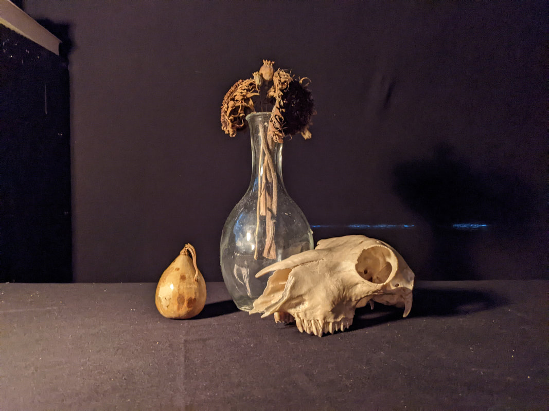
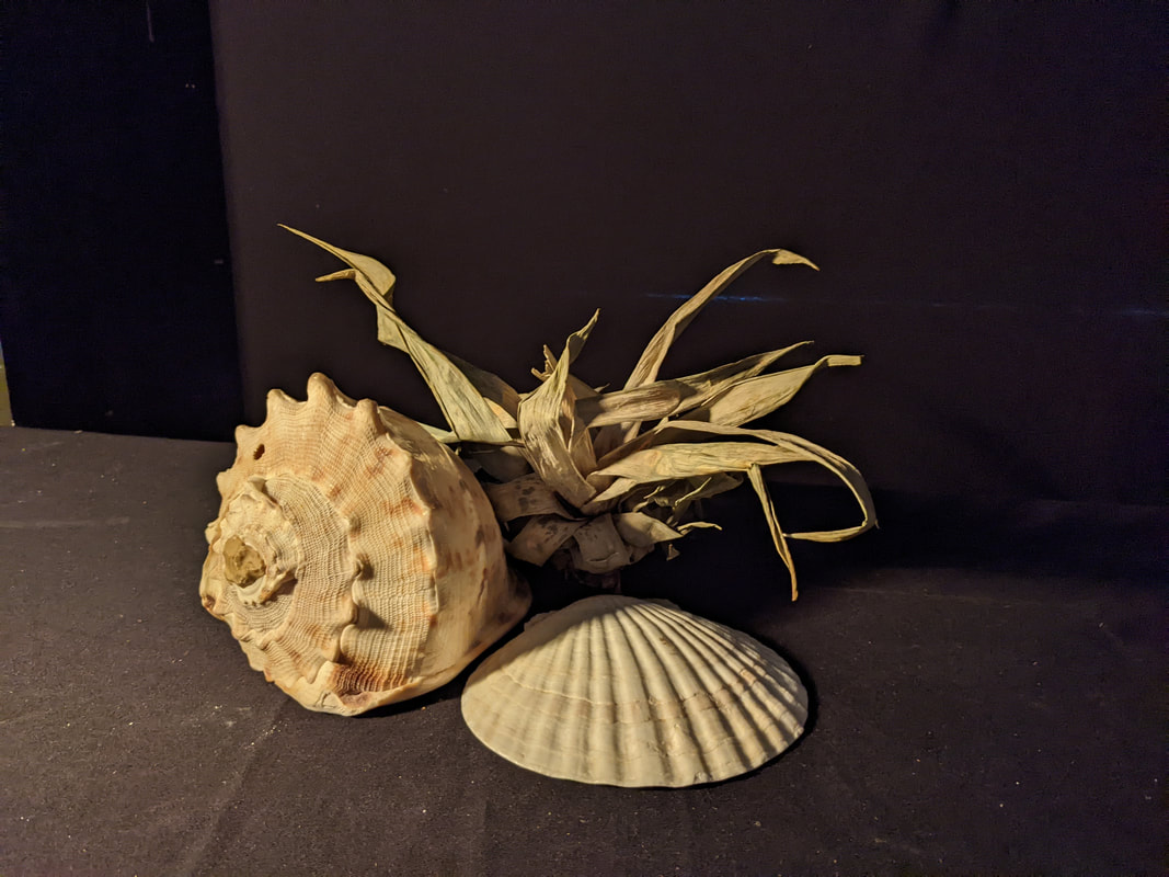
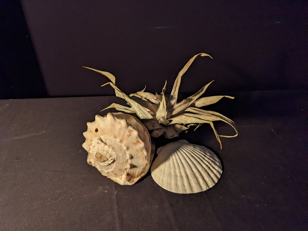
|
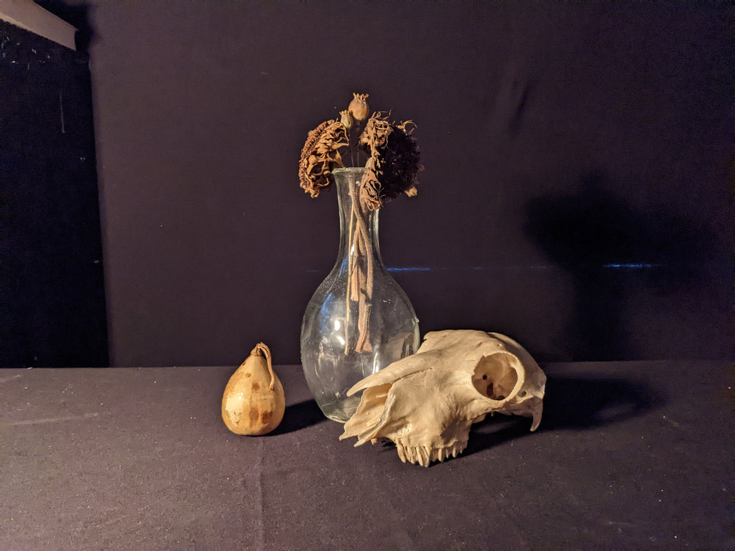
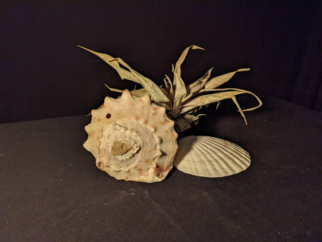
|
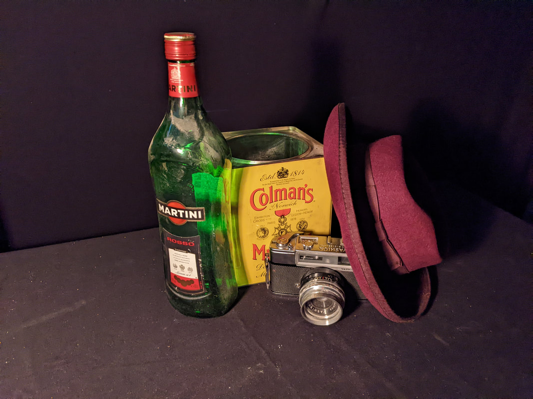
|
Edits
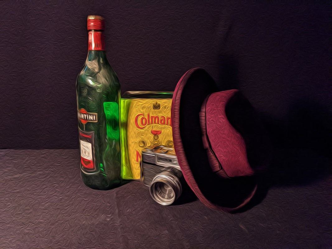
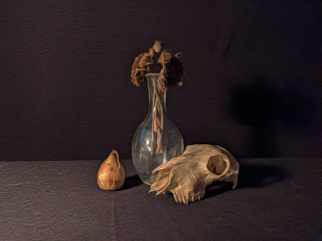
|
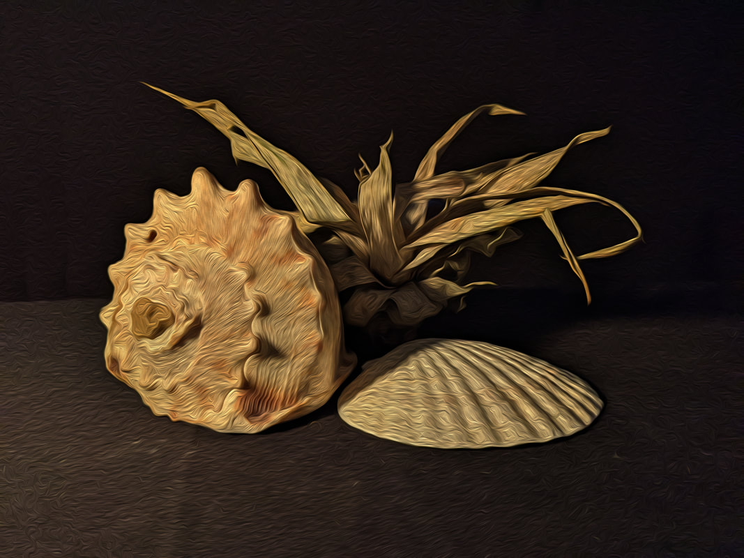
|
Edit Analysis
The main focal point of the edits are the centrally placed objects. These draw the eye as each edit contains different objects used to convey various meanings. Similarly Van Gogh uses this technique in his artwork to draw focus to key objects. The formal elements used such as colour, shape and texture have been chosen to represent different themes and aesthetics but also serve a secondary purpose of simulating the oil paint style of Van Gogh. A host of recognisable shapes can be seen within my edits, however the shape of these objects has been distorted in a way that breaks up the form ever so slightly. In my edits I have aimed to capture a certain theme based on my idea of the concepts. These themes include death, coastal and materialism. I chose these themes as they resonate with me personally, this was inspired by how Van Gogh expressed his inner personal feelings via beautiful abstract artworks. I have represented the themes in a literal way choosing objects that have innate meanings and that represent fractured elements of a persons personality. Death is something every person experiences in some way or another. this theme features objects such as a skull and dead flowers. Coastal is a theme that resonates with me as my family live by the sea. This theme contains a shells and a dry plant. Finally in a modern word materialism is important to almost everyone. This has been expressed in the form of many different items that a person might link to materialism for instance nice clothing, technology and branded items. The artificial lighting used replicates that of the still life genre. It appears dark around the centre, however all the objects are clearly visible. The effect of this is that the image has a radiant effect coming from the centre. Shutter speed was employed in a way in which I could control the amount of light in the image, this generally ranged from 1/60 to 1/80. The piece has been given an oil paint style texture to better simulate the paintings of Van Gogh. This provides a deep texture that is almost tangible as seen by the stoke like dots found within his self portrait.
Final Piece
Shoot Analysis
In this shoot I wanted to develop the idea that during the clash found between and within ideologies their foundations or what they use as foundations are often ignored for pursuit of other means. My chosen example for this was how Christianity is often used to justify and glorify a particular group. Many examples of this exist throughout history including the Spanish inquisition and Norman conquest, both of which used Christianity as a justification for their goals which were unrelated to Christianity. I took a trip to the British Museum to get inspiration for how I would portray a glorious and horrific side to faith as an ideology since they have many religious and cultural artforms showing this. I wanted to find an art piece that displays the excellence of a leader and how he is the puppet master of all that is good vs the portrayal of the real workers and soldiers who are the ones behind every victory and development in civilization. The composition and style in Assyrian art uses size, individuality and pose to portray the importance of a person or what they are doing. The king is always slightly larger, unique and in a pose that indicates he is important. Meanwhile the soldiers/people are portrayed as repetitive and often are stacked to show numbers. Another element to Assyrian composition is the soldiers are always pointing downwards, this is a subtle sign of power as it places the enemy beneath the soldiers. I have incorporated these principles into my final piece by using the idea of individuality for the king and repetition for the soldiers. I decided to link in my previous work featuring Hieronymus Bosch. I was influenced in this shoot by his composition and use of objects to display various meanings such as location and status. The biggest meaning is in the use of colour and location as on side is bright and green whilst the over is colourless and baron. I also used the hand of God images as these greatly add to the significance of status and the idea of heaven and hell as seen in Bosch's triptych 'The Garden of Earthly Delights' where its easy to identify which panel is heaven or hell due to the symbolic objects and colour used.
Assyria Reference
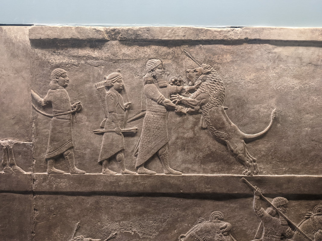
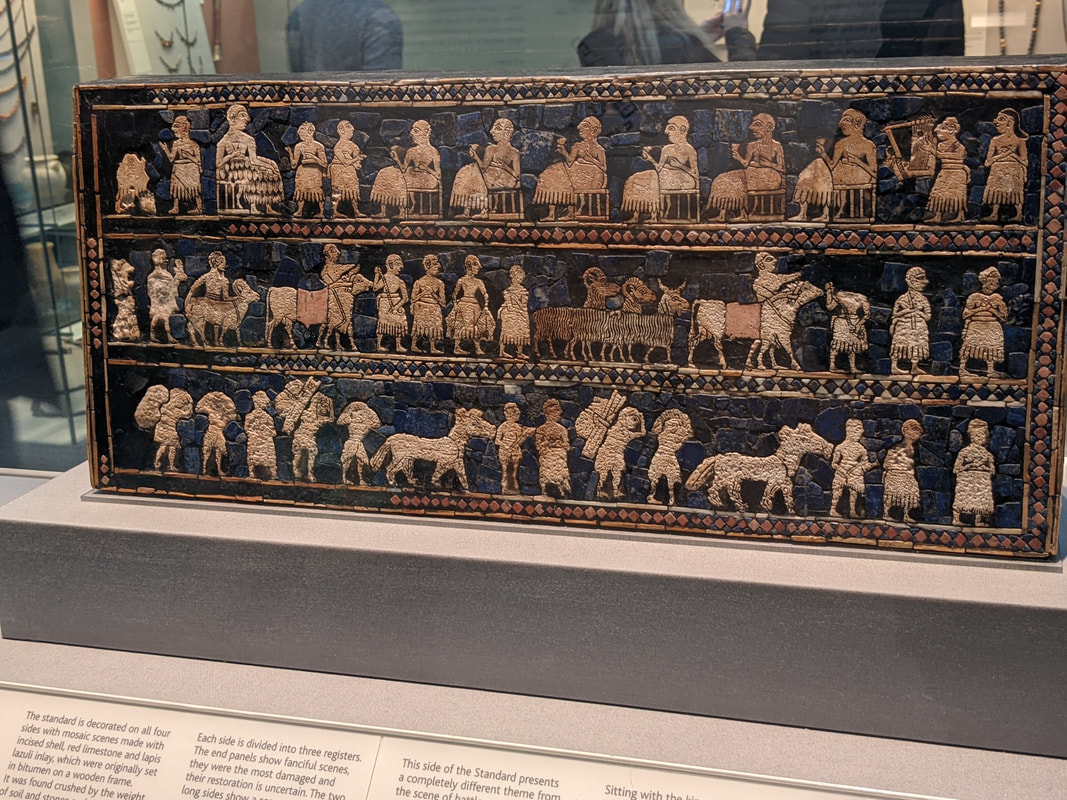
|
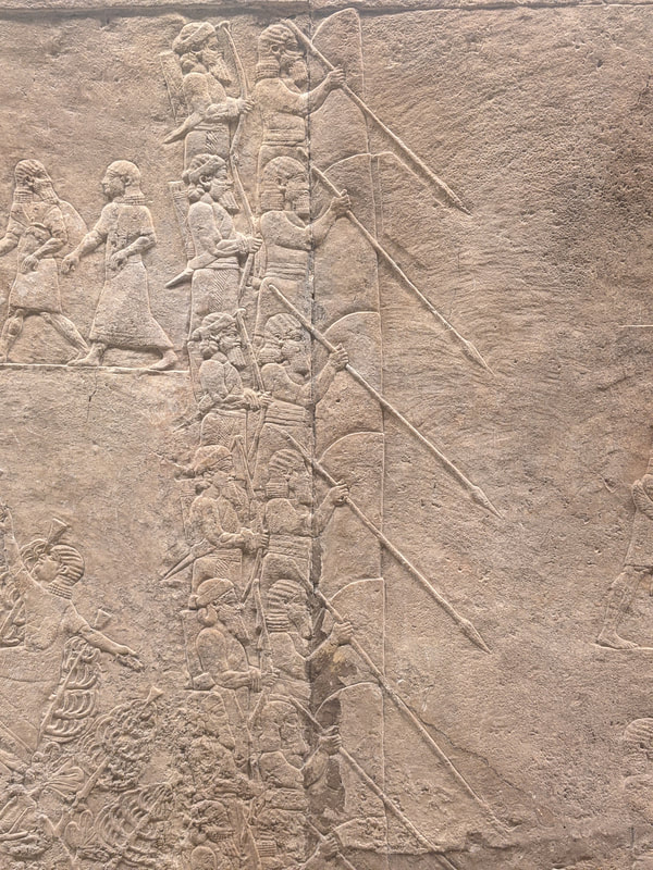
|
Final Photoshoot
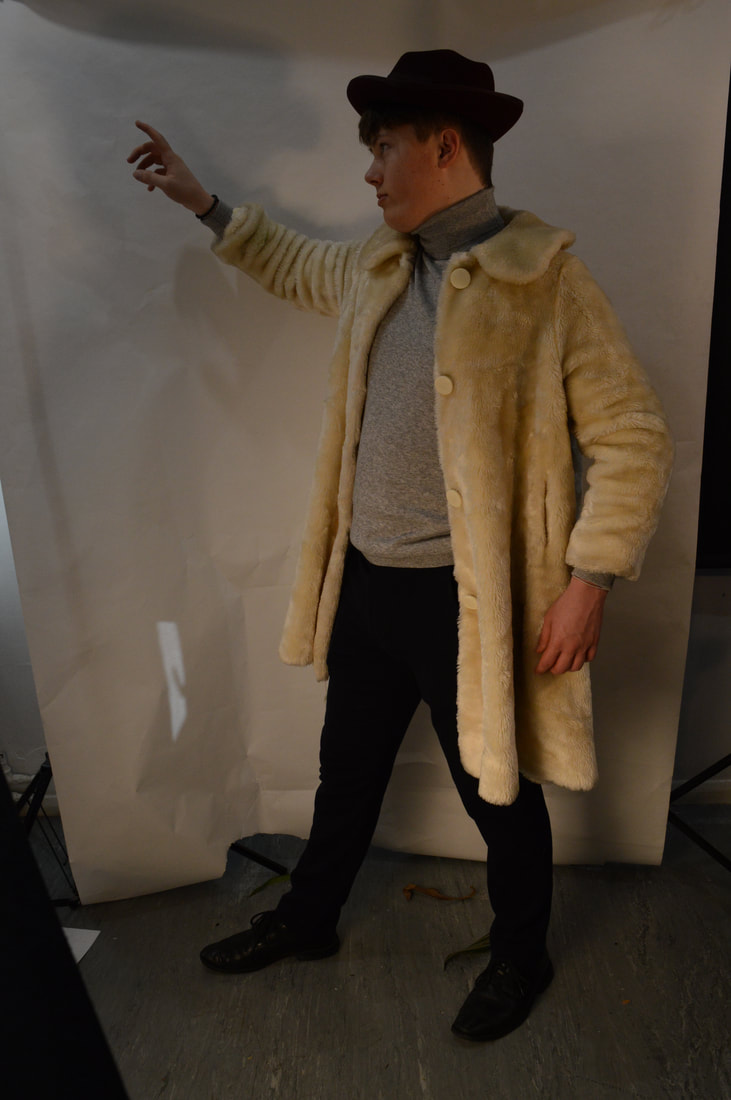
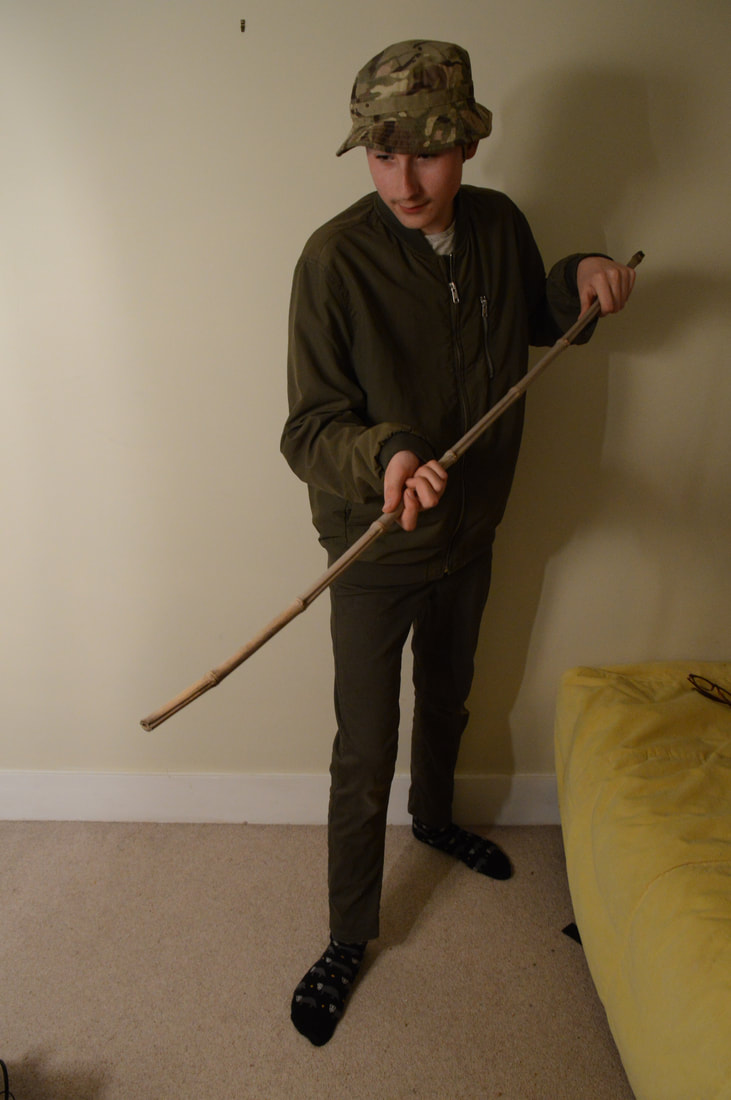
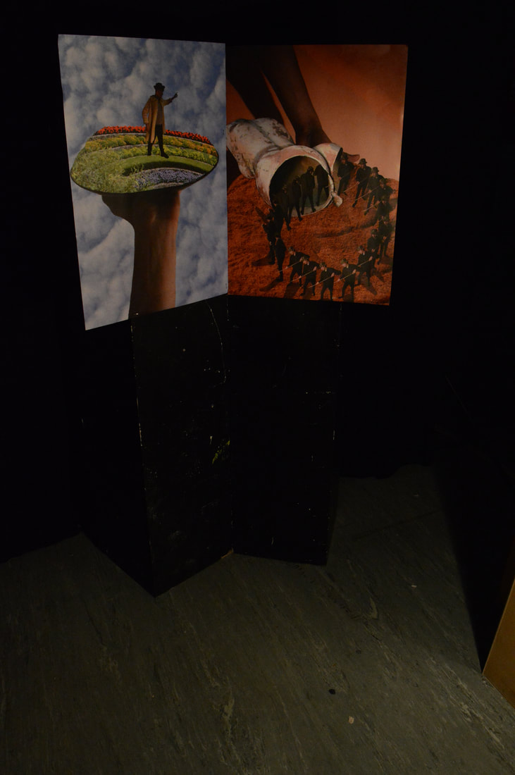
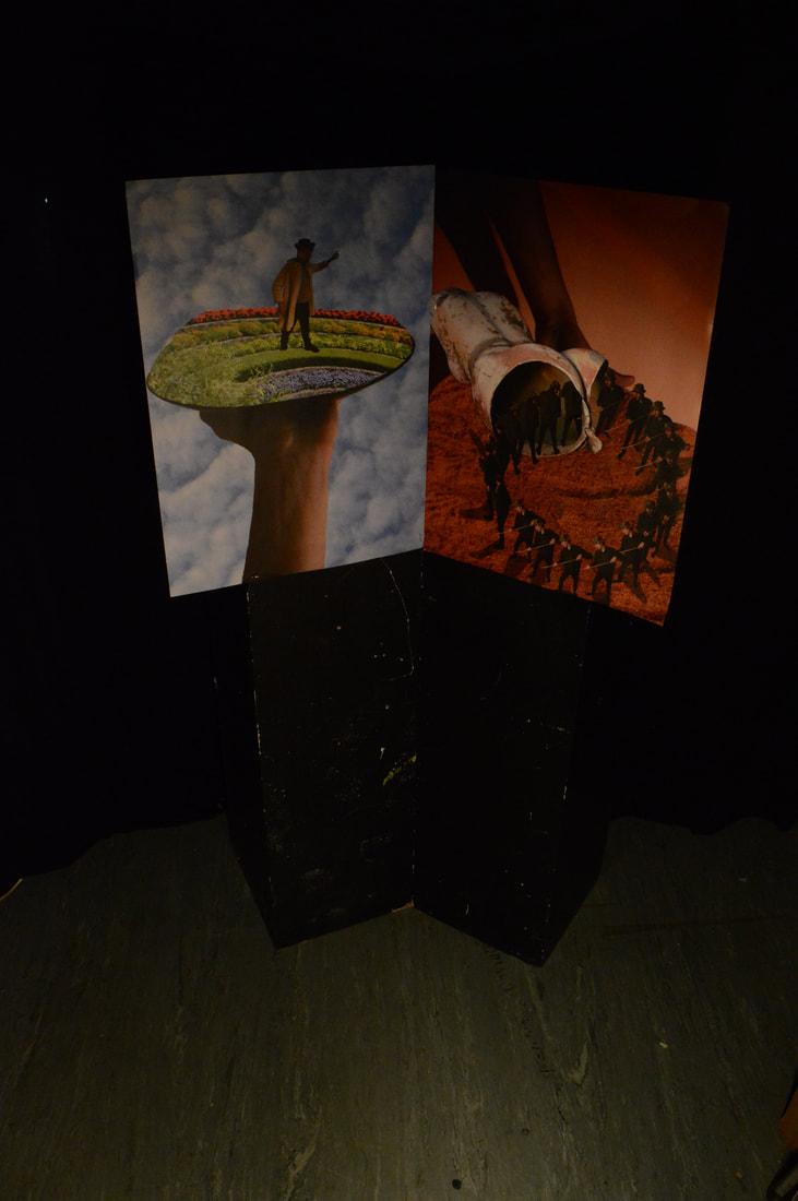
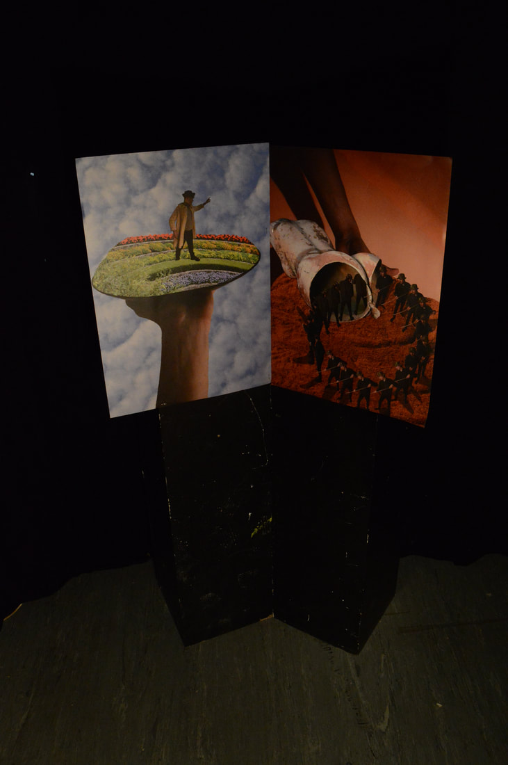
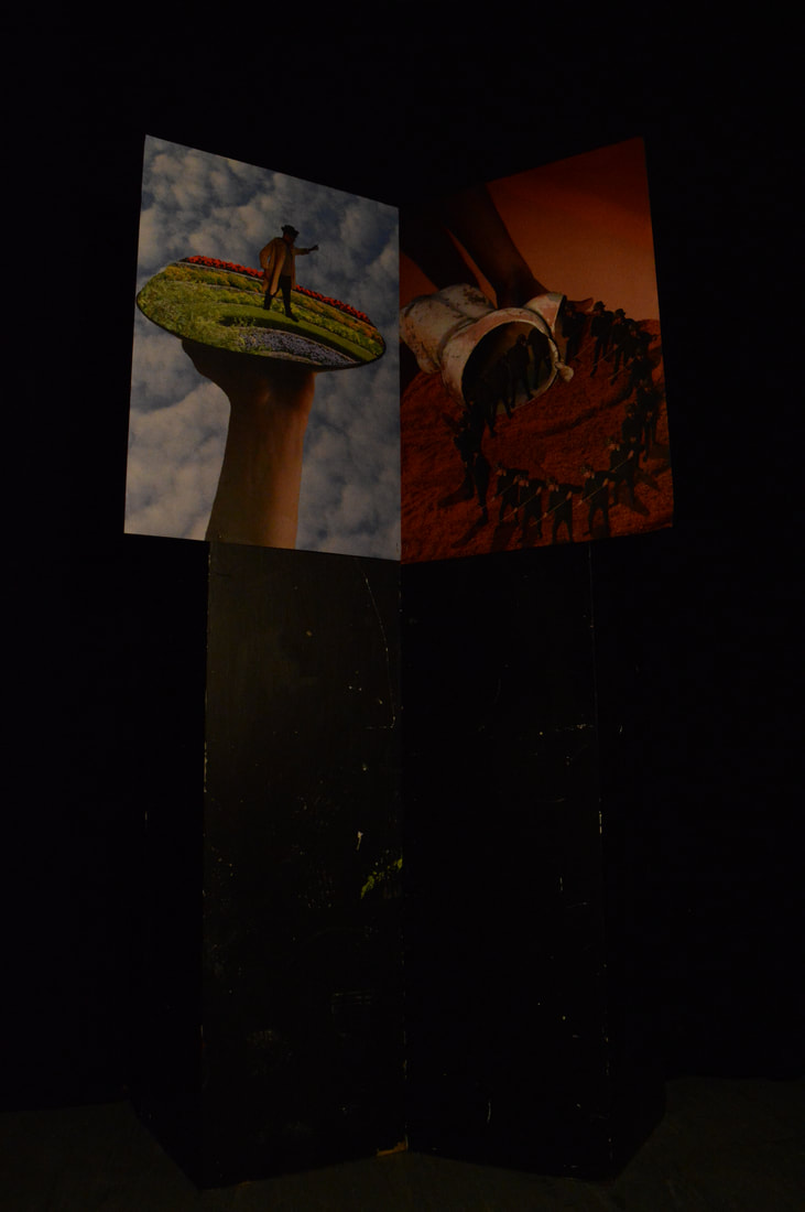
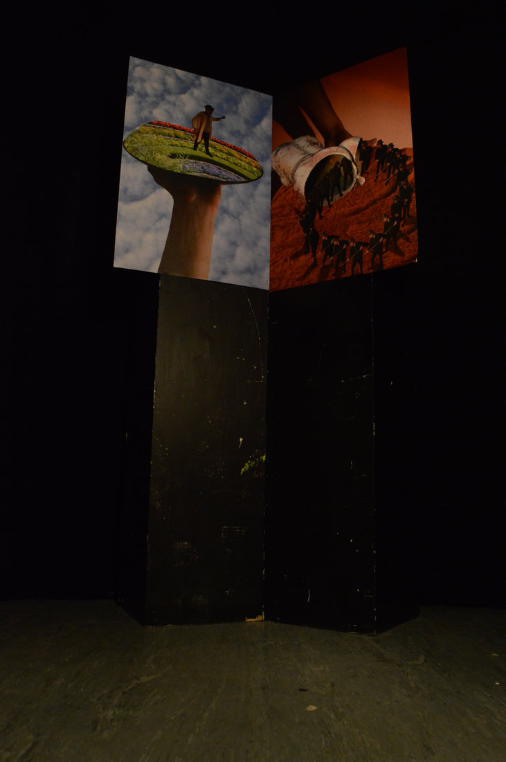
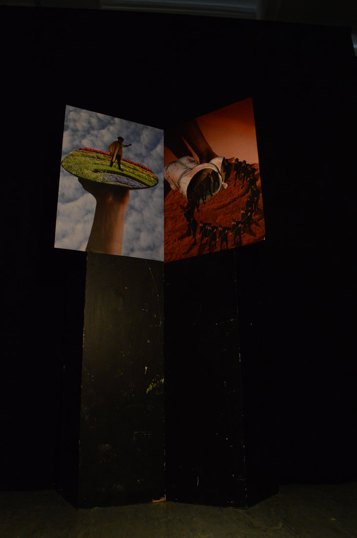
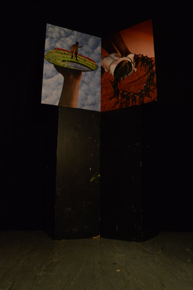
|
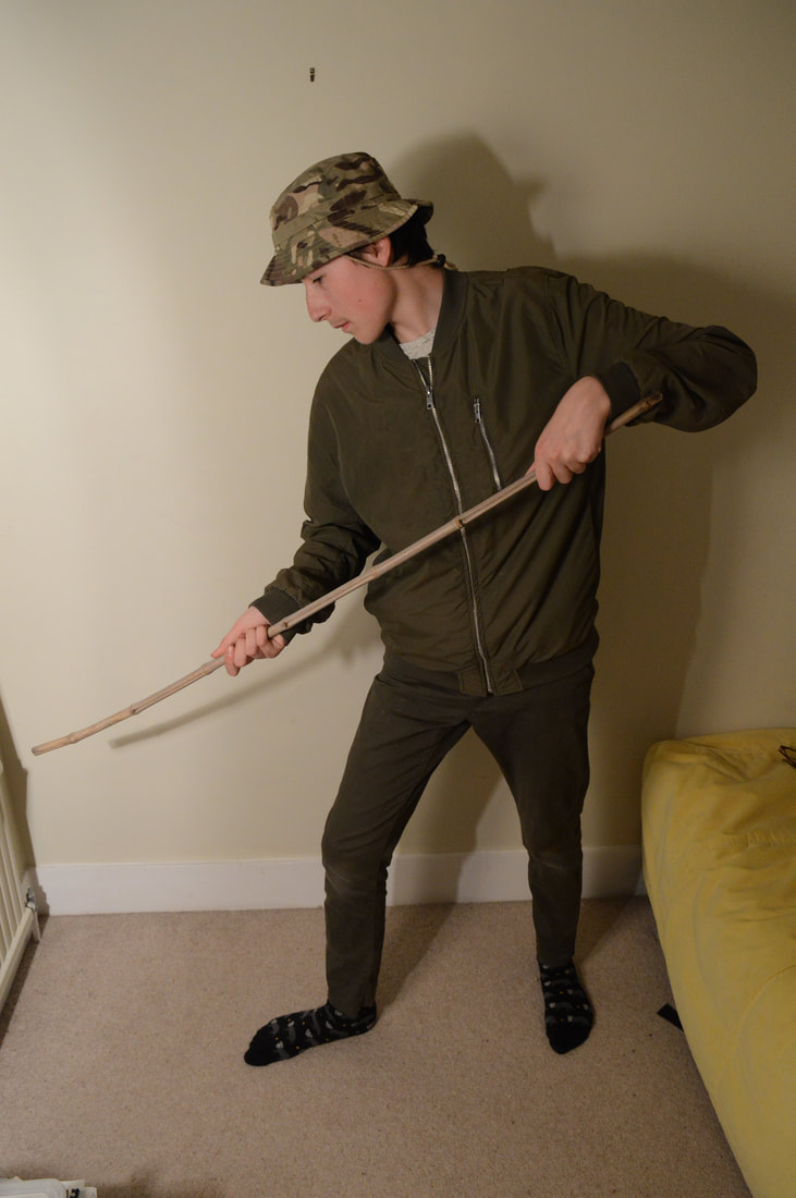
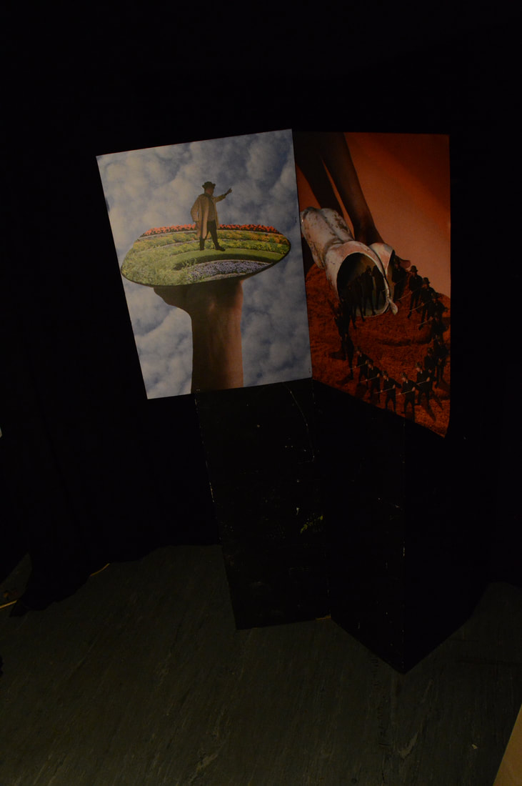
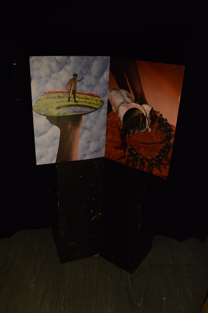
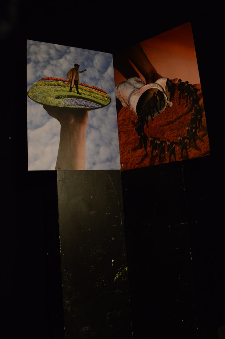
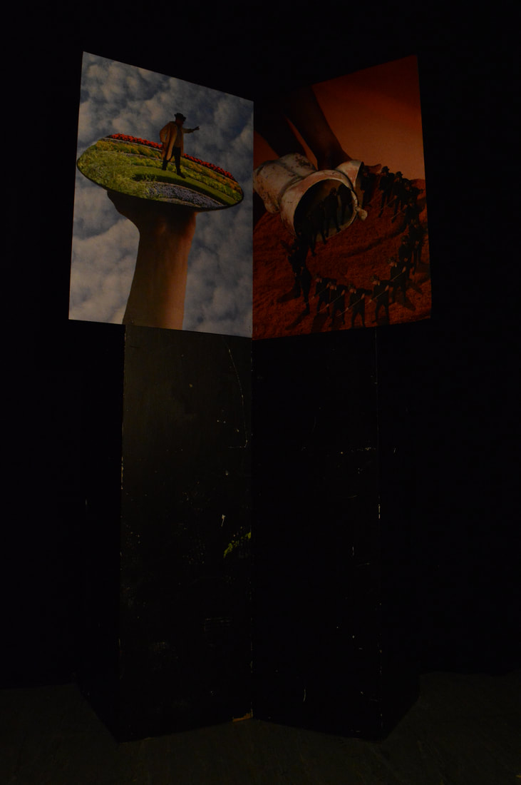
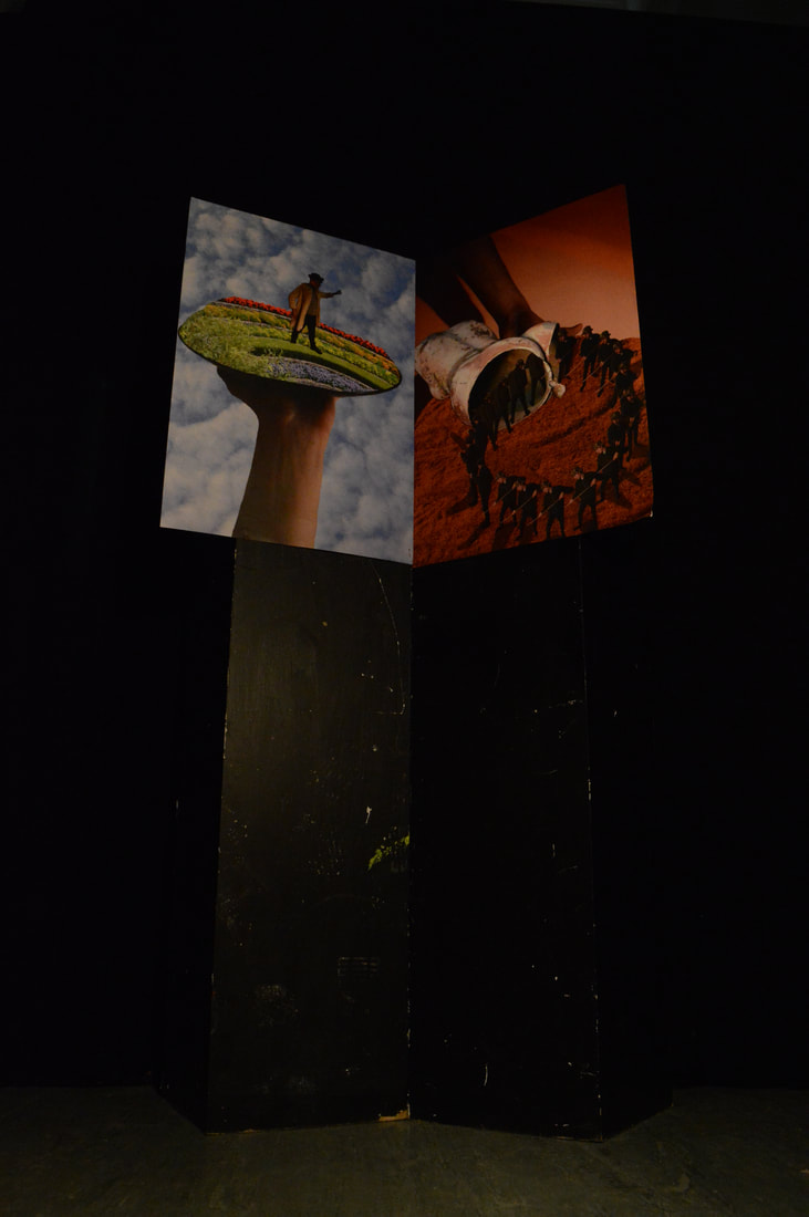
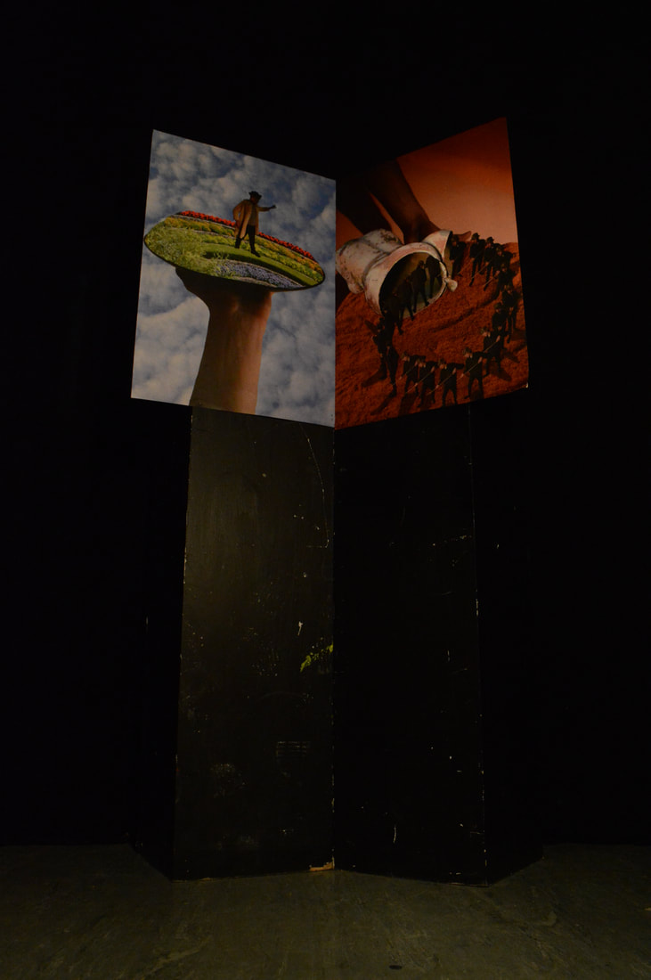
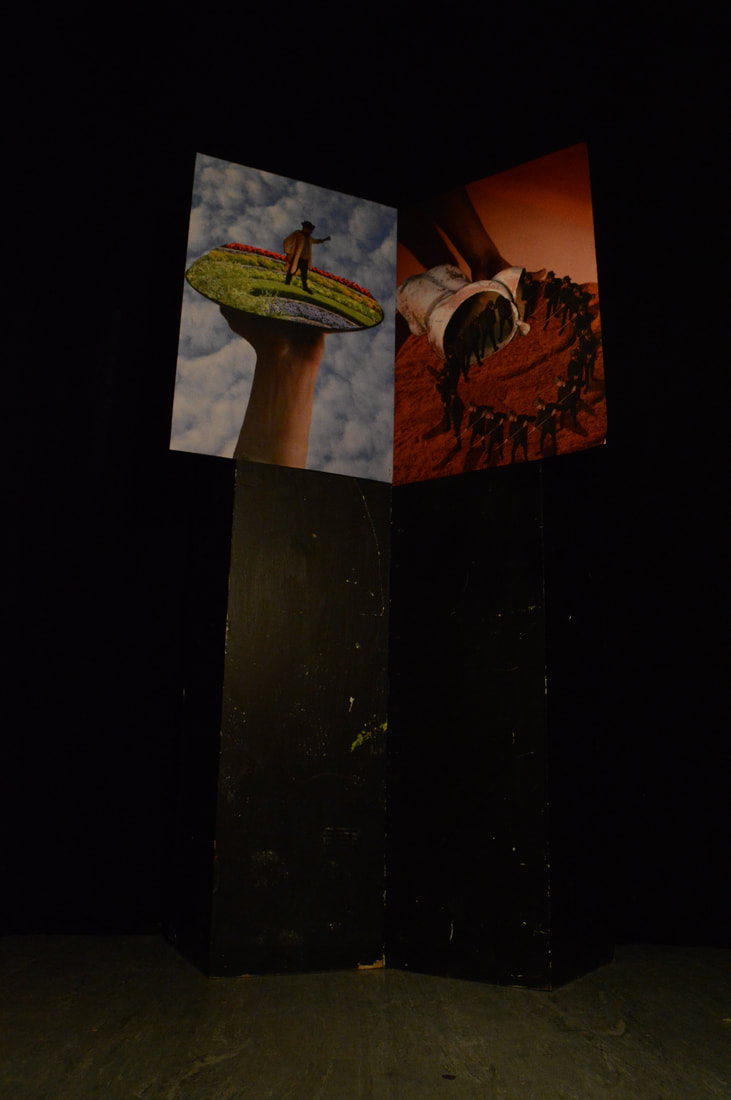
|
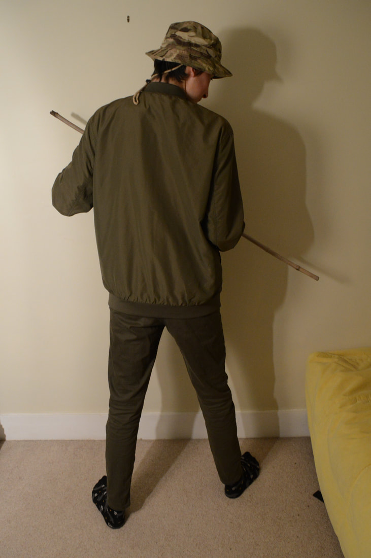

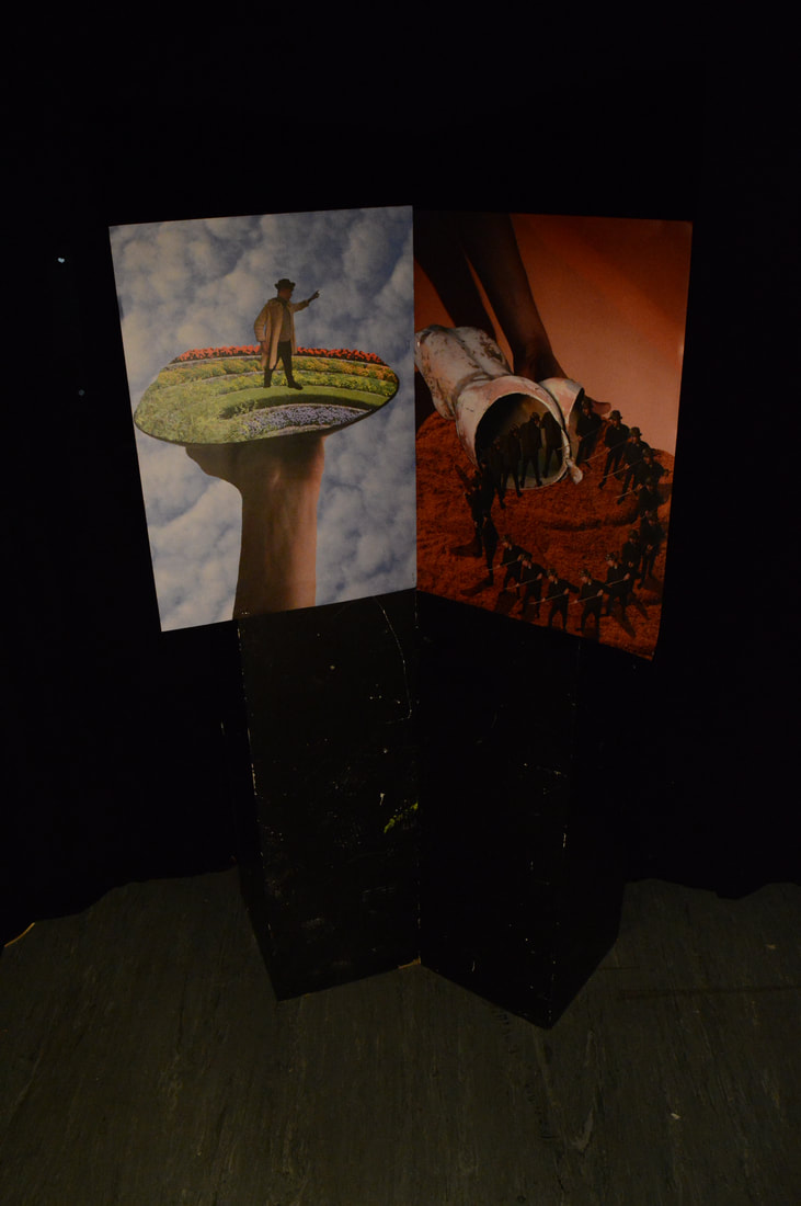
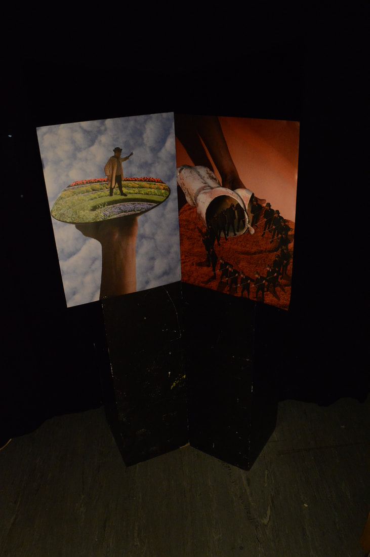
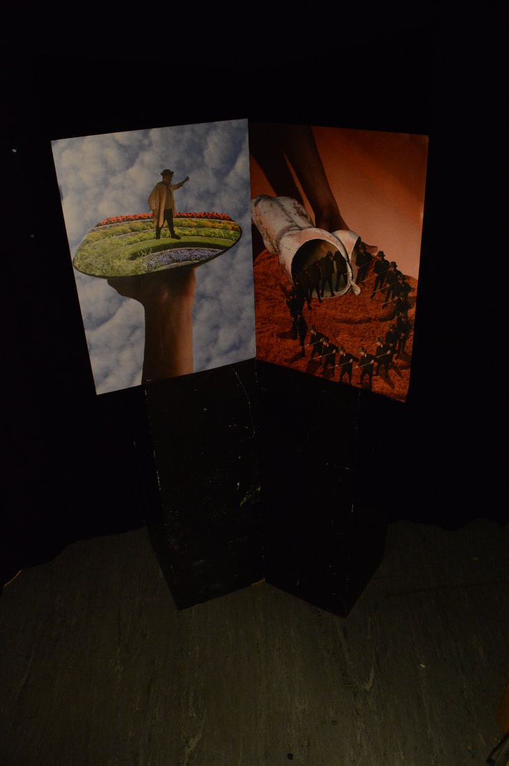
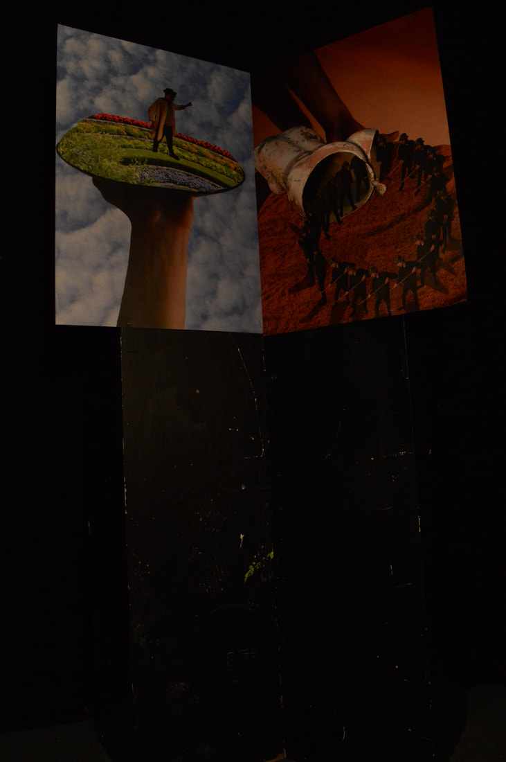
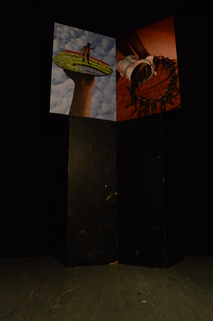
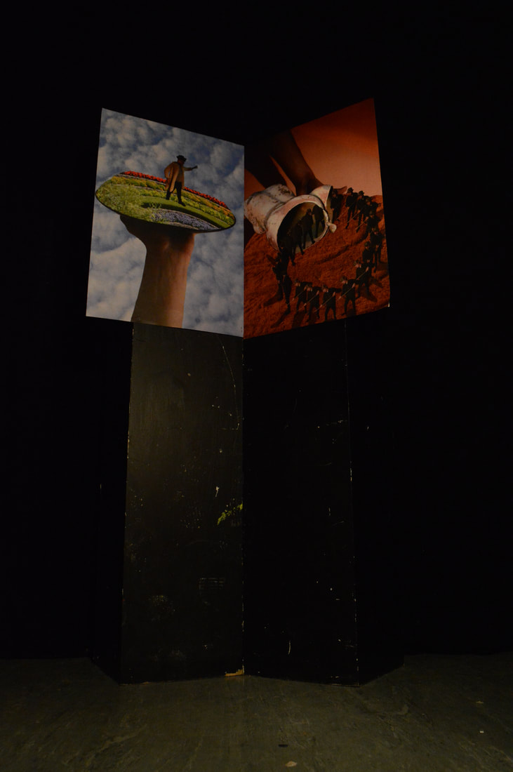
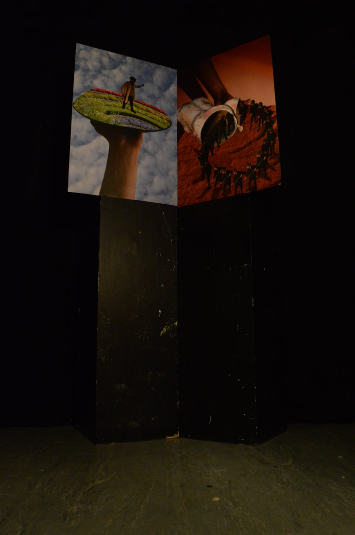
|
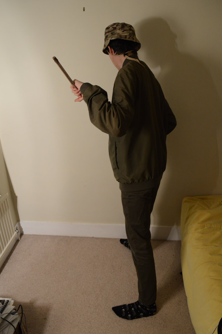
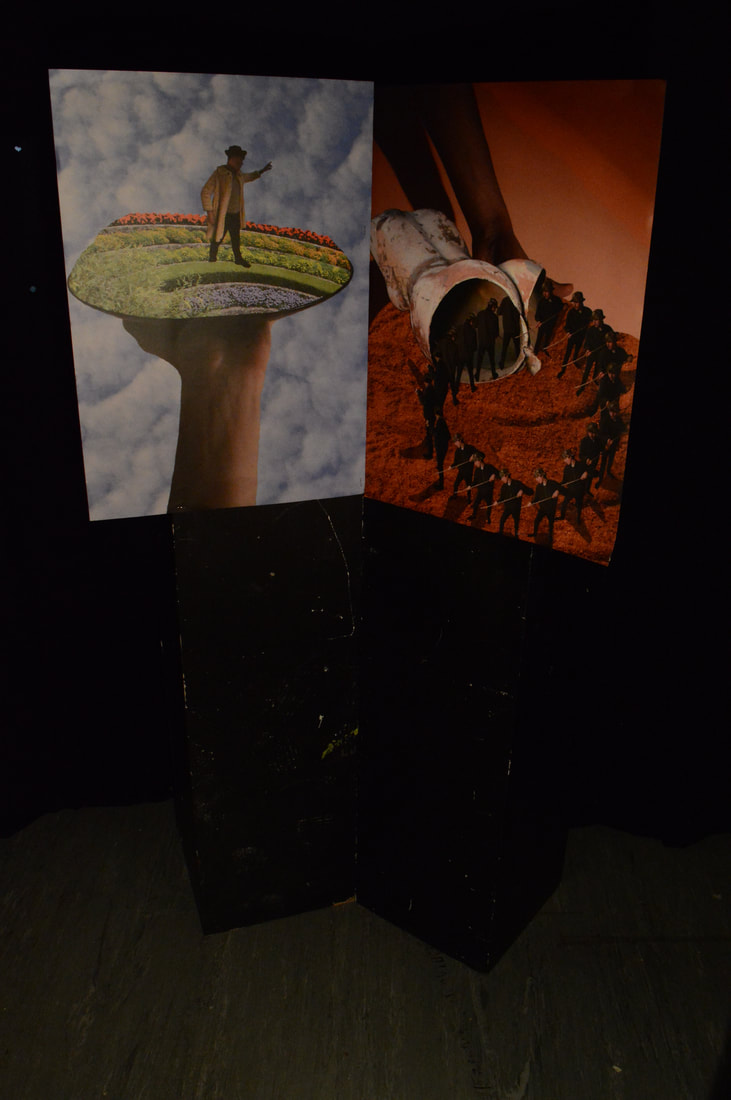
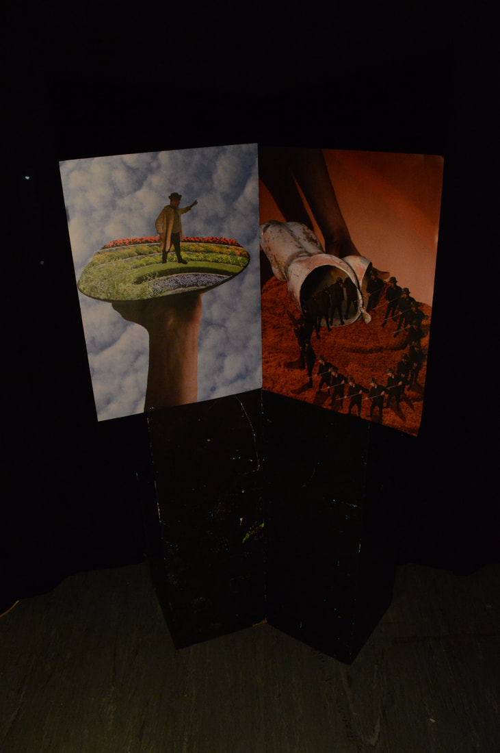
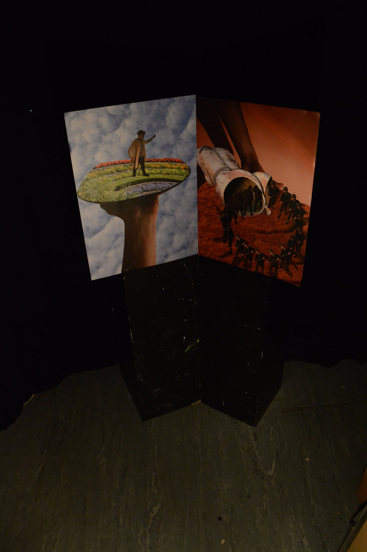
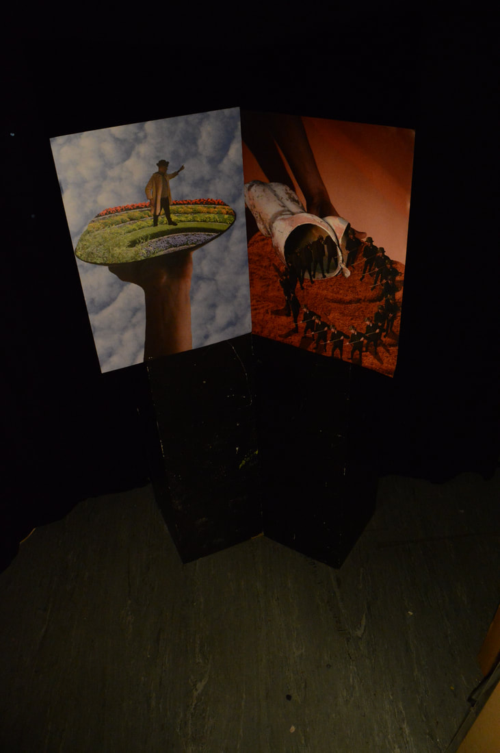
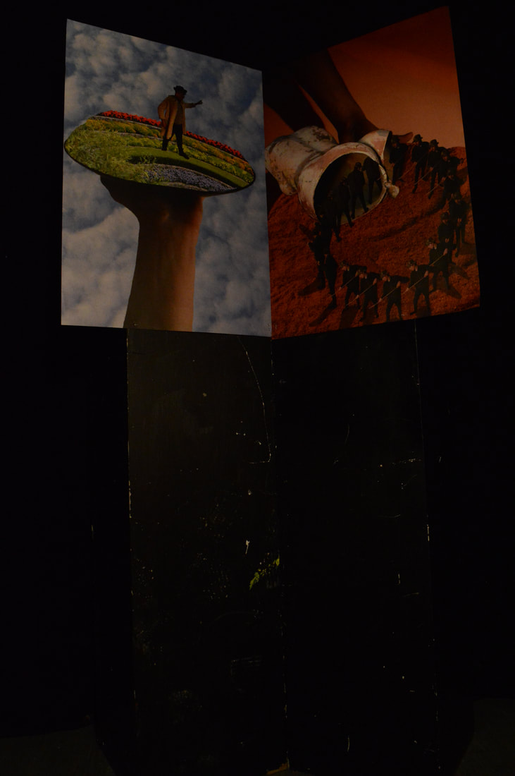
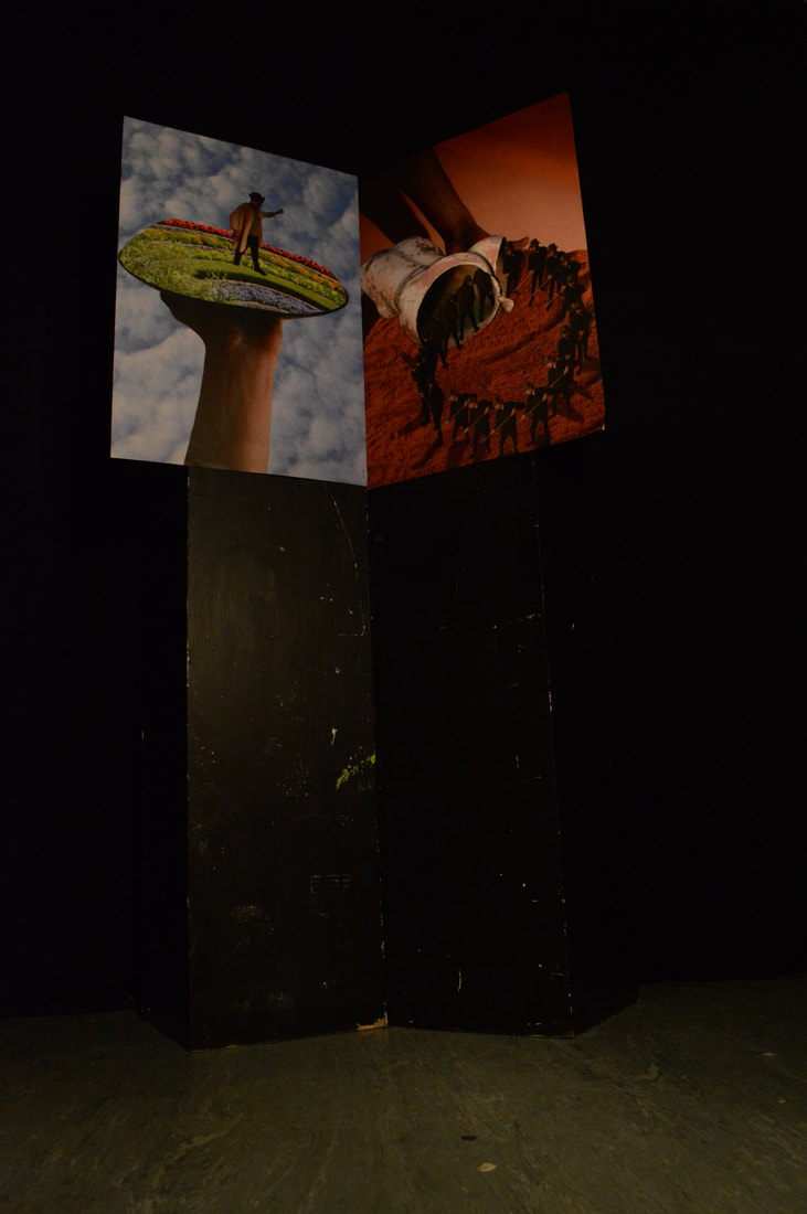
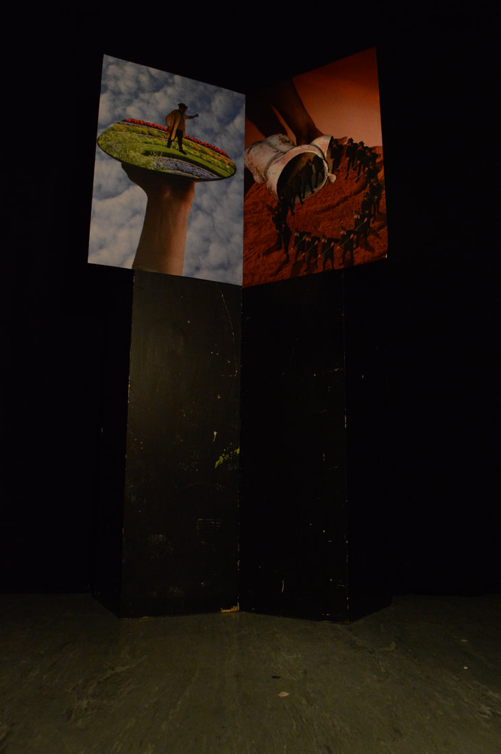
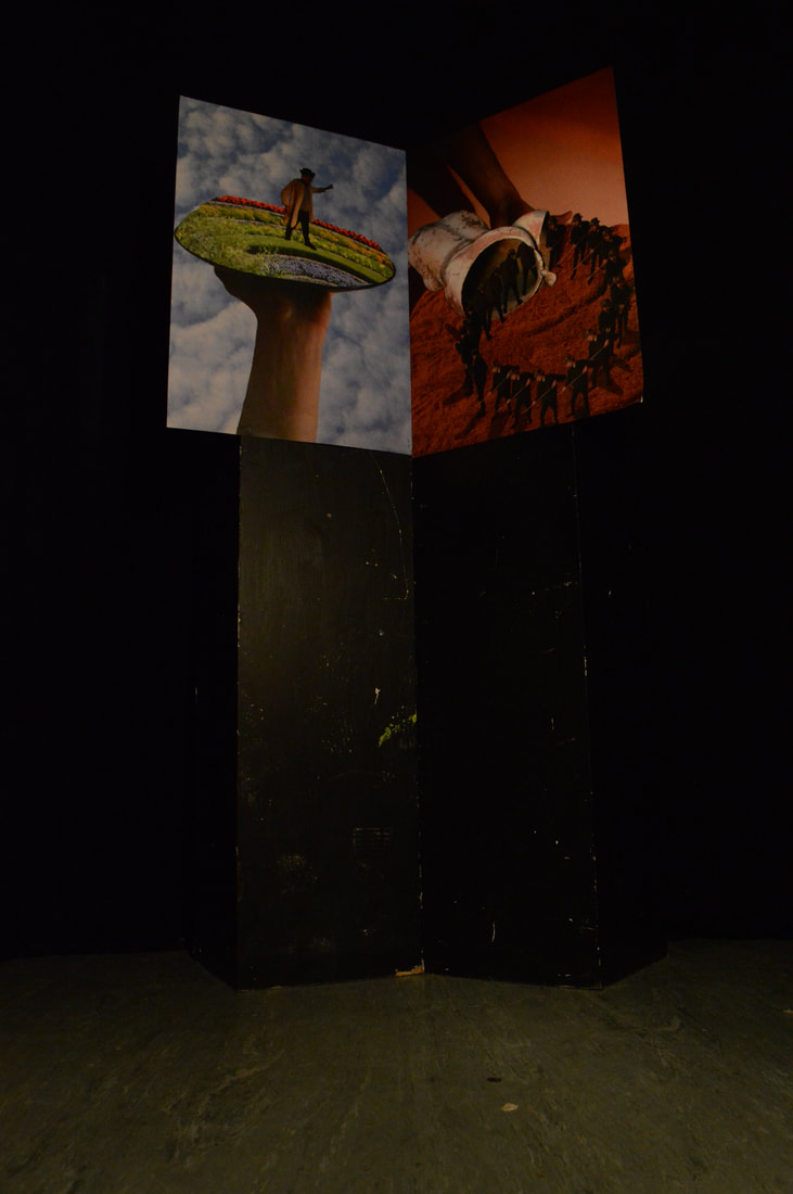
|
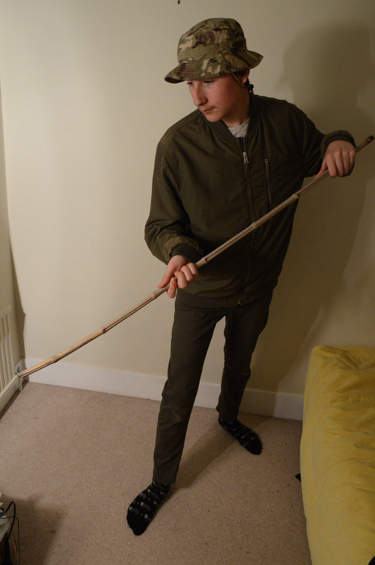
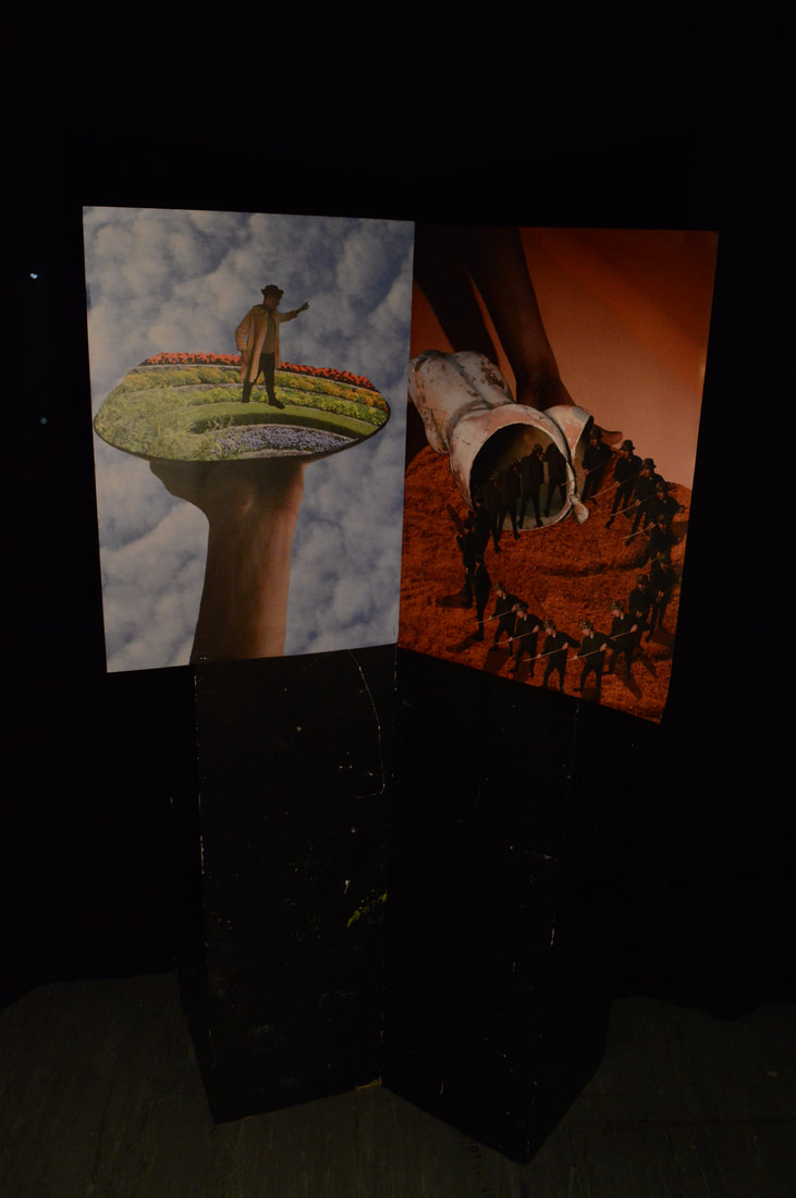
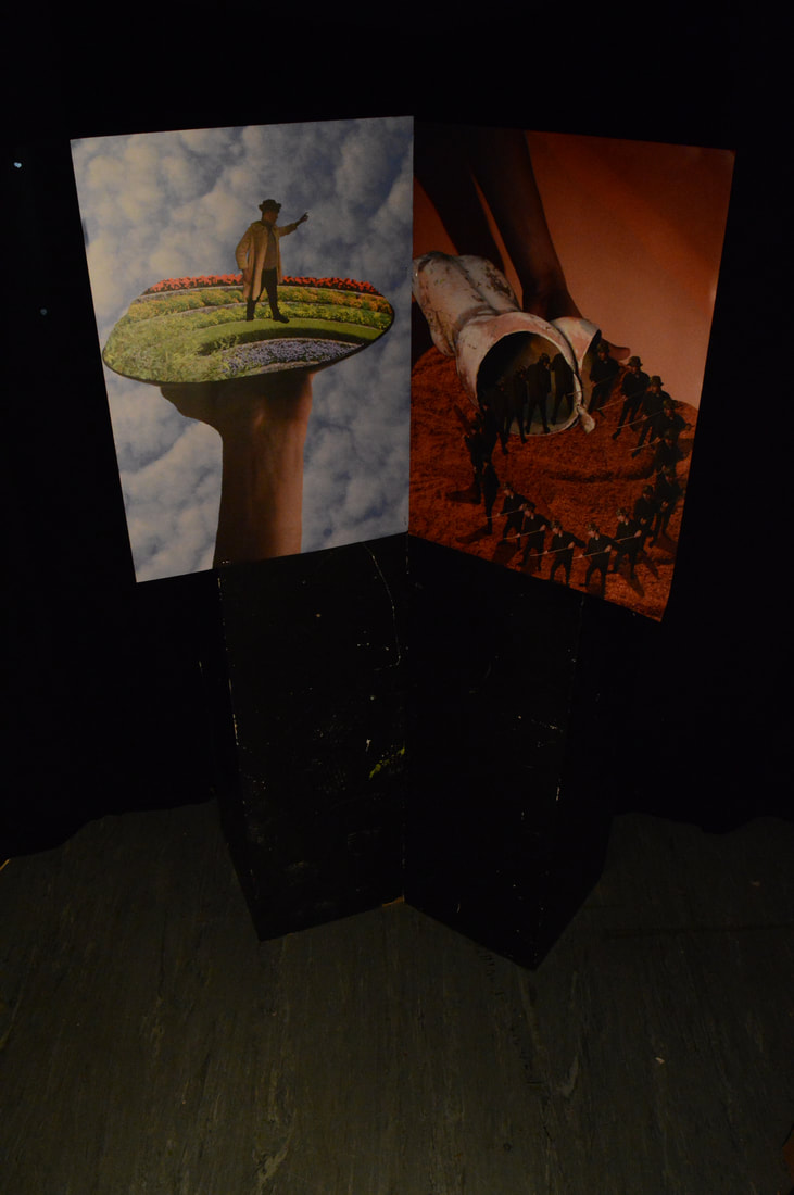
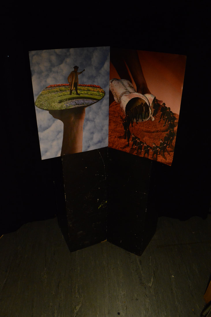
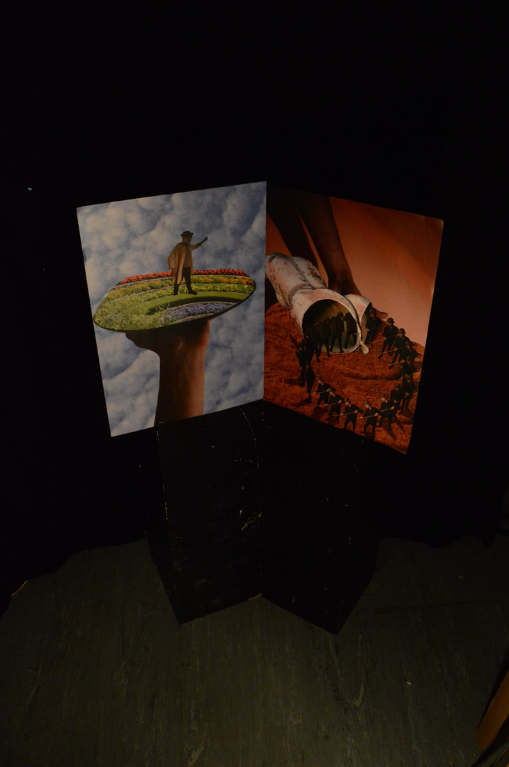
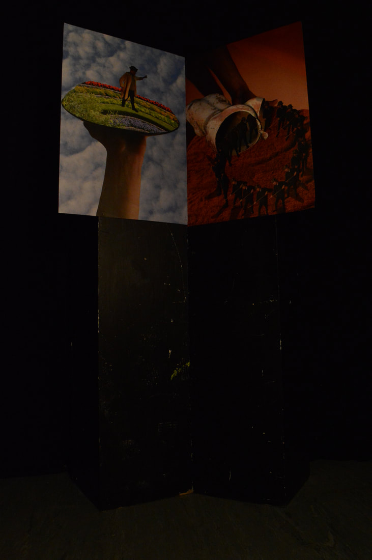
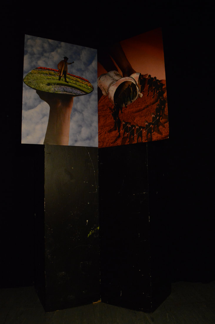
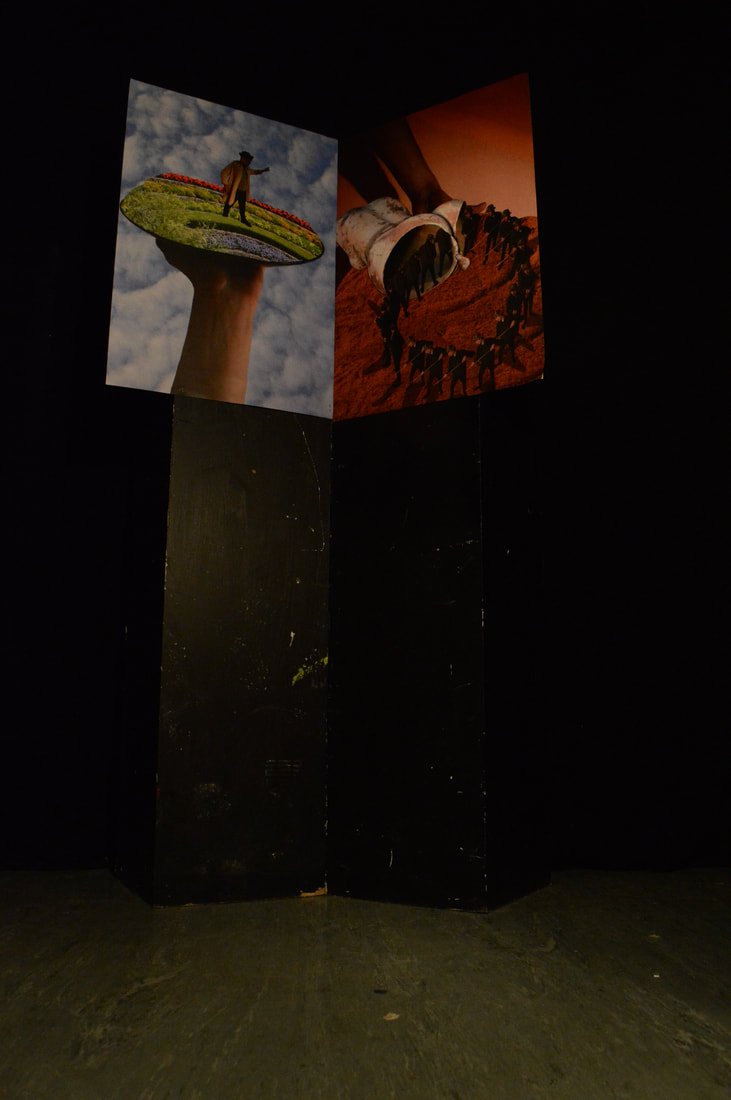
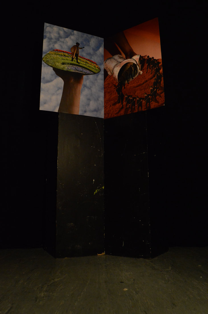
|
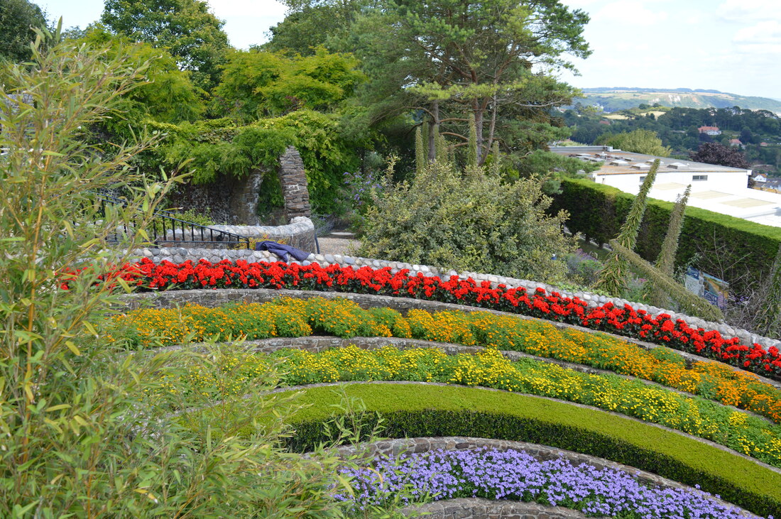
|

|
Edits
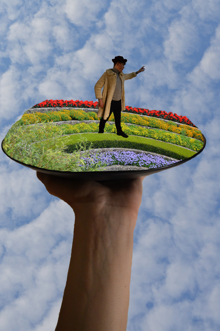
|
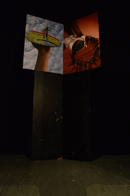
|
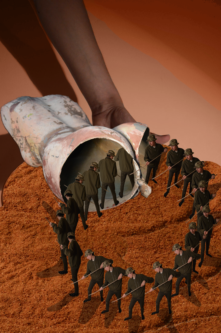
|
Edit analysis
The main focal point in the images is the use of circles in each of the components of the final piece. The composition in the image has been used in order to draw focus to these circles which are key to the pieces narrative. Firstly the central placing of the narrative in the image signifies its importance and immediately draws the viewers eye apart from the central cross which has been placed lower to subvert its importance. Secondly the composition has been employed in 3 distinct layers forming a horizon background, centre and foreground in the images flanking the cross. This forms a diptych, a technique widely implemented by the church and religious artist. This is different to the commonly used tripdych as seen in Francis Bacon's work and Bosch. The 3 elements or layers of the pieces composition allow the piece to be divided and create a hierarchy in which the central layer holds the greater importance and detail. This use of composition was inspired by the same technique used by the great painter Bosch. The individual layers have different colours, scenes and a hierarchy breaking up the piece into digestible narratives. Similarly to Bosch I have used a central object in the form of a cross. However where Bosch has an exactly central object in which all composition is formed, I have decided to place my central image below forming a triangle shaped composition. Colour plays a key role in the creation of the images narrative a symbolism. The left image features bright colour emanating positive emotion and one of perfection as seen in the Garden of Eden. Greens and blues symbolise life, growth and glory. Upon the green garden the leader has been placed, the immediate assumption is that this must be a positive leader who brings prosperity and greatness. This is the first element of the narrative as the leader represents how propaganda, historical context and other subjects form to create the opinion of the time, place or person. This was inspired by how Soviet propaganda portrayed its people and leaders as great omniscient being who ran their nation perfectly under the influence of a certain ideology. This portrayal in a historical context is false of course as the creation of the communism ideology brought suffering and lack of moralality. This is what happens when faith and guidance from moral ideologies such as Christianity are forgotten and left in the dust. This leads to the second element of the piece which is the cross created from shadow placed under the two images. This represents how often the true teachings of faiths are forgotten due to historical context, time or people. For example during the Spanish Inquisition a blatant lack of Christianity was displayed. The shadow is unimportant and below the two bright main images displaying the two sides of ideology.
Final Piece Analysis
All my work in abstraction culminated in my final piece, its creation represents the 6 artists specifically related to the final piece and all artist that came before that. The grounds forming the basis of the final piece was the themes of religion, ideology and portrayal. The earliest development began with looking at the biblical story of Cain and Abel, which represents two sides to faith and humanity. Both brothers have different ideas of what having faith in God looks like, this leads to Cain's violent wraith ending in the murder of Abel. This story forms the genesis of my final piece as it sets the foundation for faith and its portrayal in art.
Mariotto Albertinelli was my first installation in the 6 final artists. I chose to look at his art work as it was contemporary and portrayed biblical narratives in a stereotypical way with little heavily abstracted elements to the story. I mainly scrutinized the Cain and Abel artwork as this was the launching story for my final piece. In this artwork, I found how the artist had used instances of colour, light and objects to convey the meaning in the Cain and Abel story in a simple way. The key element to the artwork was the 50/50 divide caused by an invisible centre line, which purpose is to seperate each brother and display each side of their story in relation to their faith. Abel is lighter than Cain and has a light beam aiding his fire signifying that he was given Gods favour, he also is in a position of prayer and is at ease. Cain on the other hand has darker clothing which is further being blackened by the smokey fire blowing back in his face. His expression screams resentment and hatred towards God and his brother. The two sides of the story are portrayed here clearly and present two sides of an approach to faith.
Next was Ernst Barlach who was an artist that portrayed war during the early 20th century. His importance to my final piece was paramount as his personal narrative provides no better example of the effect of portrayal on an artwork. He began his art career as a supporter of war, this is best seen in his sculpture charging forwards representing the unstoppable force of the German military. He would later become an anti war artist with works that present the theme of war as horrific, this can be found in the refugee sculpture. Barlach's art would later be classed as degenerate by the Nazi regime as he was not in support of the cult of war found in Germany at the time. This inner personal conflict helped my final piece develop as it showed me that portrayal is not always obvious and interpretations can change multiple times.
I then progressed onto Marshal Arisman, an artist whose work is iconic in the media and for its dark themes. His many installations cover a wide range of themes, the most important of these themes in relation to my work is humanity, religion and identity. Another key aspect of Arisman's work is the simple use of colour to portray the theme of a piece, this often is shown by colours such as crimson as seen on his American Psycho artwork. Arisman has been pivotal in the development of my final piece as he has inspired me to consider representations of themes in relation to colour and the power a simple use of a single colour background can have.
After that I moved onto a Soviet propaganda artist called Viktor Semyonovich. His work is some of the best and most iconic propaganda from the time, he was a master of his craft. I needed a propaganda artist since manipulation of the truth and portrayal were two subjects I wanted to look at to aid my final piece. Who better to study than the works of a propaganda artist, who uses techniques involving iconography, colour and composition among many other elements in order to craft a piece that targets people and enforces particular beliefs upon them. However a major flaw with Soviet propaganda is that it only appeals to those in the Soviet union and who has an inkling of self consciousness can determine its rather simplistic use of iconography; that could even become iconoclastic due to its ridiculousness. I will use the lessons learnt from looking at Soviet propaganda to form my final piece as a lot of useful information and use of artistic techniques can be found in the art that portray a specific narrative. This also led to me looking at postmodernism as it opposes the rigid use of distinct iconography such as the hammer and sickle.
Finally I looked at Vincent Van Gogh to draw a conclusion to my artists used to develop my final piece. Van Gogh is an artist whose personal struggle us what drove his beautiful artworks. The beauty is in stark contrast to his depressing life which led to his suicide, this is inspiring as this theme of personal struggle and how its portrayed in art in a relatively common theme artists use to create a unique form of expression. His use of colour and composition is another very important aspect of his art I used in my final piece. Mainly the placement of objects and compositional elements is what I took. The most influential being the prison scene, in which the prison owners/guard break the composition; forming a very interesting compositional narrative.
Abstraction Evaluation
My journey into abstraction first began with my exploration of Andrew S Gray, a photographer and artist whose artwork features the distortion of landscapes and some religious structures in a surrealist style. I found that this first entry in my abstraction journey helped me to understand many key elements of the theme such as colour, form and distortion. I aimed to incorporate aspects of formal elements such as colour, form and distortion which create abstraction, this can be seen in artists such as Gray and Turner. Both artists formed the basis for my investigation into themes like abstraction and surrealism that create a strong sense of faith or religiosity in the imagery. They also channel the style of creationism in which the beauty of nature is expressed via captivating landscapes. My responses to these artists allowed my work to focus on developing distorting an image and emphasising this factor through camera control settings like shutter speed which results in having a great deal of control when it comes to how I wish to distort the image.
I next moved on to look at an artist that embodies both the entire theme of abstraction but adds a twist of mathematics. Mc Escher helped me to better understand how the theme of abstraction can be combined with unique elements such as mathematics to create a simultaneous theme that make the artwork instantly recognisable. The main thing I understood from Escher’s work is that a focus on particular formal elements can define a piece. Escher’s artwork is described as being produced via simple means with a real focus on shape and tone as opposed to colour or texture. The effect of his method is an awe-inspiring abstract piece with great complexity whist also making use of the simplistic nature of drawing. Another key element to Escher’s artwork is the techniques found within the artwork that provide it with complexity instead of use of materials. The tessellations and shapes are used to an incredible effect, this effect creates the composition of the piece as often a triangle will form the centre piece of his works. I have learnt that this obvious use of composition can influence my work in the way I position shapes to create centre points and compositional elements.
After looking at an illustrator, I decided to look at someone that works with expressionism and the human form under the theme of religion and personal emotion. For these specific themes I chose Michal Macku, a Czech photographer and artist whose work is deeply personal and linked to exploring human form and emotions. Similarly, to Escher his work makes use of tone instead of colours to display detail. Tone is combined with powerful emotional imagery of the human body to create a piece that expresses the themes of religion, humanity and individual emotion. What I learnt from Michal Macku and in my response was the understanding that in a movement like expressionism, form plays a great part in conveying a number of themes. For example, religion is best portrayed through humanity as it’s a creation of humanity, however as I have previously discovered through Turner that creationism is another way in which religion is explored outside of the human form. When moving forward I need to consider the way in which I want to display a theme such as religion, because this will impact the way in which my artwork is perceived by viewers. Macku’s approach is deeply personal and connected to him whilst Turner’s legendary paintings speak to so much more than humanity in a religious context.
My abstraction journey was now taking a turn as I began to notice a trend featuring the theme of religion, surrealism or spirituality in my work. So, after making this realisation I aimed to find an artist who has a deep connection with Christianity in their artwork and personal life. I chose to look at Francis Bacon, who is arguably one of the greatest religious and abstract artists in the world. His style is hellish and not what one would first at first consider Christian. His artwork to some would probably it considered heretical and in no way linked to Christian teachings. Francis Bacons artwork comes from his personal insecurities as not only a Christian, but a homosexual in a time when this wasn’t accepted by the law let alone the church. This troubled Bacon as he met inner conflict for something he didn’t make decide. This resulted in his intense impasto painting with dark crimson and horrific gory imagery. His command of colour to portray humanity is like nothing else as it emanates emotion that can be perceived as his hate, suffering and love even. Even artists of the medieval period who illustrated hellish realms were not akin to Bacon. From Bacon I gained an insight into how in art a subversion or abstraction of something can lead to unimaginable imagery with so much detail, narrative and emotion to unpack. Most importantly I gained how important colour is not only conveying emotion but also creating a subversion of typical expectations in genres such as Christian artwork which typically is bright, glorifying and closely follows biblical narrative. Bacon subverts these typical themes via colour but also composition that replicates that of Christian art. This being seen in the use of 3 and triptychs to represent the crucifixion.
My next artist Wassily Kandinsky helped me delve into the realm of the spiritual and of the connection between very personal issues such as his synesthesia. his artwork posses a hidden narrative that is complex, intricate and intriguing. His intertwining of shape and colour form a magnificent piece that that I would describe as the very meaning of abstraction. His technique is unique and makes you question how each shape and colour relates. Kandinsky was a key artist in my abstraction journey as his art is truly unique in the art story. From looking at his artwork I further understood shape and colour and how to create narrative and abstract meaning using these formal elements. I also considered how I can use objects to show a particular meaning just like how Kandinsky uses sound, shape and colour in relation to each other.
Bosch was my next artist and was key to my development into other sectors of my photography journey, this mainly being my personal study section involving the nature of heretical artwork. For me Bosch was the ultimate artist as he combined so many of the themes I was gravitating towards, these consisting of narrative, religion, composition, form, colour, abstraction and humanity. I was mainly focused on his masterpiece 'The Garden of Earthly Delights' which is by all means the greatest religious triptych ever made. This triptych withholds so much detail to unpack it formed the main section of my personal study. My detailed analysis stating the sheer amount of references to religious and historical literature found in Bosch's work opened my mind to how complex an artwork can be, especially when making use of almost every theme in art in a masterful way. The main thing I learnt from studying Bosch was that it is important to consider all themes and techniques in art and in this case attempt to make use of them all. Detail is also important as sometimes a Rothko can be pleasing, however at other times a piece with the amount of detail found in 'The Garden of Earthly Delights' is far more awe inspiring as you can look at it for hours.
Finally moving on to a legendary sculptor and painter Michelangelo. Looking at this artist marked another key move towards themes of religion as he is arguably the most famous artist to be conditioned by the church. The relics he created such as the Sistine chapel or David are ever present reminders that the beauty found within art can sometimes triumph over the real world or story its portraying. I looked into ideas of perfection and the human form as well as how mythology and religion can be combined to make interesting hybrid artworks. Mainly I learnt of the great importance of narrative and its portrayal. The best example is the stark contrast between the portrayal of holy figures, whos form is overly muscular. Compare this to David who was an average person, this is why his form has a perfect ration of muscle. My interest in sculpture was activated by looking at Michelangelo's work, my portrayal involved using shadow and pose to imitate typical sculptures.
To conclude, my journey into abstraction started with little knowledge of techniques and themes and how they are used by artist in specific contexts. As I began studying more and more artist I managed to build a repertoire of ideas and themes that I seemed particularly gravitated towards. Across my abstraction page I found the most common linking theme was religion and specifically Christianity. This would later lay the foundations for my development into the personal study and final piece. My journey ended with inspiration from every artist I have looked at, the most important being Hieronymus Bosch who heavily inspired my final piece as well as act a a culmination of all previous artists.
